Structure
Bridging activity - Document a journey
|
Before starting our course we were set a bridging activity, in which we were supposed to photograph a journey somewhere. I thought I would think outside of the box and do something that some of us do on a daily basis, as I knew most people would do something simple like a holiday or a trip on a bus. Here I have photographed a series of photos of my friends simply walking to the corner shop, whilst taking my friends Leoni's dog on a walk. The day was hazy which made the photographs seem even more scenic which I think adds to the simplicity of life in England (being quite rainy, dark and busy). The start of the journey shows my friend Anya smiling being happy that she has just left and towards the end you can no longer see her expression because she is tired after the journey, but I think this is very interesting. The photographs simply show typical teenage life, which is not really captured on a camera that often.
|
|


Structure of Nature
|
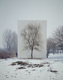
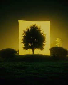
Myoung Ho Lee photographs still trees framed against white canvas backdrops in the middle of natural landscapes
Lee is a young artist who originates from Korea and has produced a variety of magnificent pieces to share. All of his work questions the way art should be presented which I think adds to the complex meaning behind each piece. His work makes us look at the structure of the tree rather than its surroundings. He makes the trees seem as if painted on a canvas, which makes his work truly incredible. |
|
|
My Response
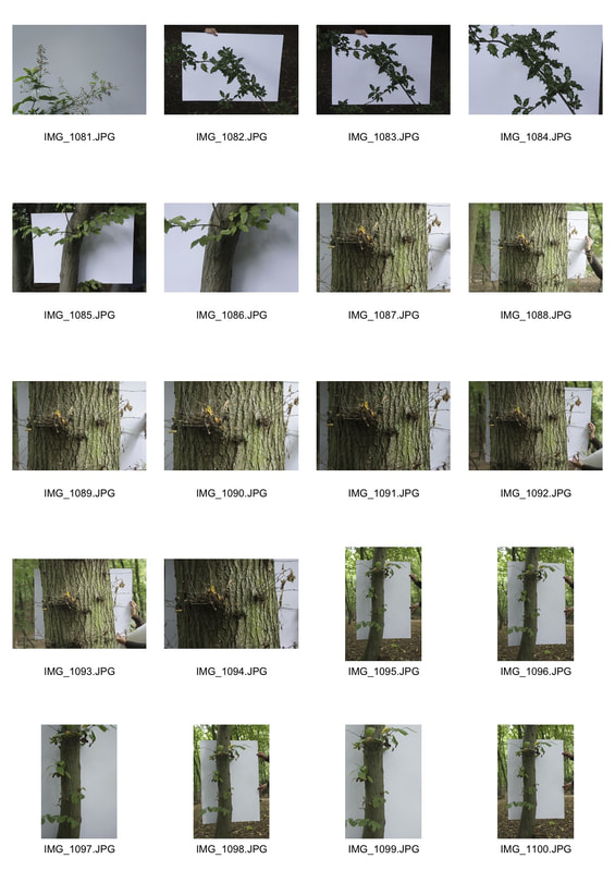
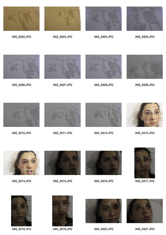
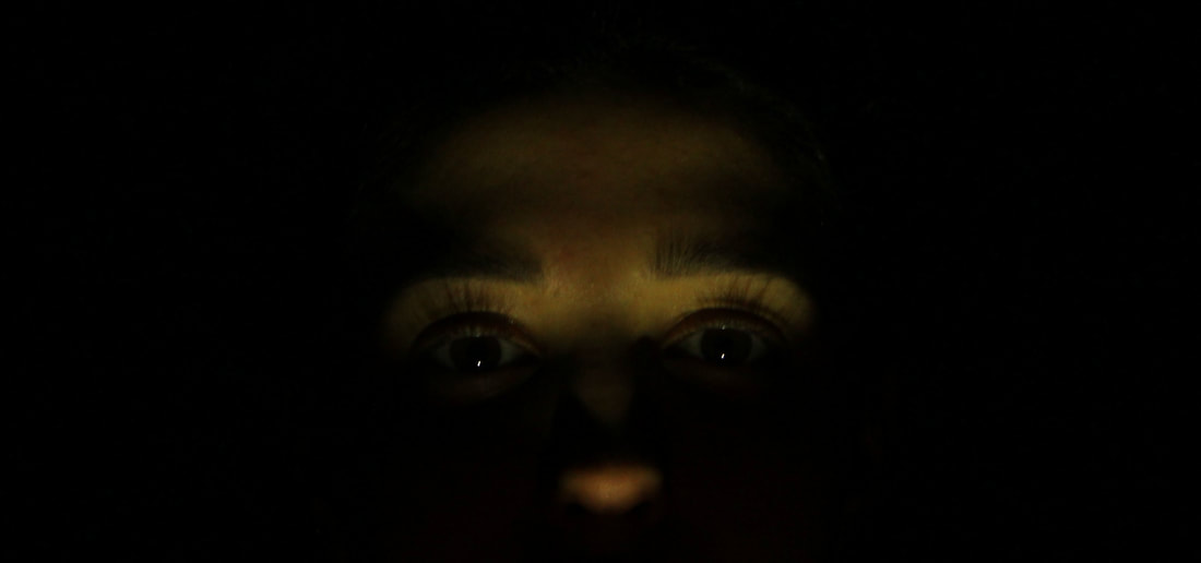
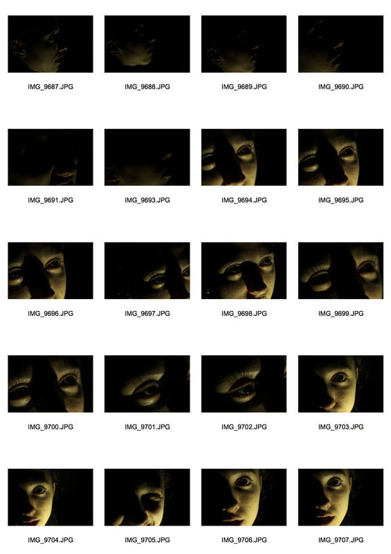
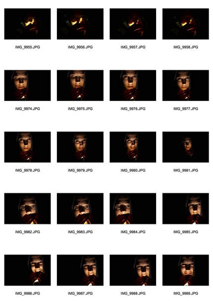
Here I have responded to the artist I was given. (Shown on the contact sheets below) As you can see I took around 80 photographs, each with different positive & negative aspects to them. These photos were taken in the woods with a plain white piece of A1 card to show the structure of nature. I enjoyed this task as I learnt about exposure on the camera I was using and different ways of controlling the white balance. This definitely improved my photography and will do so in the long-run.

|
|

|
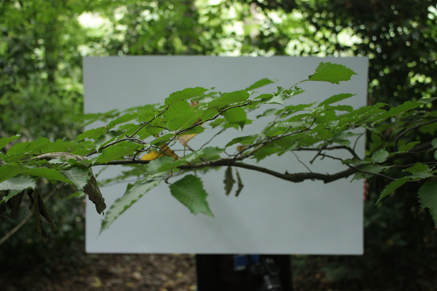
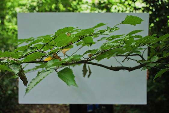
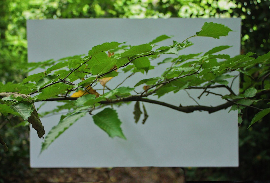
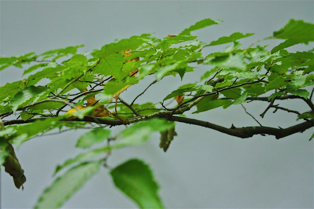
Here I have decided on my favourite photograph. The positioning, angles and exposure has turned out marvellously. I have edited the saturation slightly as I was using a different camera to what I usually use, and so it did not capture the colour very well. I have then experimented with an APP on my PHONE. I have erased any traces of my parter and layered it on top of the same photograph. It could of been better but I am astonished as to how well you can use your phone to edit. This clearly shows us how much technology has developed. If I took a photograph of the surroundings the photographs outcome would've been perfect. I love how you can see the structure of the branch in immense detail and you can also see the slight pops of colour on the leaves showing us that Autumn has finally arrived.
|

|
|
|
Technical focus - Aperture
Meaning: A space through which light passes through a camera (the opening on a camera) We were asked to experiment with the aperture with the use of nature yet again. The higher the aperture the smaller the hole and therefore more of a depth of field. With this technique that I was taught, I am now able to vary the quality of my photographs with a simple change in the settings on my camera.


|


|


|

F/32.0
|

F/5.6
|

F/5.0
|
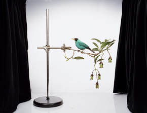
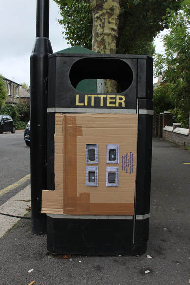
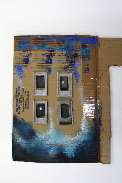
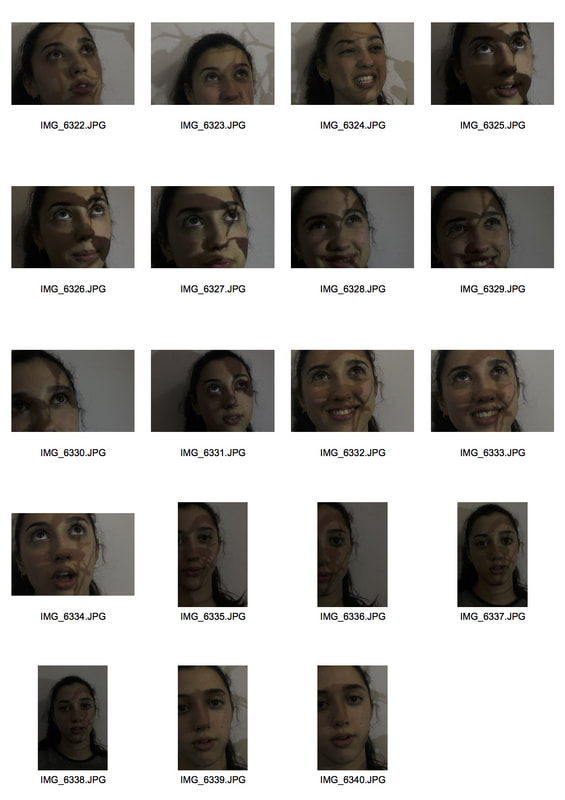
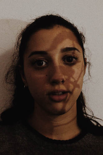
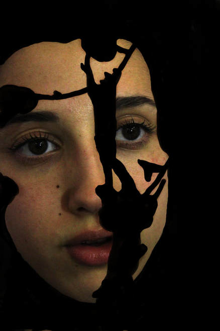
Sanna Kannisto
"Stage where the play is changing and I'm the director"
.
|
|
Sanna Kannisto is a photographer who began her work in 1997. Her work began with rainforest fieldwork and then she began working with scientists to link both art & science together. She spoke with scientists and began to understand what they did and started to get involved in the process. The white background/ light box represents the scientific documentation so she uses the science apparatus to add more depth and context in her photographs.
|
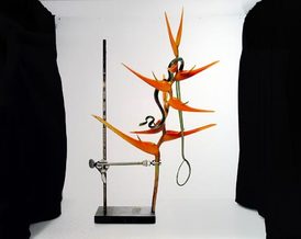
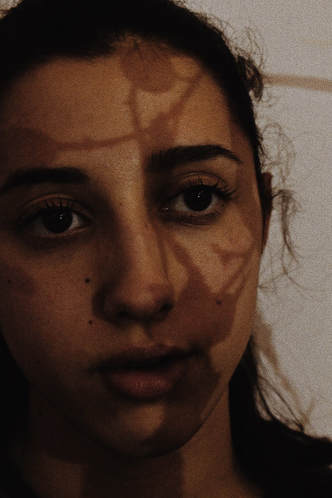
Artist Response
|
|
So here I have presented all the photographs I have taken responding to Sanna Kannisto. I varied my exposure and worked on my depth of field whilst taking these. I learnt how to over expose my photographs when in a situation where I cannot see the features of the plants clearly. You can see this in my series of photographs (the photos start off quite dark and not so great quality), towards the last photographs, the photos are clearer and the white balance is much better.
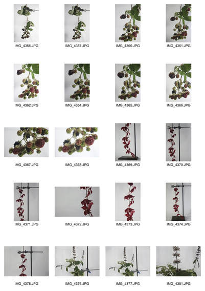
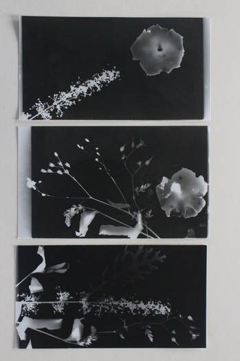
Dark Room Experimenting
What is a photogram? A photogram is a photographic print made by printing objects onto light-sensitive paper and exposing it with light from above.
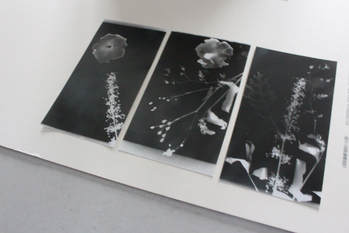
Here we experimented with the use of the dark room. We used the techniques of talbot and calotype. The process involved us going into a dark room with a dim red toned light which did not effect the photographic paper. We then had to place the photographic paper under the box camera and place natural objects on top of the photographic paper before taking of the safety lid and then exposing the paper to light. We then put the paper into 3 solutions - stop, fix and clean. The overall result was this and i think this was a very good turn out.
|
|
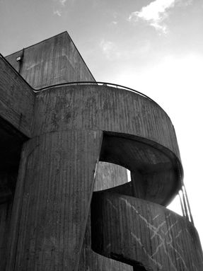
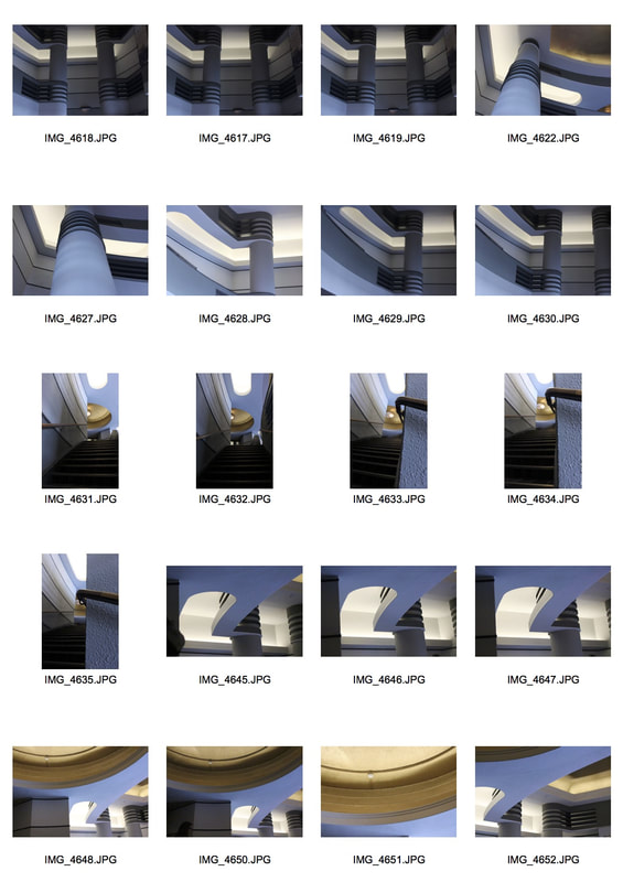
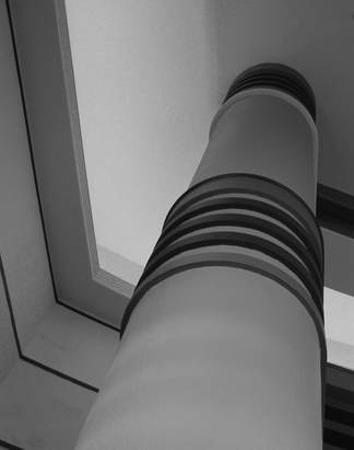
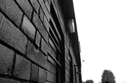
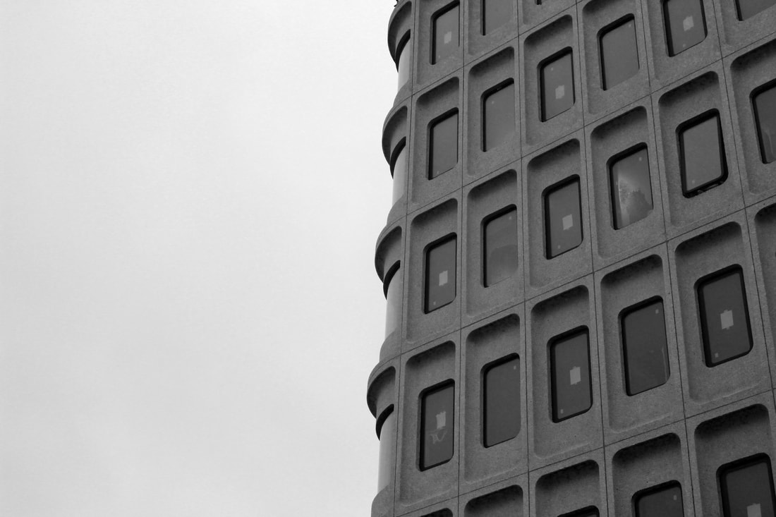
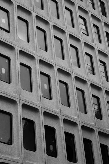
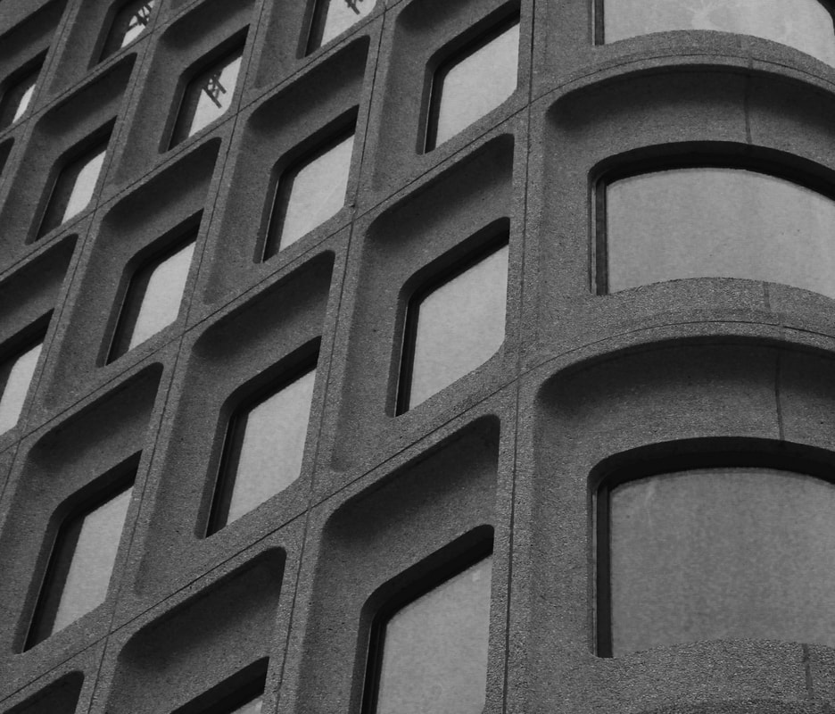
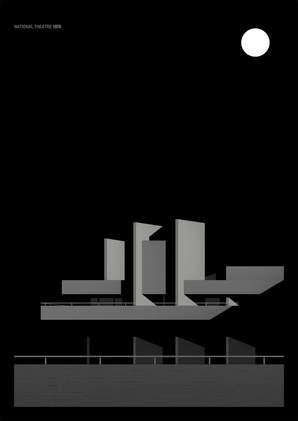
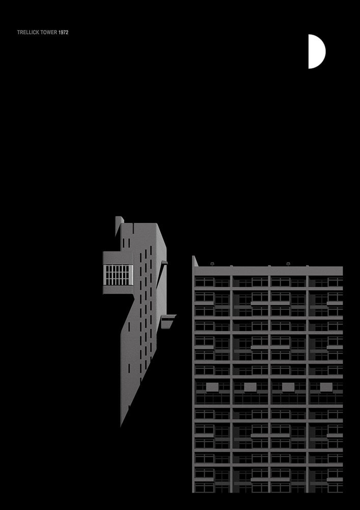
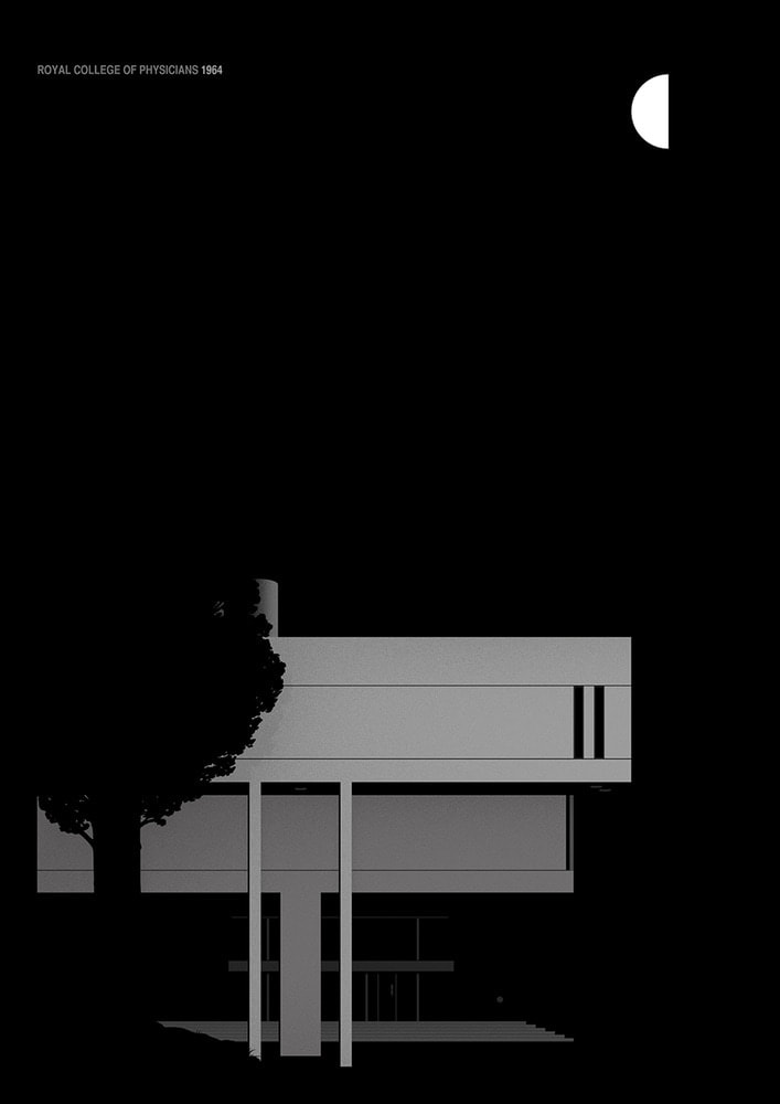
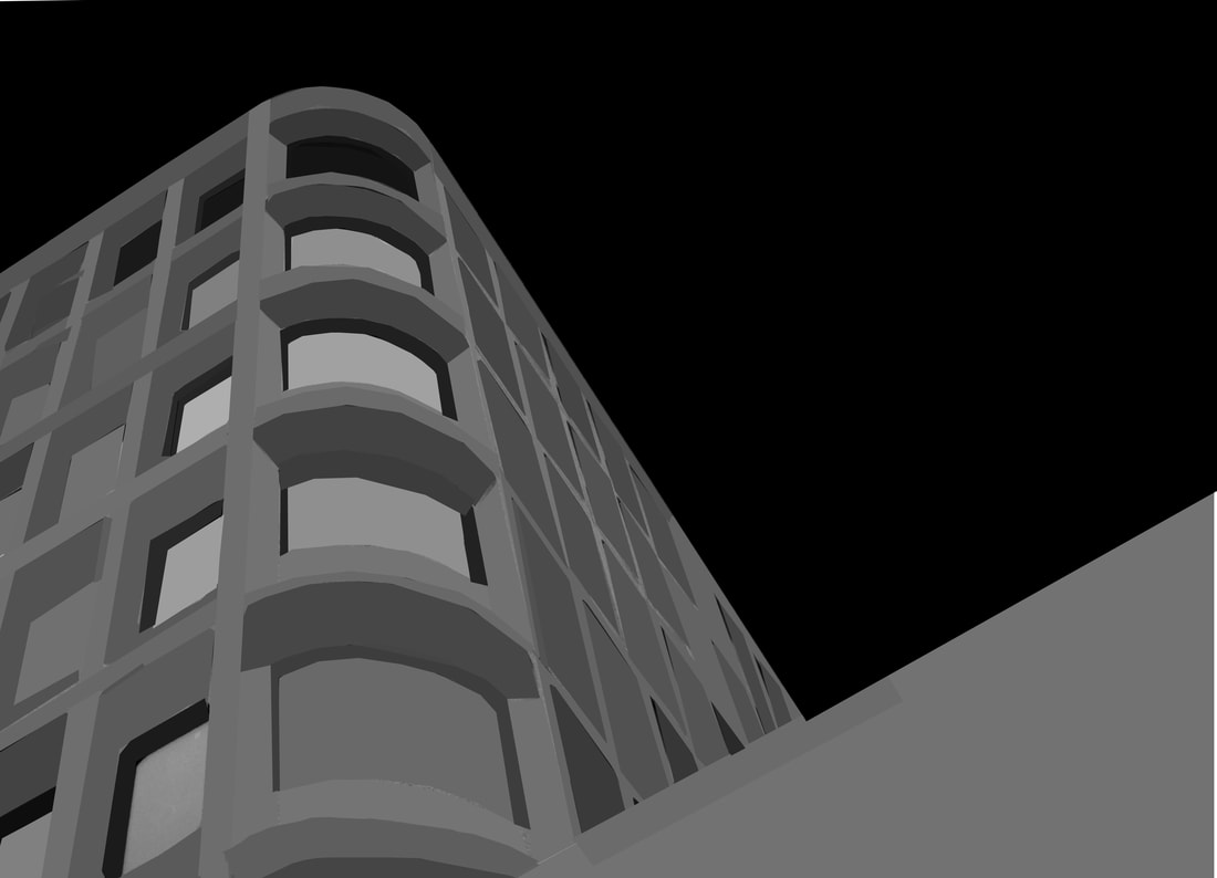
Structure in architecture
Simon Phipps
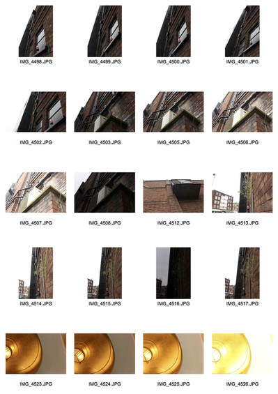
Simon Phipps is a photographer who photographs structures in buildings. I mainly focussed on the brutalist series he had created, here he focussed on the concrete buildings and the shapes and patterns in the architectural structures. The style of architecture was all about materials and the aluminum certainly evokes feelings of those used to construct the buildings.
|
These are some examples of Phipps' work which I found particularly fascinating. The tones & contrast used in the photographs captured my eye.
|
|
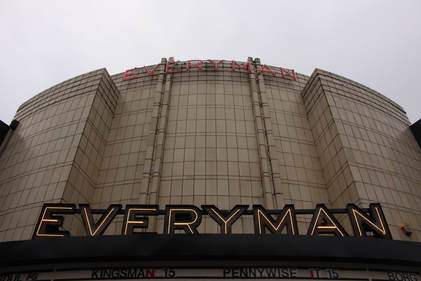
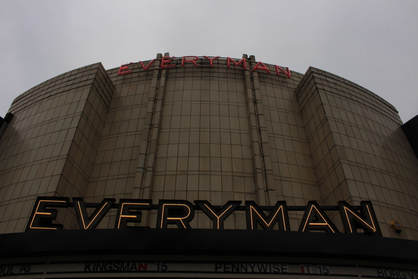
Response 1 to Simon Phipps
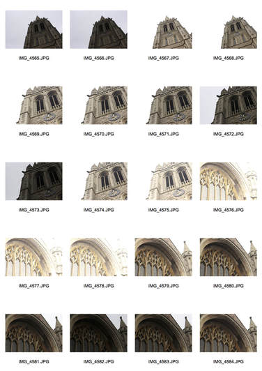
The next series of photographs show my experiments looking at different buildings - in this coincidence the Everyman Cinema and St James' Church in Muswell Hill. We experimented with the use of exposure. This includes the use of over-exposure and under-exposure. This helped me when I was taking photos against the light or in dim areas (e.g. inside or in a shady area).
Be specific regarding ISO/exposure and photographing into light. Look again at the dept website.
|
|
Here I am focussing on the exposure of the photograph to create different effects and moods.
Response 2 to Simon Phipps
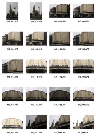
Here we took another series of photographs but instead of focussing only on the exposure and ISO, we focussed on the framing of the image to create a greater effect. I focussed on the different lines and shapes the buildings created and the way the architectural buildings were built. This created much more impact in the photographs as you could create images that are unrecognisable.
|
|
|
I then chose a series of photos out of the 60 photographs I took and made them black and white. I also played around with the exposure and contrast using photoshop to link it better to Phipps' work.
Outside the cinema
|
Inside the cinema
|
Inside the church
|
Behind the cinema
|
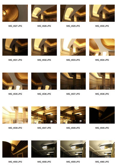
Inside the cinema (stairwell)
Ceiling inside the cinema
|
Outside the church (entrance)
|
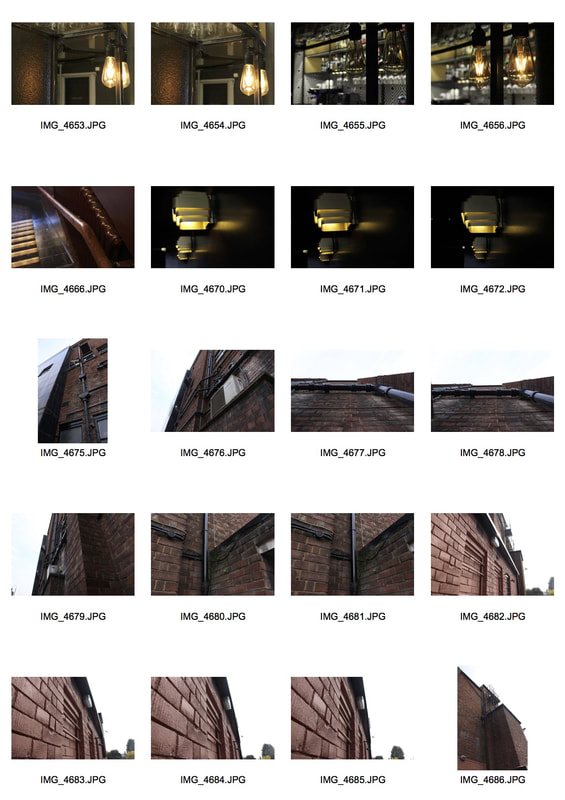
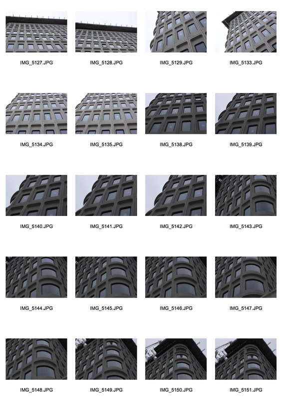
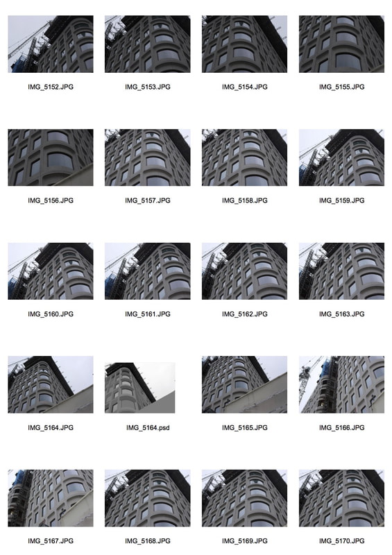
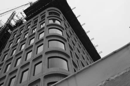
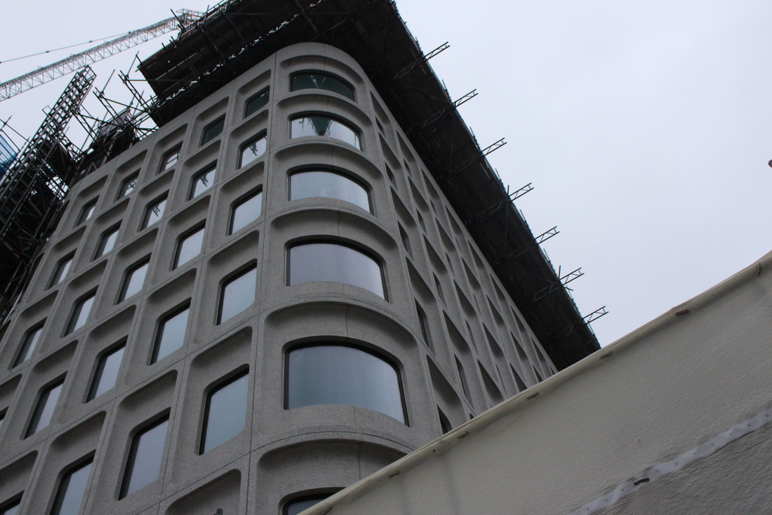
Brutalist Structure Task - Camden Town Hall
"The city’s changing architecture is a kind of memorial of humanity’s endeavours and schemes, for all buildings have been fashioned according to the ideologies of their days".
Brutalism thrives from the idea of "raw concrete". This style of architecture appeared and immediately became associated with a movement emerging in postwar British architectural structures. To classify as a brutalist structure, the architectural piece should be largely based on size and the use of raw concrete, most brutalist structures focus also on the geometric shapes and lines. The use of this type of structure is to reflect what is within them, or what is going on behind the walls, usually being office or business work which is known as being very structured and serious.
The intention of the task was mainly to respond to the ideas of Simon Phipps and his ideas about Brutalist structures. When we photographed the structures we focussed on three different themes; negative space, form/shape & line & perspective. I think in order for a photograph to be considered a "Brutalist image", I think the idea of a black and white filter has to be used in order to complete the idea. I think the filter adds to the mood of the image and also reflects what is going on inside the buildings. It also adds a sense of seriousness and sophistication, also reflecting an office life.
|
|
I then picked four photographs which I think showed the different ideas of negative space, form/shape and lines & perspective.
|
|
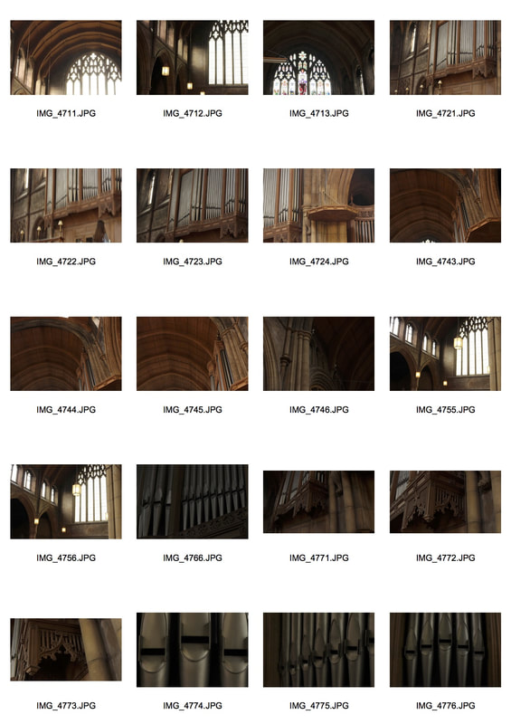
Brutalist task - Extension
Thomas Danthony
He turns photographs that he has taken in to simplified images in Photoshop and then in turns creates screen prints of his creations. The overall effect of the photographs are spectacular, as if unreal and definitely not a photograph. With the use of photoshop he creates a new way of looking at different structures in London and it is definitely magnificent. The process he uses is simple yet effective, making the entire piece even more intriguing. The photograph begins as simply being black and white, then using the lasso tool, he selects an area of the photograph then uses the blur effect and blocks out the details. This is done all over the photo to create an image that looks like this.
|
|
|
Photoshop steps
The steps were extremely simple to work with. I firstly changed the image to black and white and played around with the levels to get the tone and contrast how I wanted it to be. Then using the lasso tool selected areas and blurred just as Danthony does in his work. It was very time consuming however, I tried to get shapes perfect and the building works were in the way of the building and disrupting the view, but other than that the piece didn't have a hard method behind it all - and it did look very good in the end.
Overall finish
This is my response to Thomas Danthony. I think the colours replicate his work quite well, the piece looks as if it wasn't a photograph and has been graphically drawn, which is the way Danthony creates his work. However, because I had less geometric shapes it was harder to get sharper lines and shapes in my response. If the curves were straight the overall effect would have been more effective.
The windows could have been done much more neatly but due to the curves it was hard to be perfect, but I still think it clearly represents Danthony's ideas.
I made the sky black to make the structure seem more prominent and eye-catching. The building works had nothing to do with the brutalist structure so I made it seem like a part of the sky so that the audience could focus more on the way the building looks rather than its surroundings.
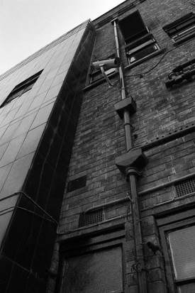
Before
After
Extension part 2
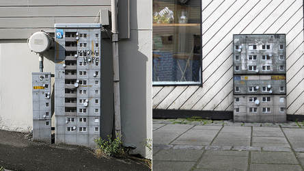
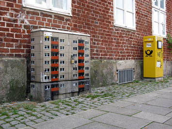
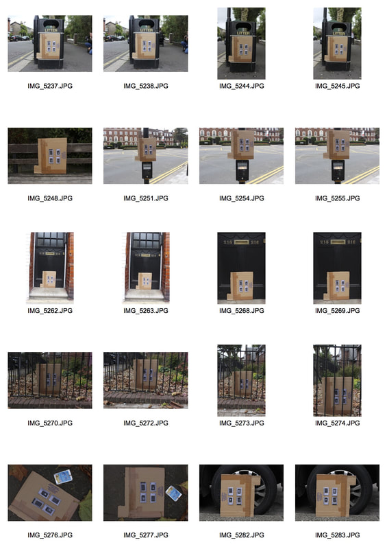
EVOL (artist)
German street artist EVOL transforms banal urban surfaces into miniature lifelike buildings. He is like an urban planner, but unlike the others, he creates a city within the city.
The artist uses complicated stencils and photographs to quickly transform powerboxes, and other worn urban surfaces into miniature apartment buildings or other structures. By drawing tiny balconies and satellite dishes onto the side of an electrical box, he is able to turn it into a realistic tiny skyscraper.
His work in my opinion, is very interesting. The unique way he has thought of placing miniature structures onto random objects outside e.g. a power box, makes it even more fascinating. It is definitely interesting to look at and observe.
|
|
My Response
|
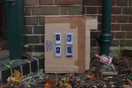
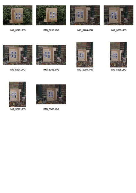
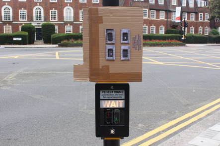
We did a response to Evol's work by creating our own miniature buildings out of card and a printed image of one of our brutalist buildings the image seen on the right is the image that I used to create the windows. I layered card to make it look 3D and more interesting. We then decided to take the photographs outside (Muswell Hill) in different settings / backgrounds to create different effects. I then took 3 of my favourite photographs out of the 30 that I had taken that I think looked most aesthetically pleasing. Then we took paint and used different materials e.g. sponges & wire wool to add a bit of colour to our miniature structure, to add a bit more fun to the buildings in order for it to look more pleasing to the eye.
|
|
Here are the photographs I chose that I thought were most effective.
|
|
|
|
I think the overall outcome of the piece was quite fantastic. The way i have placed the building in different areas outside make the world seem like a big place. The idea is very interesting and using the backgrounds you can reflect different messages and stories about the area and your work.
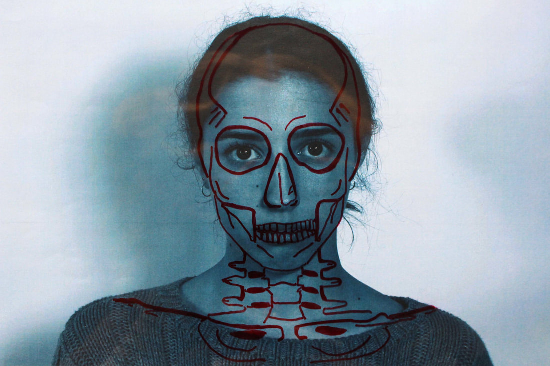
Structure of the body
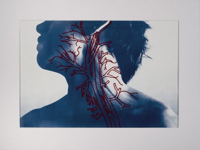
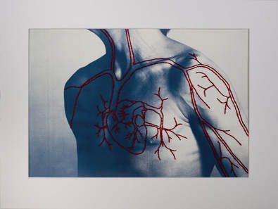
Patrick Hickley
In his series complex series Patrick Hickley creates a series of hand printed cyanotypes on watercolour paper and then hand stitched thread that represent the different muscle structures of the body. I like this idea as it looks like we are looking at a body scan. The use of the red thread completes the idea of the human body and blood. This is what mainly structures the human body.
|
|
Response to Patrick Hickley
Here I have photographed Sophia and using photoshop, made the image a similar type of blue as Peter Hickley. I then printed out the image and using transparent plastic sheet, I drew over her face masking the idea of a skull on the inside of her body. I think the effect turned out quite similar to Hickley's and I think I would do something like this again.
Final Outcome
Overall I think the final outcome was very effective. The colours contrast each other and the redness pf the lines reflect the body from within. I think I should experiment more with this idea and maybe work on different areas of the body to create different effects. The use of the sharpie makes my work much more different to that of Hickley.
Structure in 'The Truth About Fashion'
Artist : Anna Kulachek
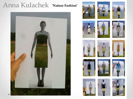
I have chosen a strand that I am quite passionate about and that is the fashion industry. I have taken inspiration from the well-known artist Kulachek, who uses still landscape/ country/ field images behind a photograph of a woman who's outfit has been cut out the photograph.
My idea involves the industry of fur and cruelty. This is something I am very passionate about and would like to show this through my photography. I will take an image of myself and using acetate / photoshop or a print out, and then place myself in the animals environment showing how cruel the industry is. It will show how we turn a blind eye to what we are doing to the animals we love and care about.
My idea involves the industry of fur and cruelty. This is something I am very passionate about and would like to show this through my photography. I will take an image of myself and using acetate / photoshop or a print out, and then place myself in the animals environment showing how cruel the industry is. It will show how we turn a blind eye to what we are doing to the animals we love and care about.
Structure in 'society'
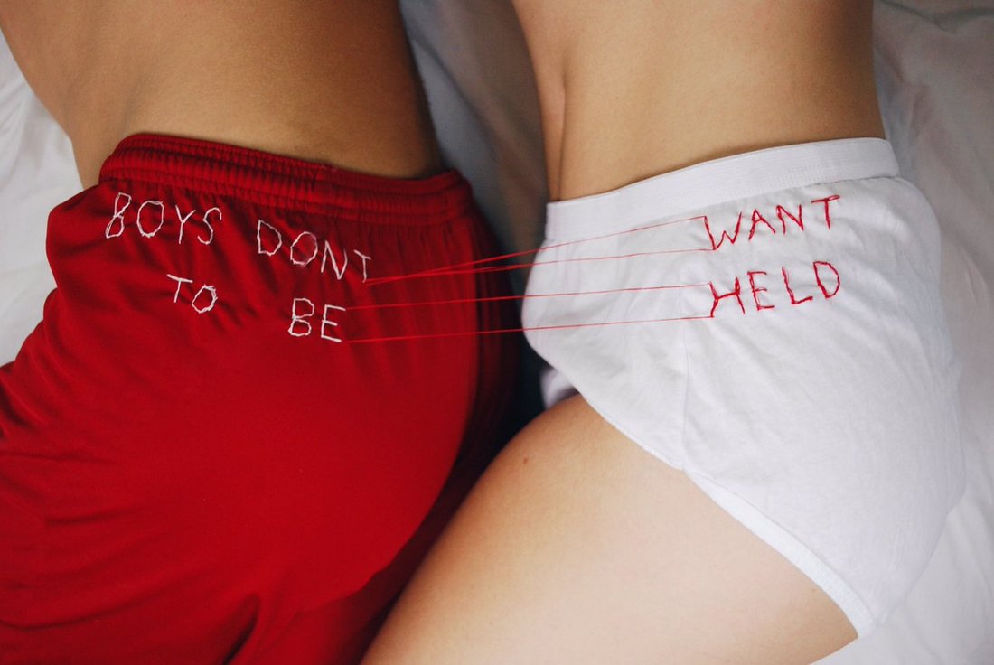
Artist/ Photographer : Rora Blue
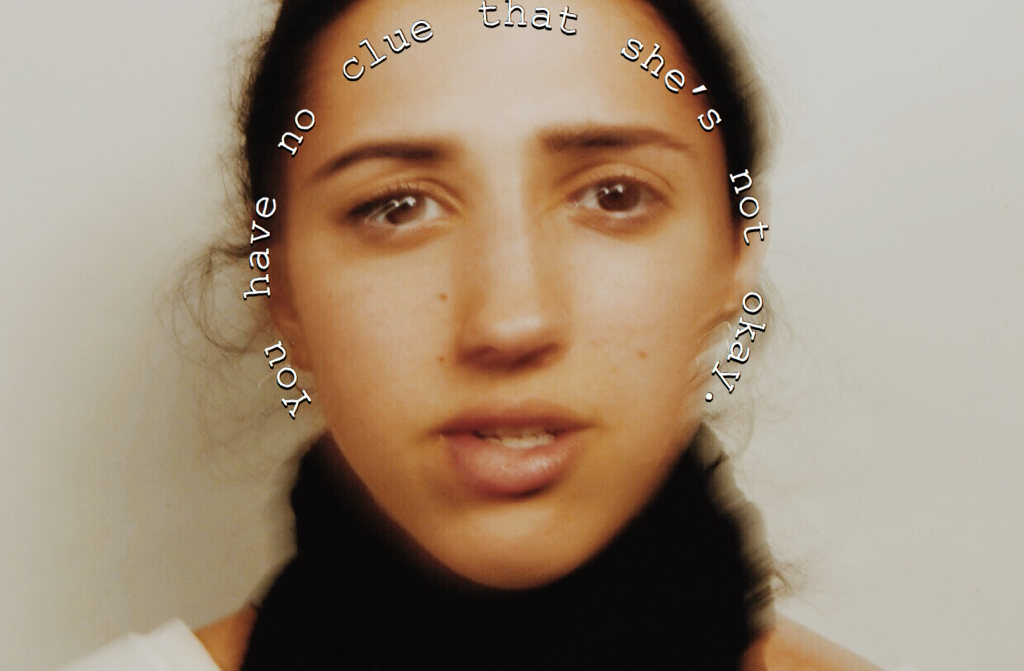
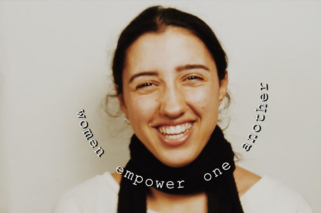
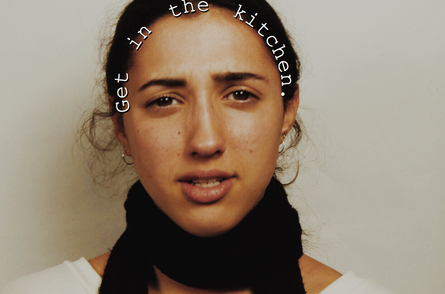
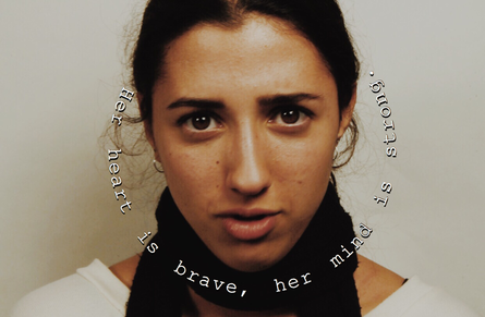
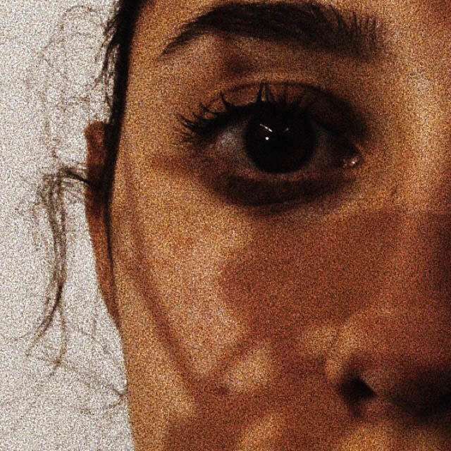
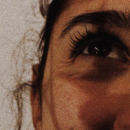
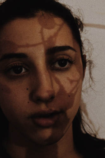
Rora Blue uses different items to represent different ideas thought in todays society, especially about the idea of feminism/ sexism. The use of stereotypical quotes and other stereotypes, makes the pieces more effective as we hear some of these sayings in our day to day lives. The use of red could indicate love or anger, but also seduction. The idea that women are only seen via the male gaze has been considered everywhere causing a lot of conflict and anger. Here I have photographed Sophia with those similar ideas.
|
|
Response
|
|
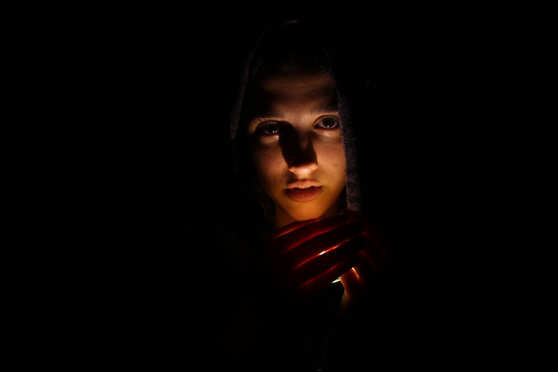
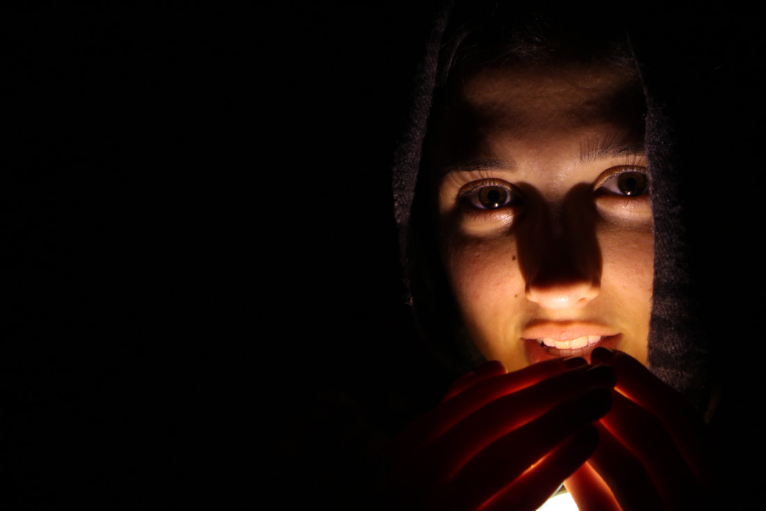
Whilst taking these photographs I was stating quotes to my model to photograph her different reactions and moods. I reference empowering and rude quotes to capture different reactions. I think the effect was quite shocking, her facial expressions differed immensely and her eyes seemed to change gaze each time I said something different. Just like the artist who had inspired me to do this, I wrote the quotes on top of the image but instead of it being sewn on, I used photoshop to add the text on top of the images. The slight sepia colouring of the image adds a deeper mood to the photograph, setting the idea perfectly.
Structure in time & movement
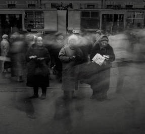
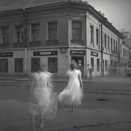
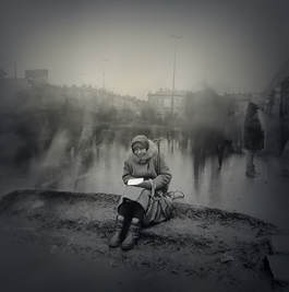
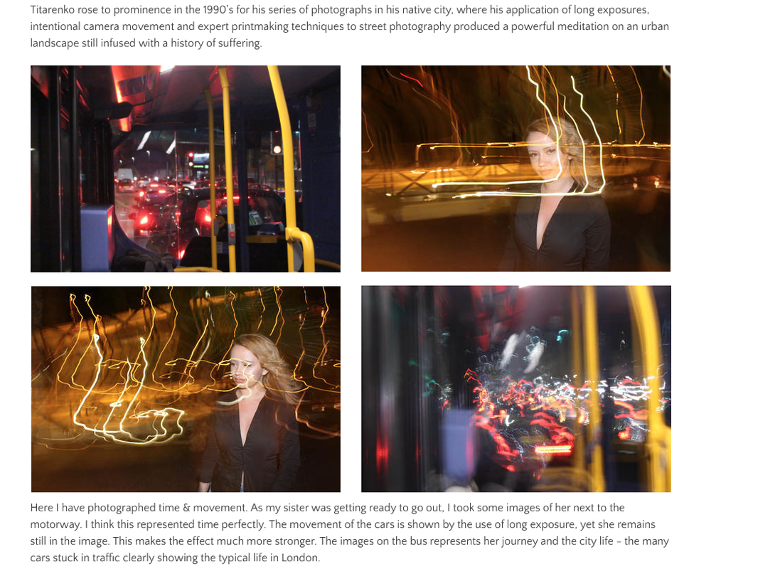
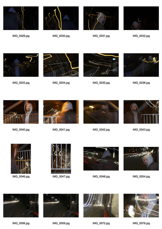
Photographers : Alexey Titarenko
The northern city of St. Petersburg is known for its summer “white nights” and its short, dark winter days lasting for just a few hours. In the winter of 1991-1992, one cold and gloomy day, I strolled sadly down a street which used to be packed with people, which used to be full of joyful vibrancy and dynamism. It was poorly lit; evening was settling in. There was not a single car visible. The depressing and strange quietness was interrupted by the sounds of banging grocery store and bakery doors, stores in which the shelves were absolutely empty.
|
|
|
Titarenko rose to prominence in the 1990's for his series of photographs in his native city, where his application of long exposures, intentional camera movement and expert printmaking techniques to street photography produced a powerful meditation on an urban landscape still infused with a history of suffering.
|
|
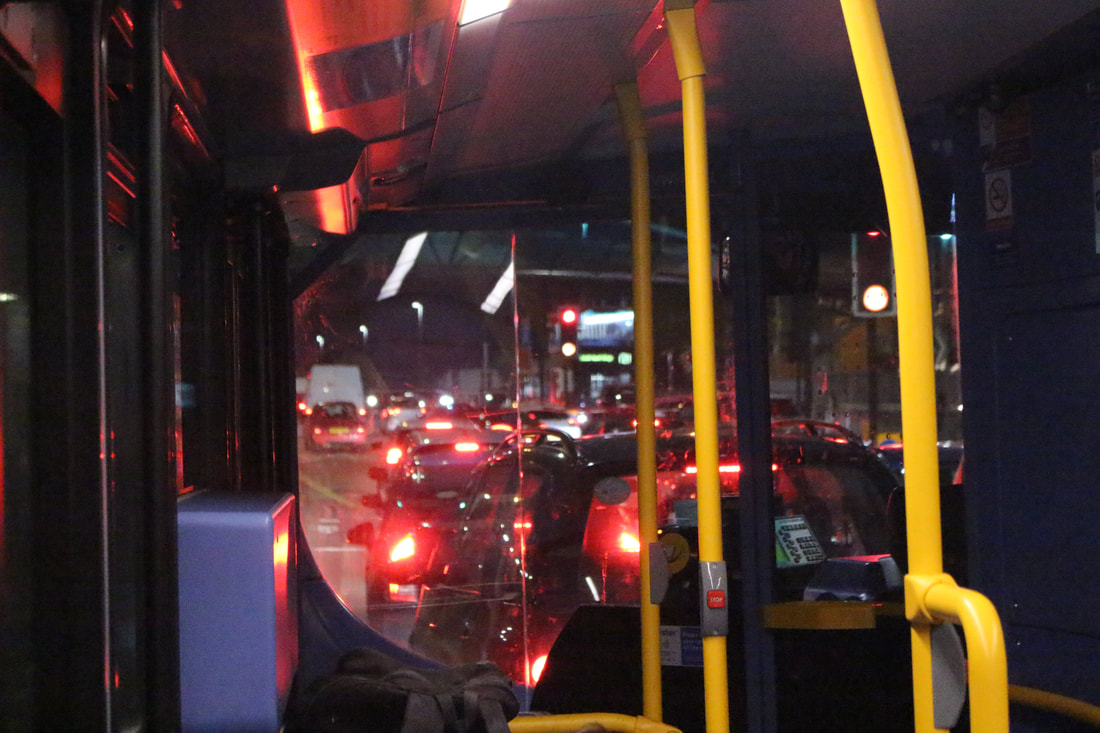
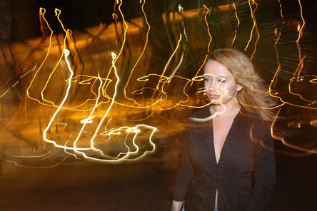
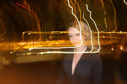
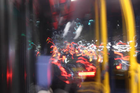
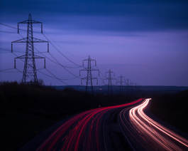
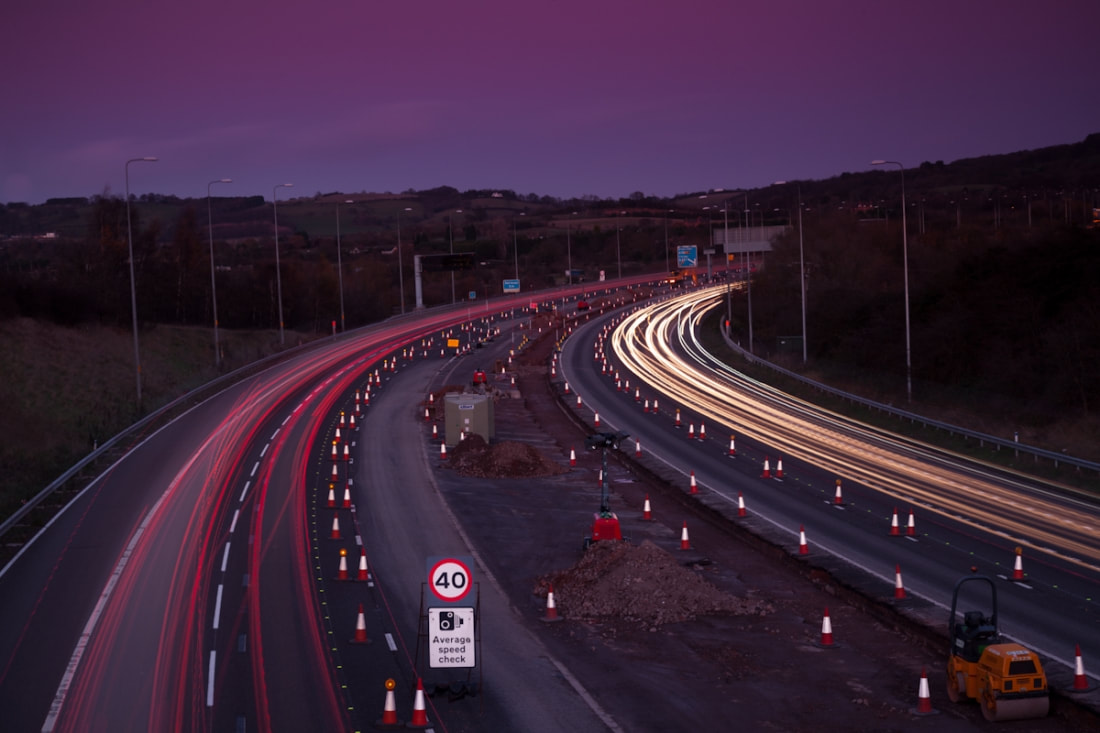
Here I have photographed time & movement. As my sister was getting ready to go out, I took some images of her next to the motorway. I think this represented time perfectly. The movement of the cars is shown by the use of long exposure, yet she remains still in the image. This makes the effect much more stronger. The images on the bus represents her journey and the city life - the many cars stuck in traffic clearly showing the typical life in London.
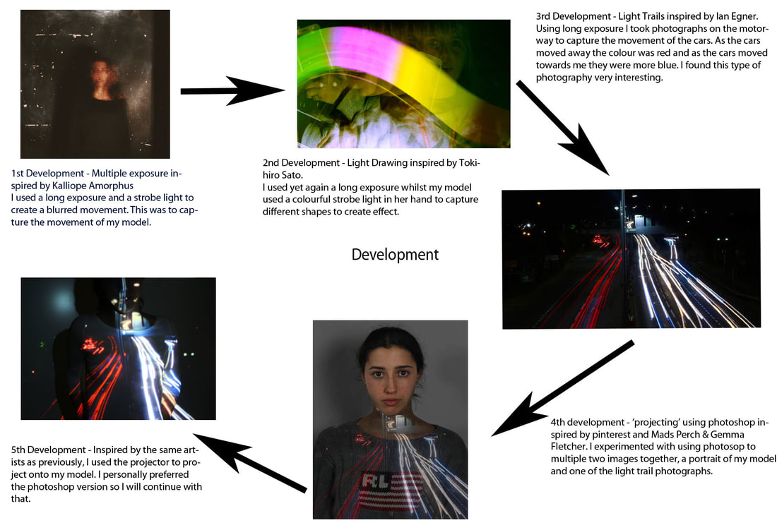
Development using a strobe light
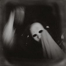
Kalliope Amorphous
|
|
|
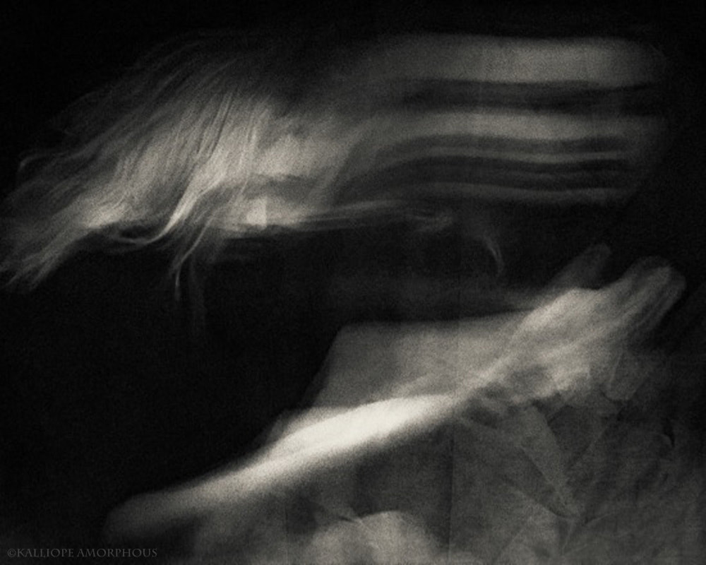
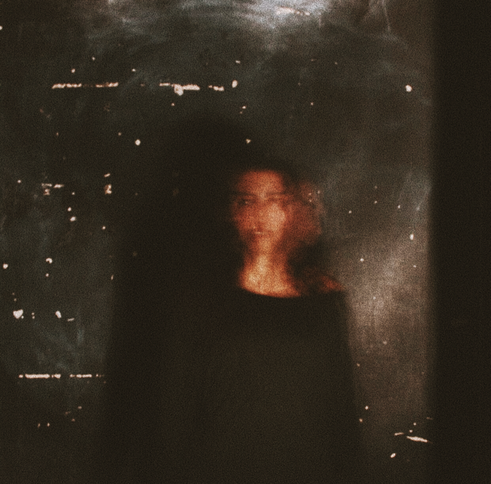
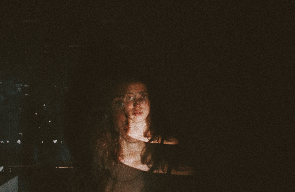
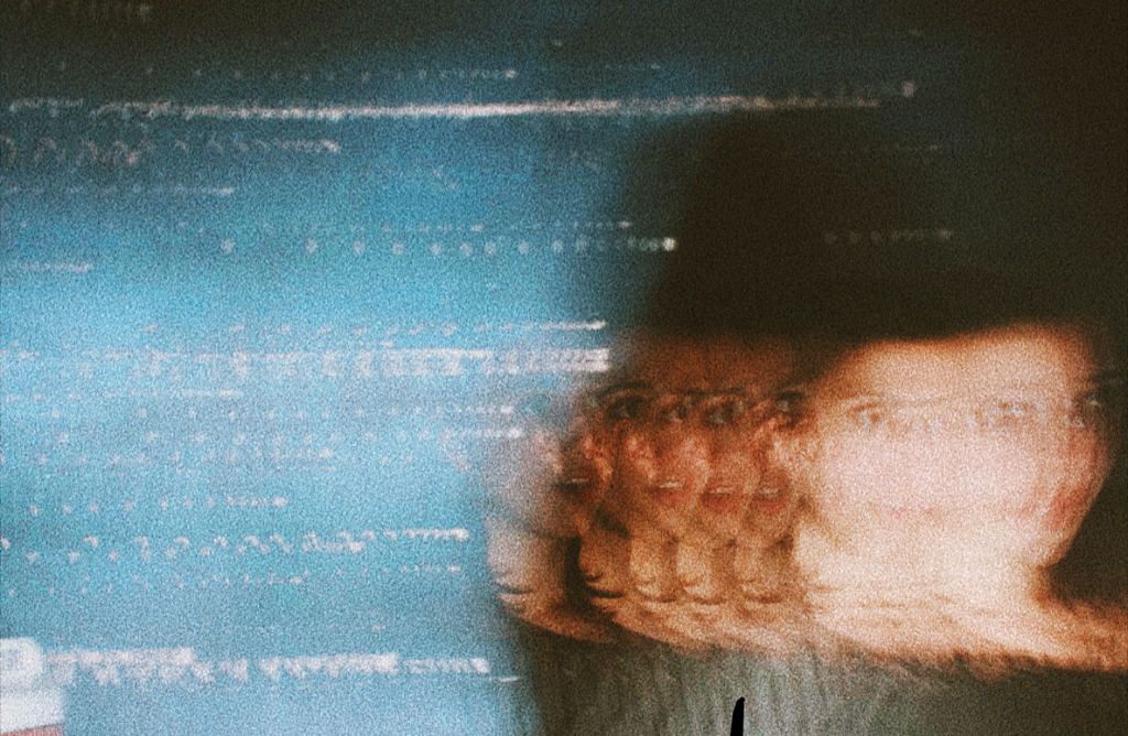
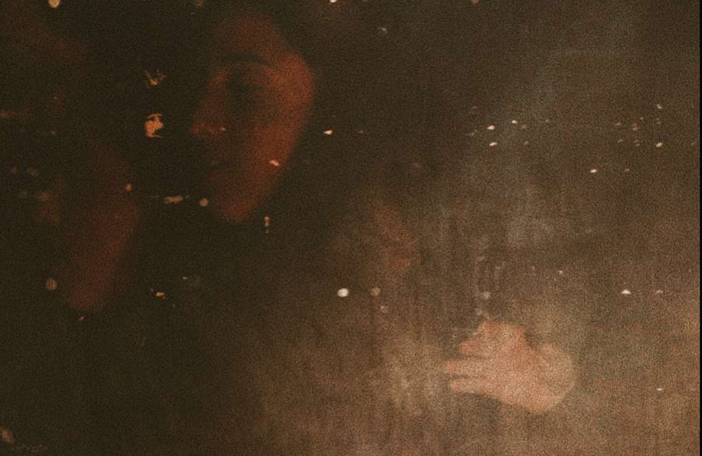
Kalliope Amorphous work seems almost dreamlike or surreal. She presents different narratives through a variety of different experimental photography. Most of Amorphous's work that I looked at used reflections, blur, mirrors, and multiple exposure representing different themes — identity, mortality, time, and consciousness. I particularly liked the ghost like images that she had created making it seem as if there was more than one person in the frame. It also captured the movement of the figure much more interesting and mysterious.
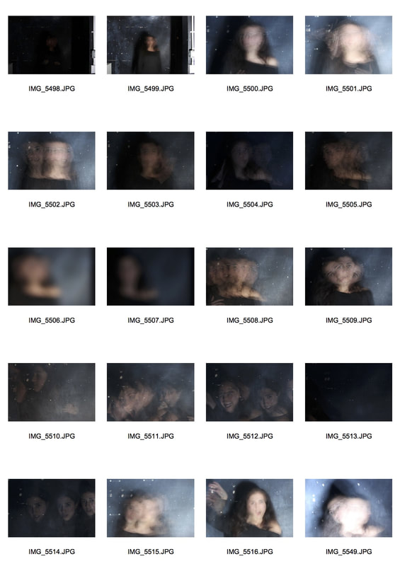
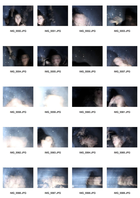
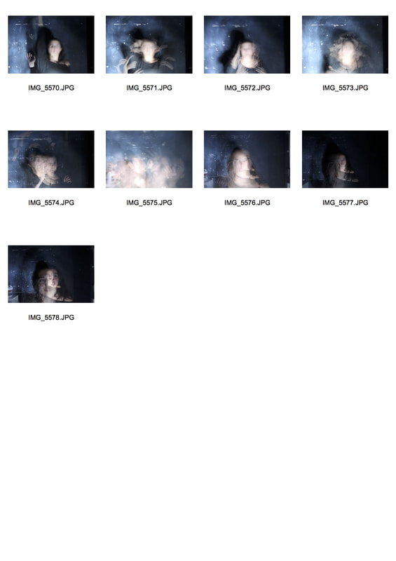
Multiple exposure experimenting
Contact Sheet
|
|
|
Favourite photographs
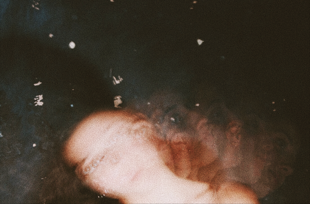
I think these images captured the ideas of Kalliope perfectly. The first image presented seems very ghostly in particular as you can only see Sophia's head moving. The other images capture the structure of movement in time. The multiple long exposures captured the movement very well and made the photographs much more interesting.
|
|
|
|
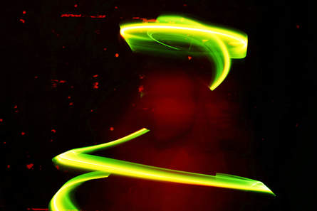
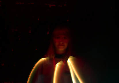
Light drawing
Tokihiro Sato
|

|
|
Sato uses light to show the movement of people in different areas. He best known for his unusual expressions of light and space and interpretations of performance and dance. I like the way he is able to capture the movement just by using a simple technique of moving light.
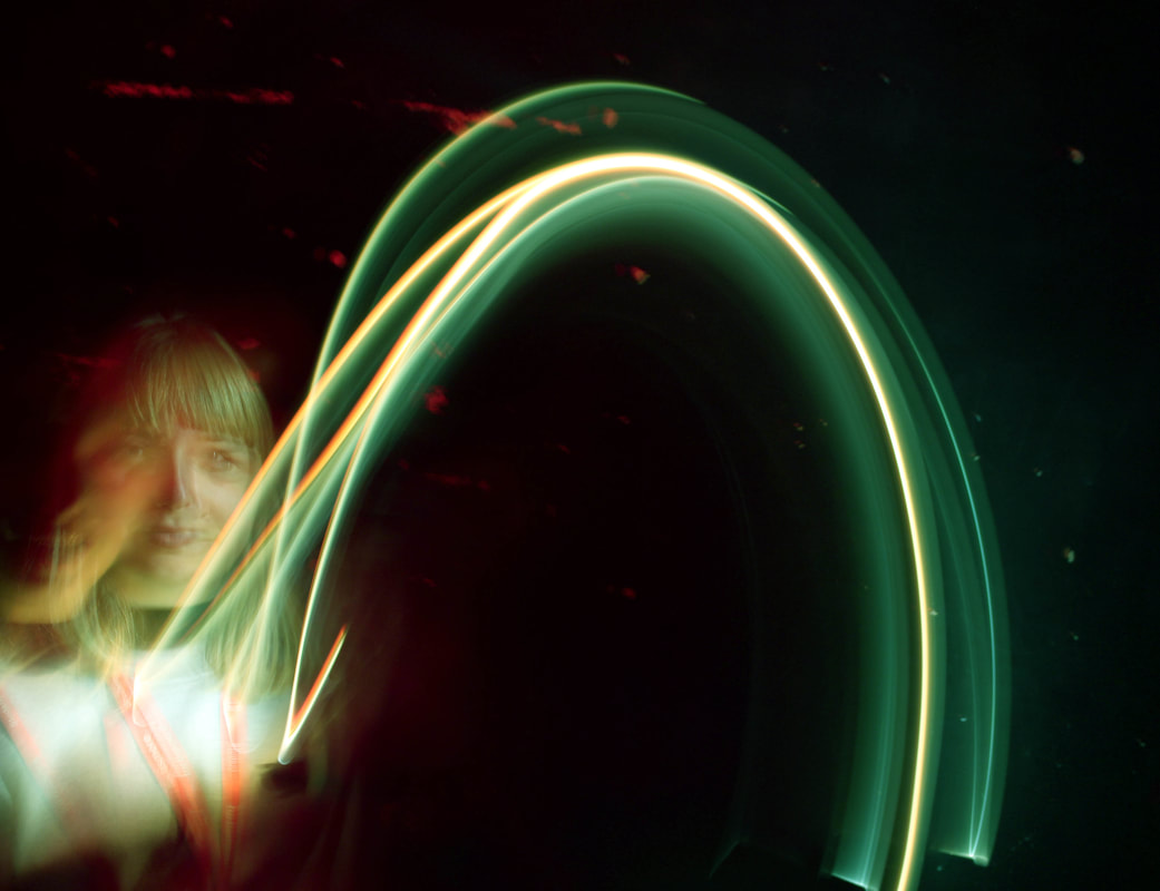
My response
Here I have used lights to create different 'drawings'. I used a colourful strobe on my phone on the first set of photographs using a long exposure. On the second set of photographs I have used the torch of my phone and my model has covered it with her finger to make the light more dimmer effect. The movement of the arm is captured by the light creating quite interesting effects.
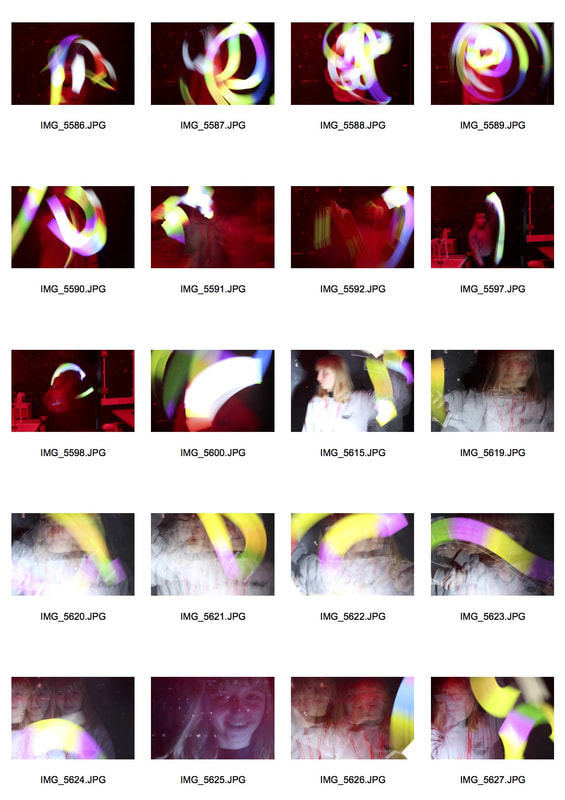
|
|
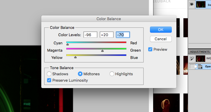
I took my favourite photographs and using photoshop, I edited the colour balance to make the 'drawings' more vibrant and interesting.
|
|
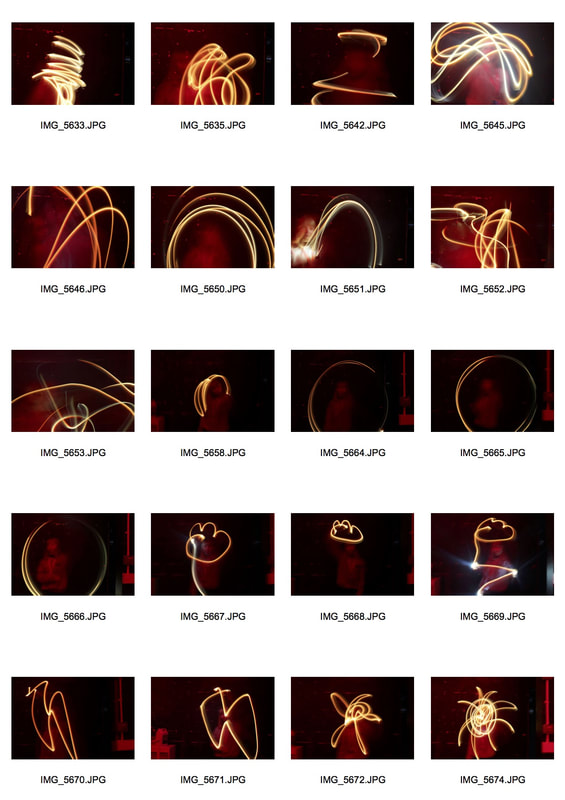
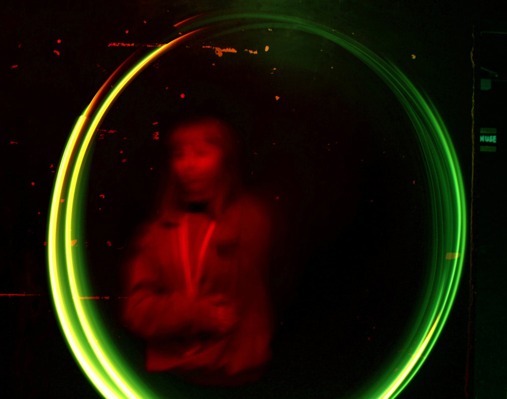
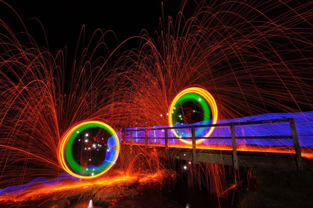
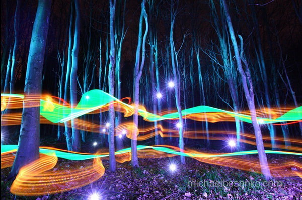
Moving light images
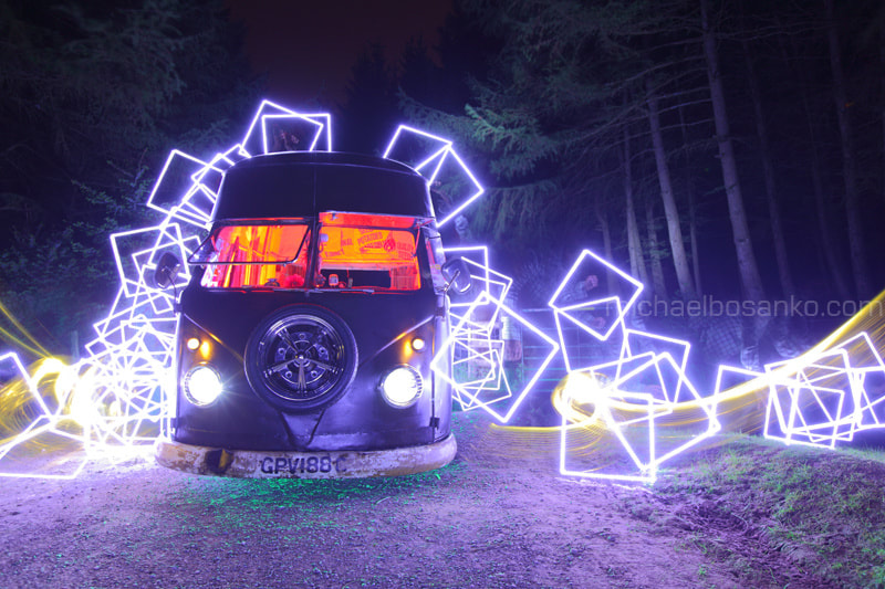
Michael Bosanko
|
|
|
This photographer uses light as a way of art. Michael does what is known as "light graffiti", which I think looks extremely vibrant and appealing. He takes a lot of time with a long exposure whilst he draws using different lights. The round shapes were done with a light on a string which I thought was particularly effective as it is simply a continuous string of light going around making it look as if it has been drawn.
My images
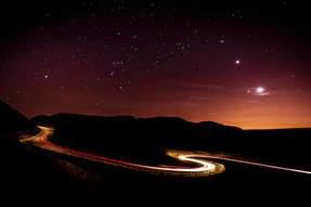
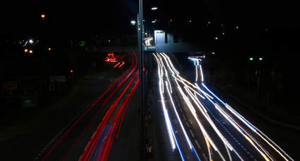
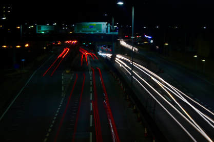
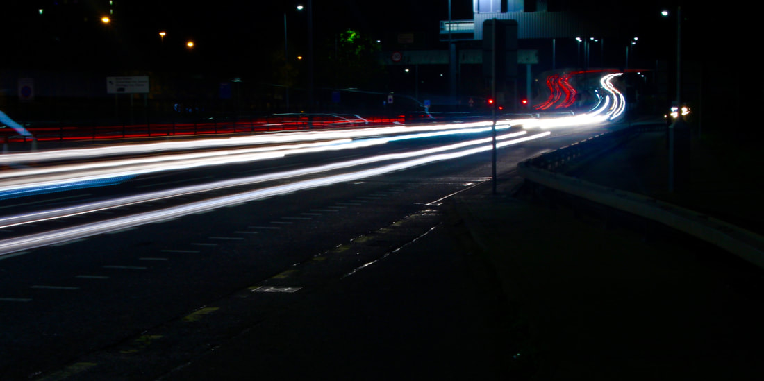
Light trails (motorway)
Ian Egner
|
|
|
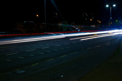
The photographer that I took interest in was Ian Egner, I like the idea of movement and light and Egner experiments using just that. He mainly takes photos of motorways and the movement of the cars, usually in the evening/night. He captures the surroundings and uses a long exposure to create the image of a moving light rather than the cars on the motorway. He captures the speed of how fast time is going by which is what my chosen strand is.
My images
|
|
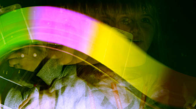
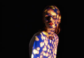
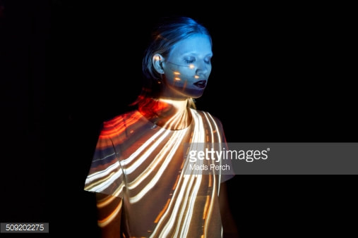
Reflection of light
Mads Perch and Gemma Fletcher
|
|
|
I wanted to work more with people so I found these photographers whom used a projector to reflect the images that they had taken onto a person. I particularly liked the projection of the motorway which links perfectly with the light trails that I was looking at before this.
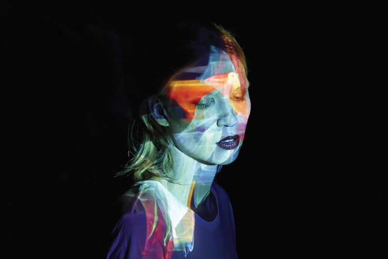
Experimentation using photoshop
I started experimenting with photoshop to create a 'projection' of the motorway light trails onto Sophia's body. I merged the two photographs together to create this sort of effect. I think the overall effect was good and it turned out how I wanted it to. The light trails seem as if they're emerging from Sophia's head which I think adds to the effect of the whole photograph.
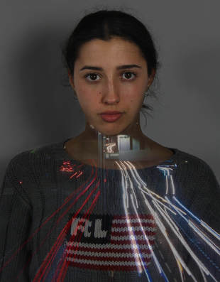
My images
Projecting the image
Contact sheets
|
|
Final images
|

|
Reflection
Solve Sundsbo
|
|
|
This photographer uses different shadows using different materials to create a reflection onto a human figure. Solve tries to capture the structure of beauty and the female figure using the light as a way of defining different parts of the person. The straight lines make the images pleasing to look at as it gives it a sense of abstraction.
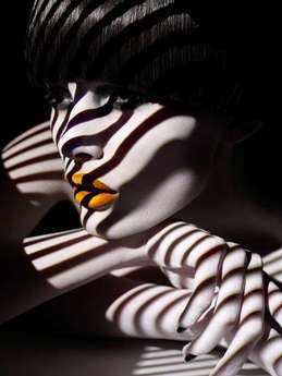
Shadows using natural light and natural objects/materials
Jonas Hafner
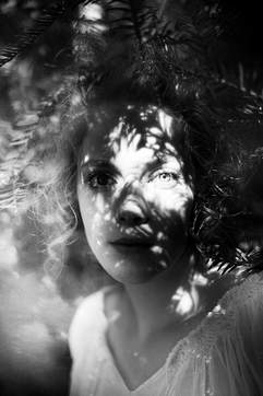
|
|

|
Jonas Hefner knows how to capture the tense beauty of men and women by way of delicate and cicerone portraits. Lights infiltrate through plants and fabrics, revealing stunning patterns on model’s faces as mapping projections.
|
|
My final images
Here are the final edits of my favourite five photographs. I have edited the photographs so that they look like they're old photos, this can be seen through the sepia colours and the high grain level. The use of the leaves, puts together the structure of nature and the structure of the human body together as one, creating a great effect on the entire piece.
|
|
|
|
Using light to create shadows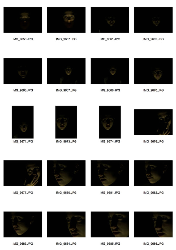
Favourite photographs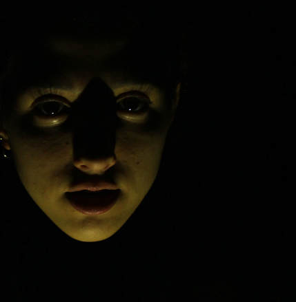
|
|
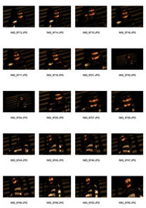
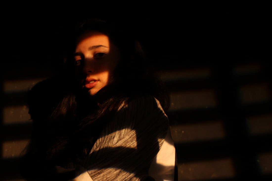
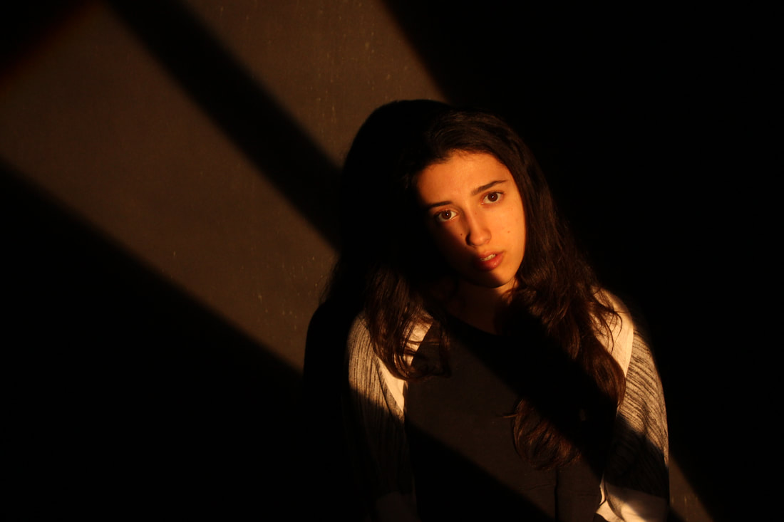
Film Noir
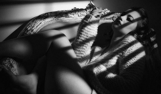
Classic film noir developed during and after World War II, taking advantage of the post-war aura of anxiety, pessimism, and suspicion. "Film Noir" or black film/cinema was created by French film critics, who noticed the features of darkness and downbeat looks reoccurring throughout the movies.
Film noir is not a genre but rather a mood, style or point-of-view. "The primary moods of classic film noir were melancholy, alienation, bleakness, disillusionment, disenchantment, pessimism, ambiguity, moral corruption, evil, guilt, desperation and paranoia"
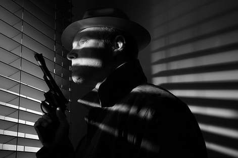
I decided to experiment with this idea of presenting a mood in an image. The idea of mystery creates tension for the audience and makes the photograph more interesting to look at. The use of the shadows created by the blinds makes the person seem 'cut out' from reality, only seeing certain parts of the body clearly through the light emerging from the blinds. The shadows of the lines makes the image seem very intriguing and interesting, this appeals to me and what I want to do as I am looking at the use of shadows in images.
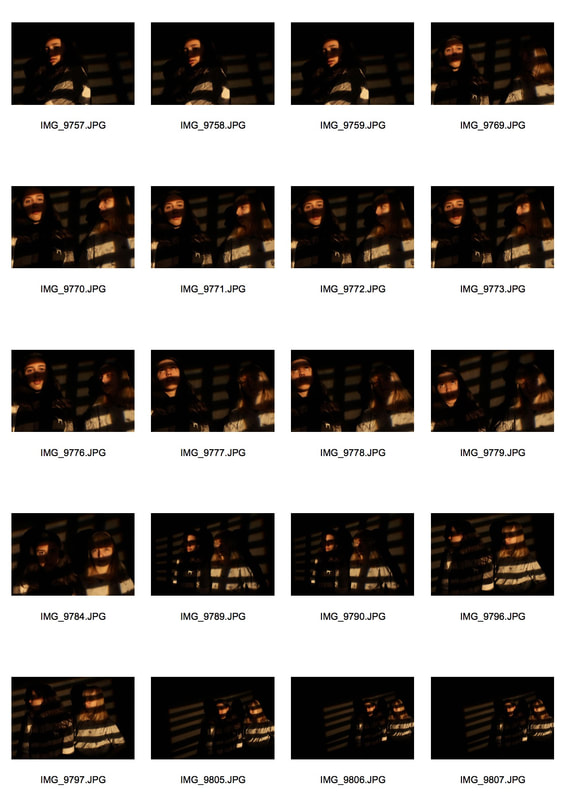
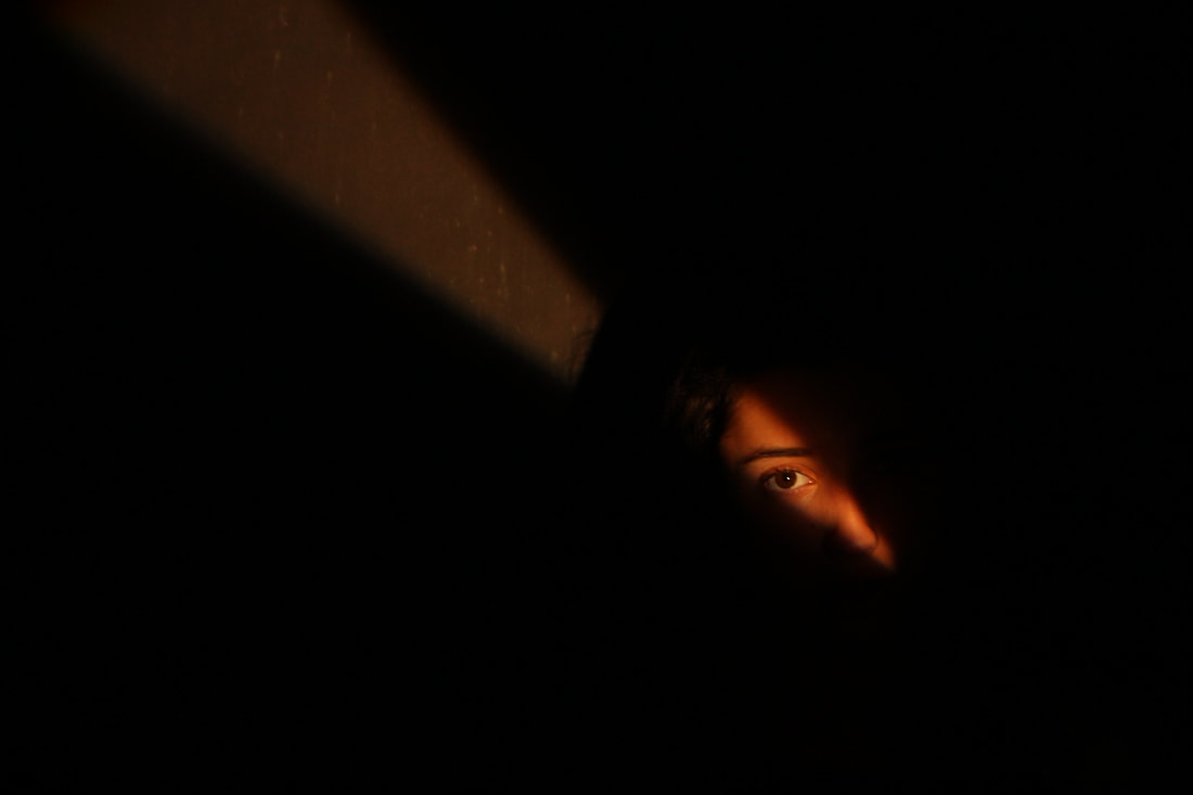
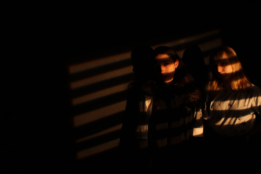
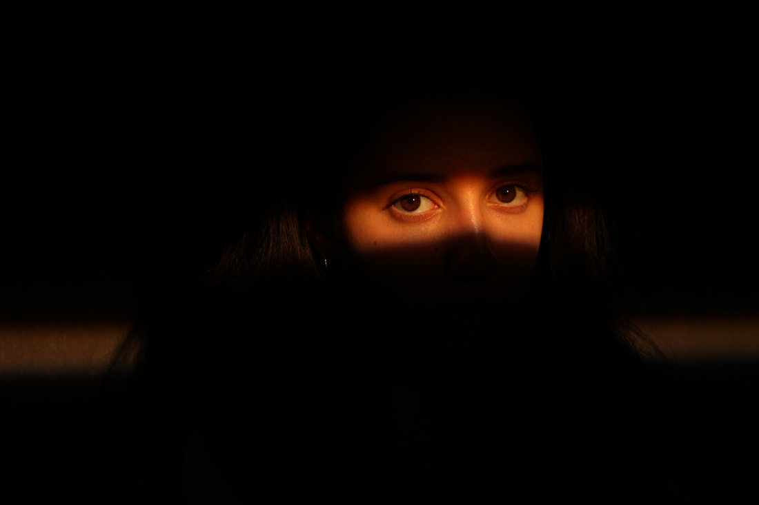
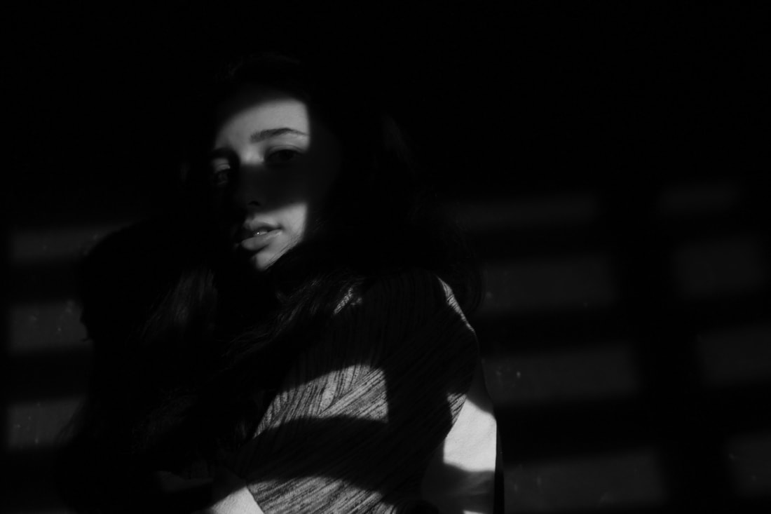
My response
Here is my response to the idea of 'film noir', I have shown the image in black and white and in normal colour. I have focussed on certain features of my model including the mouth, eyes & nose. I used two models for one of my images to add more of a mysterious aura to the photograph. I prefer some coloured photos and some black and white, depending of what mood I wanted to set.
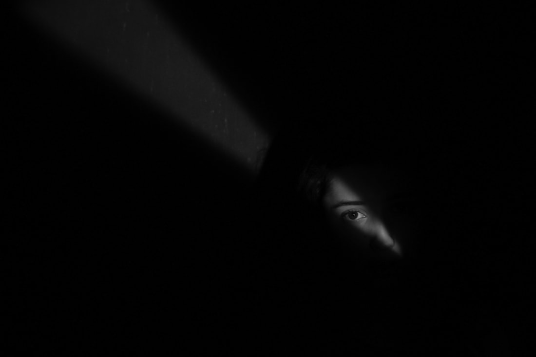
To create the lines of light, I used a projector with strips of paper, leaving gaps between each strip of paper. This allowed some light to be shown on my model, as the strips of paper created a shadow, which worked out very well.
To create the lines of light, I used a projector with strips of paper, leaving gaps between each strip of paper. This allowed some light to be shown on my model, as the strips of paper created a shadow, which worked out very well.
|
|
|
|
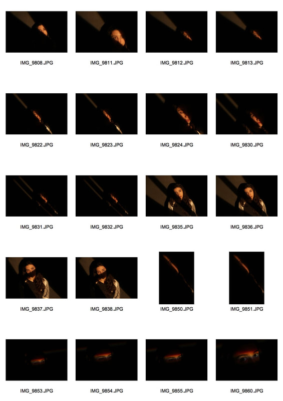
These are the photos that I found most effective out of the sets that I took. I moved the strips around when changing the position of the model according to where the facial features were positioned. The first photograph shown only reveals one eye clearly which adds the depth of mystery to the image.
|
|
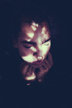
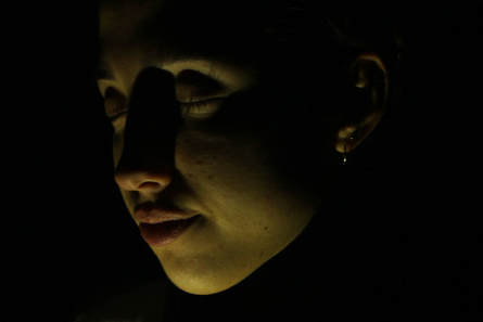
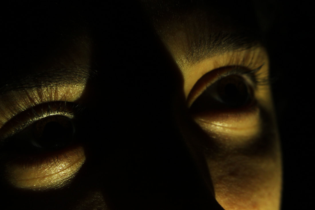
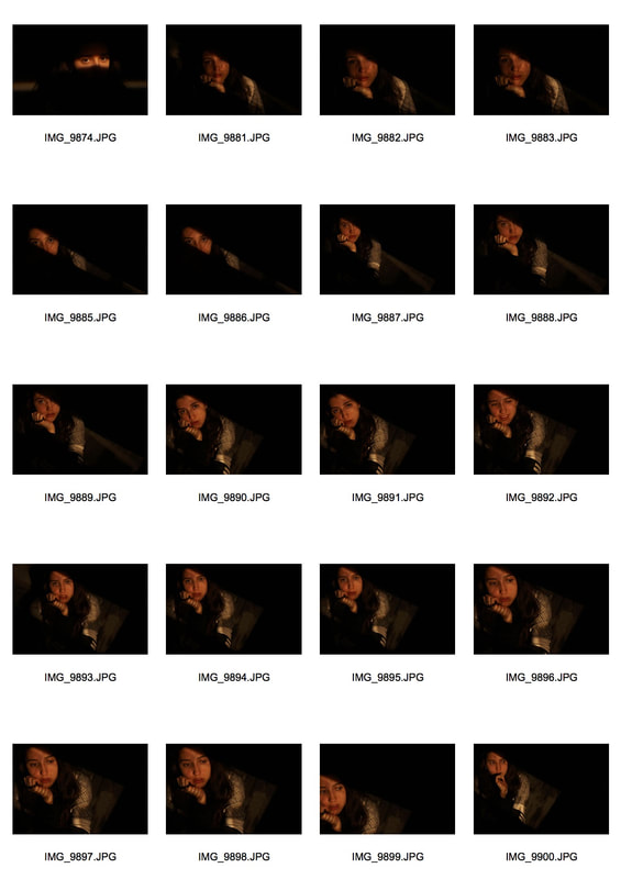
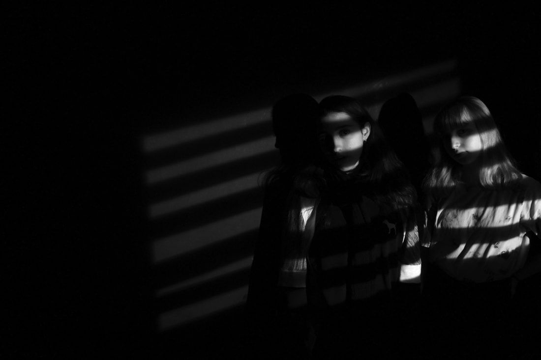
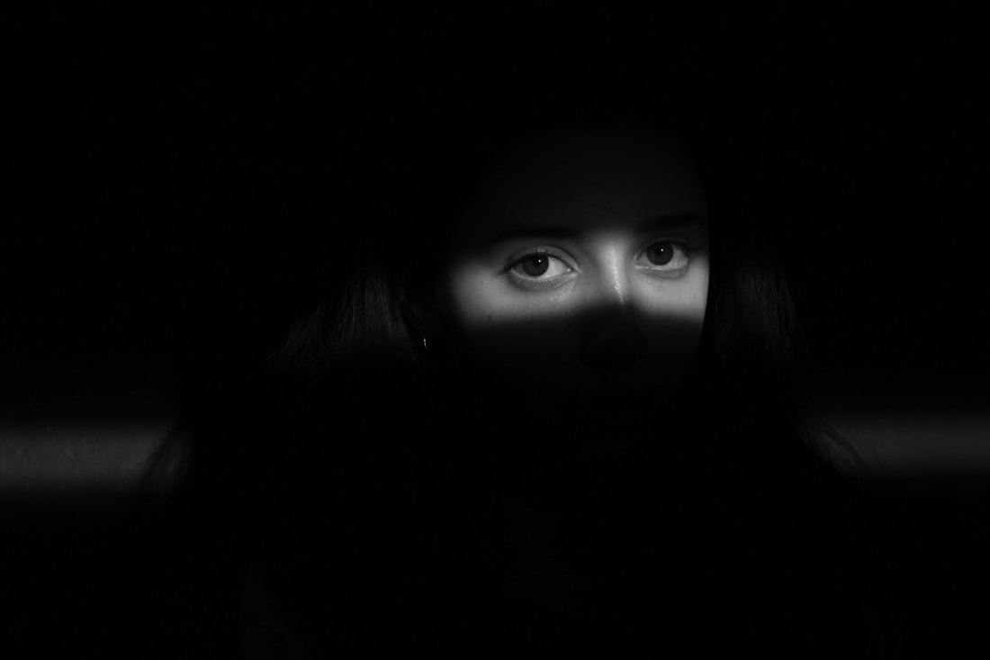
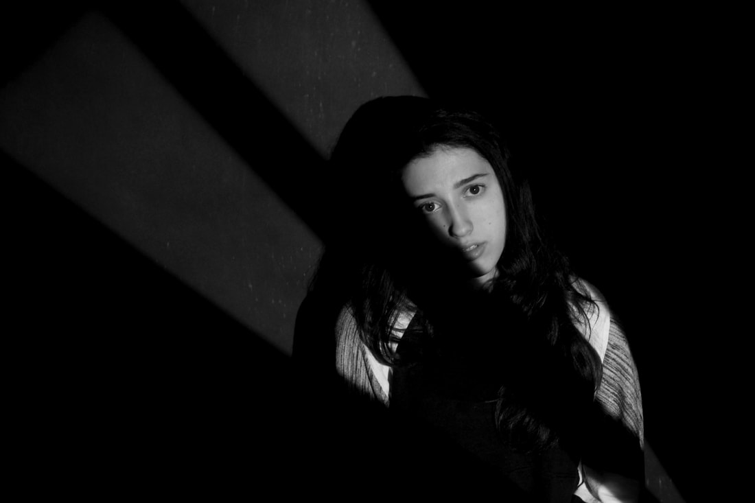
Pinterest Inspiration
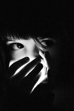
|
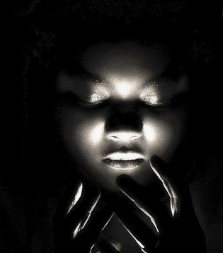
|
These photographers create surreal, mysterious images. They do this by cupping a light in their hands, this makes the models seem powerful and supernatural. The photographer clearly wants us to focus on the darkness and light / shadows. The photographers have used a dark room most probably in creating their work. This creates a mysterious and ominous atmosphere.
|
|
Inspired by Pinterest I created a series of images using my model Sophia to use the idea of light and shadows on the face to create effect. I think my work can be compared to the Pinterest images very well, I have used the same compositions and I have also used the dark room. I think the overall photographs turned out very well but I think the darkness of the images doesn't appeal to me so I am considering the idea of portraiture with my light and/or colour.
Development
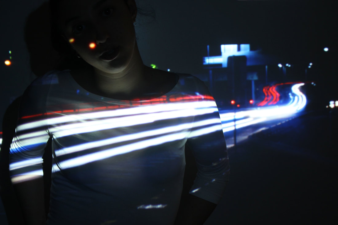
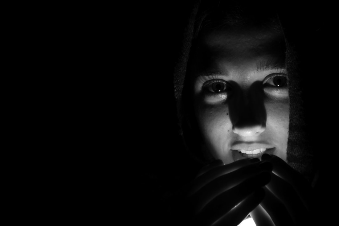
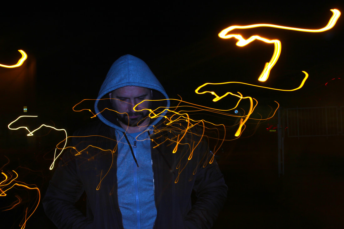
I have decided to return back to my previous ideas on light photography but involve more portraiture. I think the idea of taking a still image of a person whilst the lights move is very appealing to me after I had experimented with many different 'dark' ideas e.g. the shadow photography/ film noir. I think the light photography would be great for the 'Structure' themes it explores the structure of light / movement of light whilst also looking at the structure of a person. The use of force flash enables me to capture a person stationary whilst the lights move around.
I have decided to go back to an earlier development because the use of artificial light in the studio was not working for me. I will try to use light already seen in the environment using force flash, so that I can capture the model clearly whilst still capturing the movement of different lights. I did this when I was looking at different strands and particularly enjoyed taking the photographs, so I will now experiment more with this sort of idea.
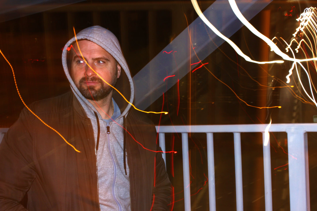
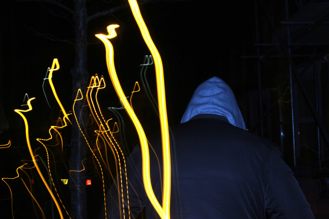
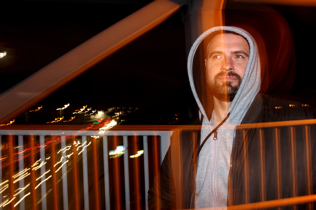
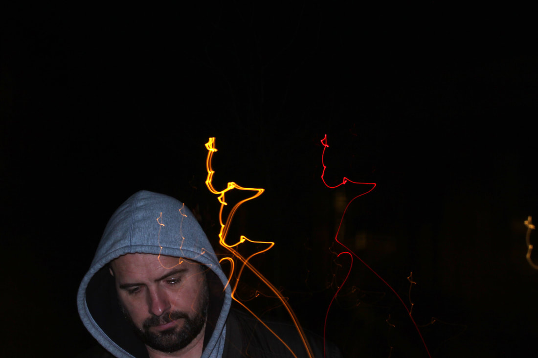
Movement outside and at home
Final images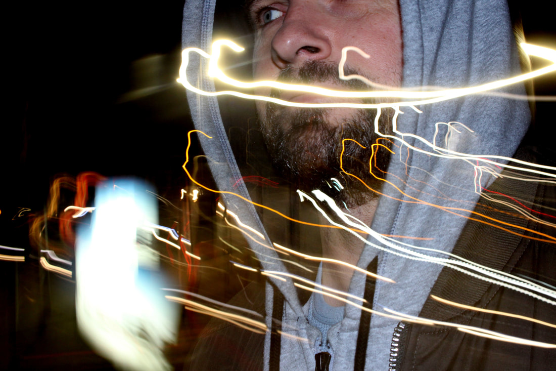
|
|
The images of movement taken outside turned out much better than the photos taken at home in warm light. The movement of the cars and lights in the city is clearly represented throughout all of the photos outside with the rapid movement of lights across the photos. I managed the exposure very well. My ISO was very low at 100 and my shutter speed was very slow to be able to capture the movement of the light. I prioritised my shutter speed however to capture the movement of the light as this is what I was mainly looking at, as well as colour. I did not use a tripod for my images so I was able to follow the light in its direction easily. The images express my intentions which were the idea that we are so still whilst so much movement goes on around us. The idea also touches the idea about time and how quickly it goes by, this is clearly represented through the lights moving rapidly across the screen.
The subject I chose to photograph did not turn out as well as expected. The colours of the image did not appeal to me and therefore I will look for a different location at the same time of day (as it was easy to capture light movement in the dark). I think I will begin to add more colour to my images to create an impact on the audience. I like the idea of bright colours to really actually light and how it works. The structure of colour, light and human (I think) will work solidly together.
The subject I chose to photograph did not turn out as well as expected. The colours of the image did not appeal to me and therefore I will look for a different location at the same time of day (as it was easy to capture light movement in the dark). I think I will begin to add more colour to my images to create an impact on the audience. I like the idea of bright colours to really actually light and how it works. The structure of colour, light and human (I think) will work solidly together.
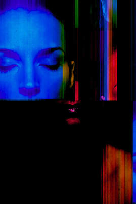
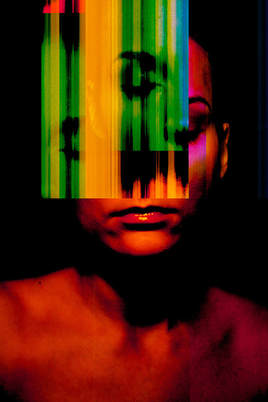
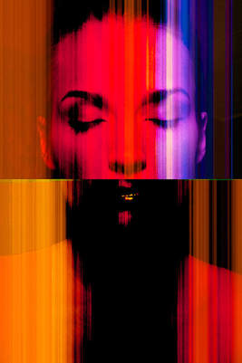
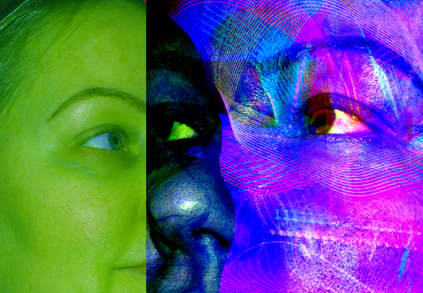
Marta Timmer
|
|
|
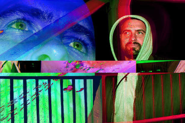
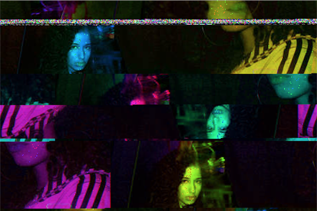
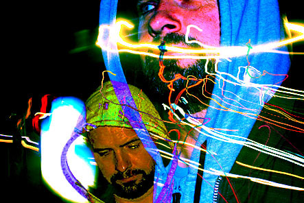
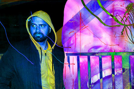
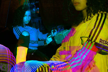
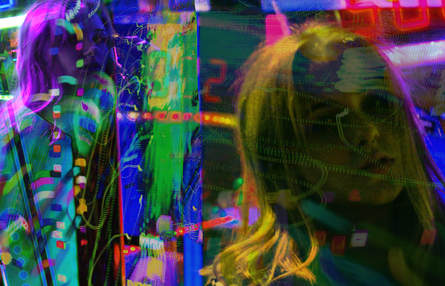
Marta Timmer's photography features the idea of a 'glitch'. The use of the inverted coloured and moved sections of the face make the photograph seem very intriguing due to the distortion. The colours of the images appeal to me very much as I think it really represents the light in the image which is what I am looking for. I think her work relates to my theme on structure of light as it is completely different to a normal image you would see. It subverts the idea of the usual structure of an image which is what I am trying to do with my photographs. In her images, she uses one model throughout her 'glitch' series but I will try use more than one model in my images and merge them together to create a different type of glitch.
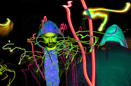
Experimentation using colour and layering
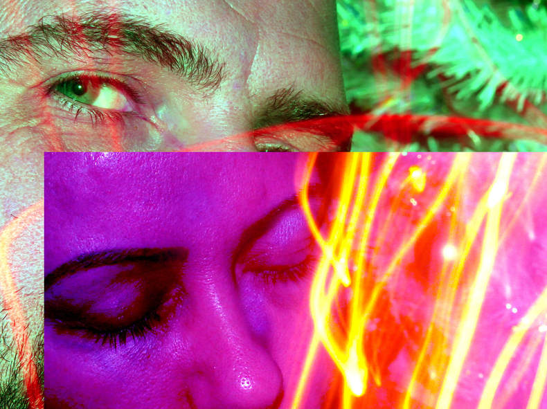
Here I have used two subjects in two separate photographs. I have edited the images using the steps shown below. This works well with my theme as I am now looking at the structure of colour and light as well as of course the human figure. I think the layering of images creates a interesting effect as we can focus on different parts of the face in depth whilst also seeing the light and colour around the figure. I prioritised my shutter speed to capture the movement of the light again whilst keeping my subject still. I think in my next set of images (probably in my final images), I will experiment with different ways of layering the images to make the images look like one, I will continue with the use of hue and saturation to create an intriguing image.
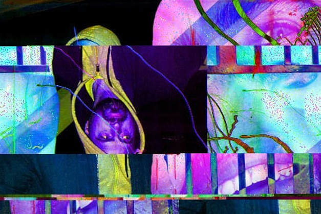
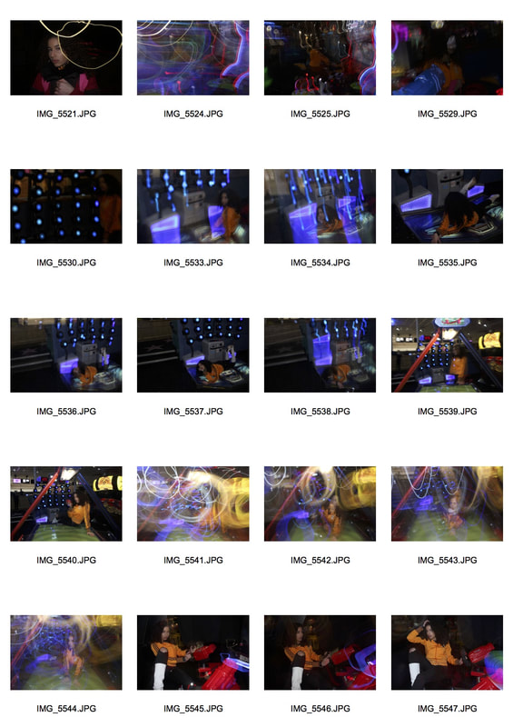
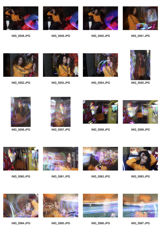
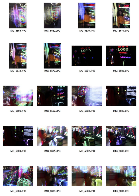
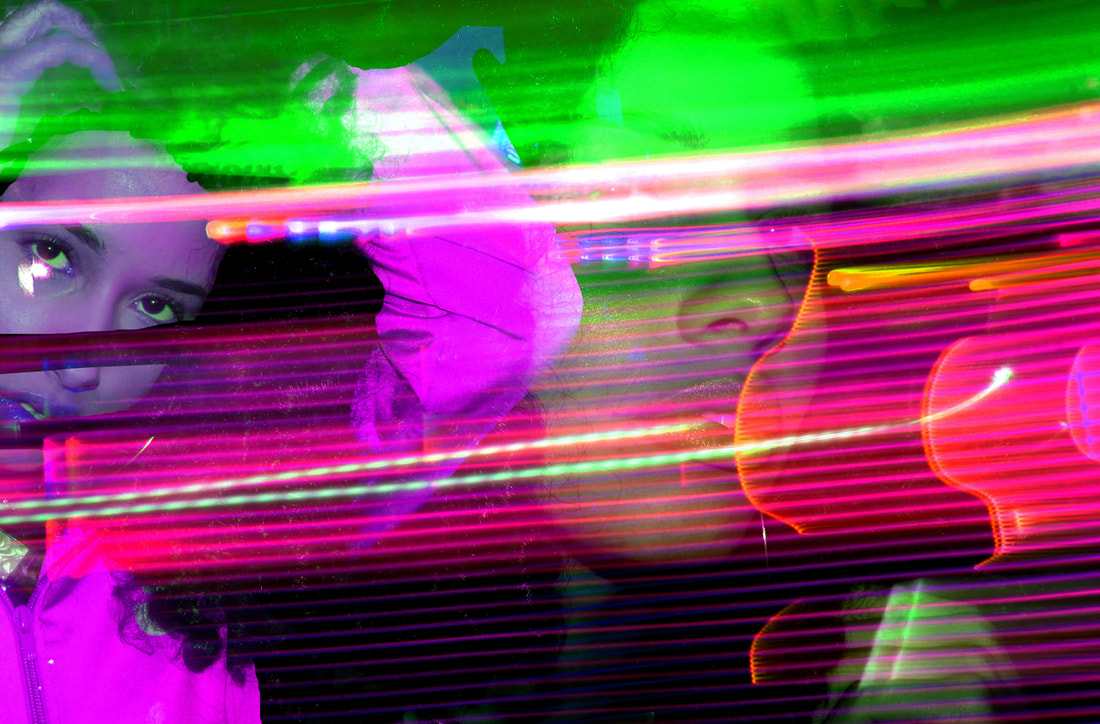
Photographs in the arcade
Contact sheet (arcade)
Due to my previous images not being in my ideal location I decided to experiment with a different, more interesting location - an arcade. The lights and colours being emitted by the arcade games made the images much more interesting and colourful, which was exactly what I needed. I did the same thing where I layered two different images together and I think the overall effect was very interesting. I think in my final piece I will try merging the two images together to make the image seem more "realistic" / interesting.
|
|
|
|
|
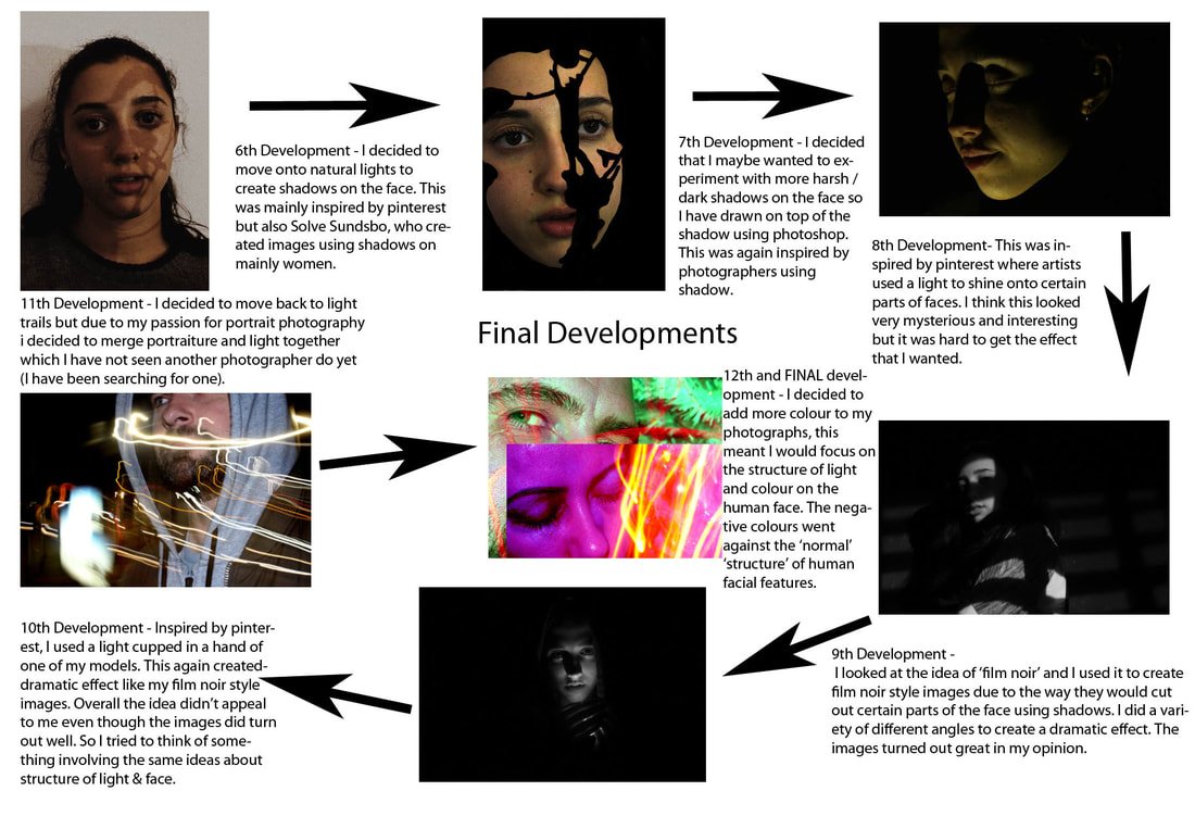
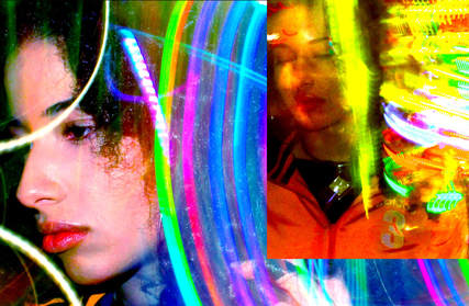
Final Piece
Merging two images together
Final images
|
|
My final images turned out like this. I have used four subjects, including myself in my images. The image of myself was taken using a timer and tripod unlike the others, and was edited the same way as the rest of the images. The image of myself however layers 3 images not two as I was not able to hold the exposure down myself, I had to take a picture of my surroundings and layer that on top of the image. The other 3 subjects turned out very well, the second two images took a lot of time to precisely get the correct angle in order to place the images on top + merge. I managed the exposure very well on the other three subjects. My ISO was at a very low setting , but I prioritised my shutter speed in order to capture the movement of light, I did not use a tripod for the images of everyone except myself.
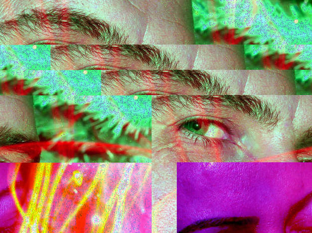
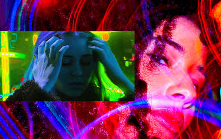
Glitch using audacity
I decided to add more to my final piece before printing and mounting my images. My images that I edited already had a glitch effect to them but I experimented a bit using audacity to add actual technical glitches to my images and they turned out amazingly and exactly how I wanted them to turn out. The glitch added that extra impact onto my image, ruining the entire structure of the image but yet again making the irregular image still very bright, colourful and vibrant without the use of a simple, straightforward image. I think this helped me a lot with the idea of glitches and I will be working with glitches more often with my work now thanks to this technique that I discovered.
Final Glitch Images