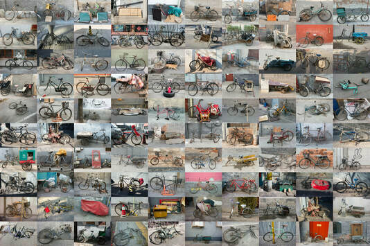
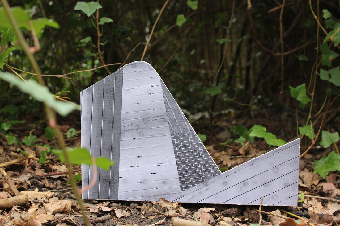
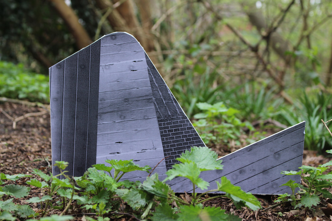
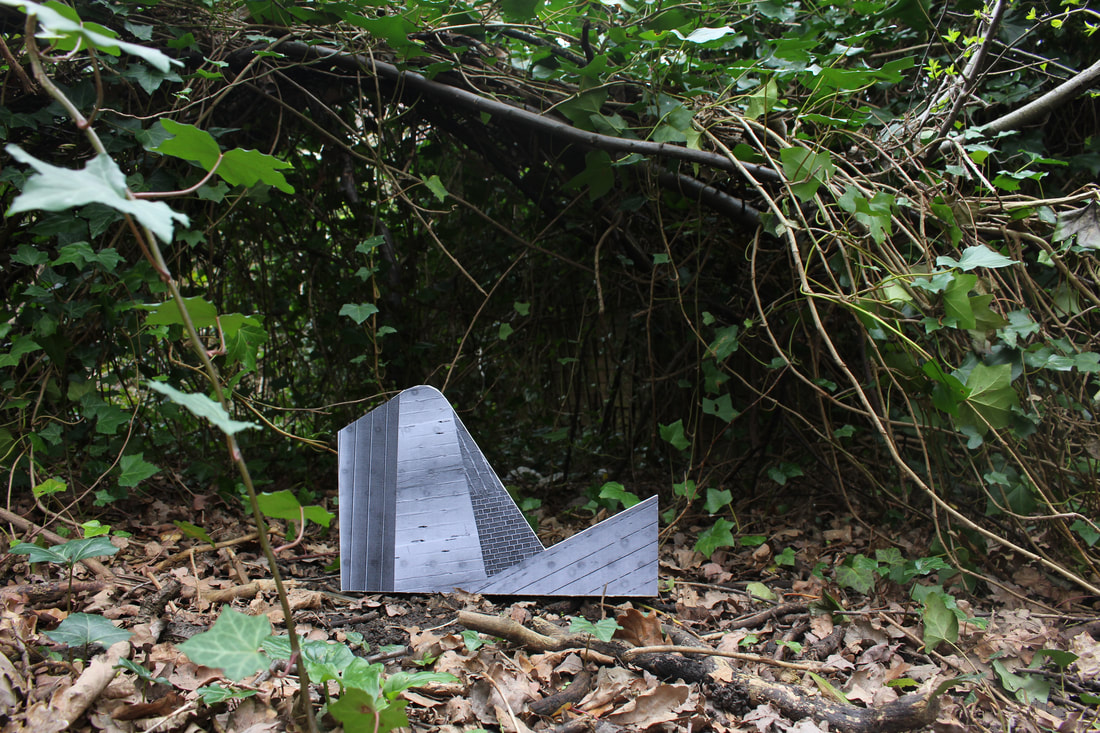
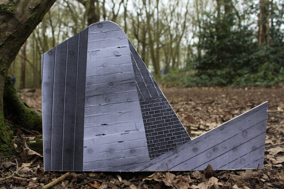
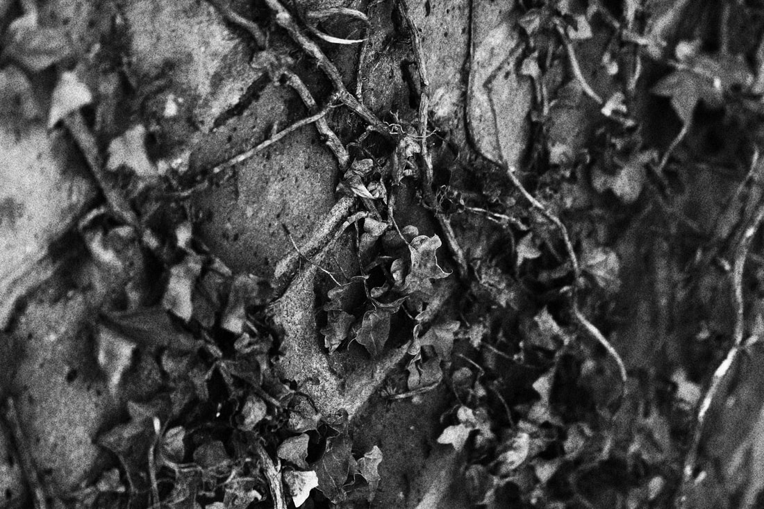
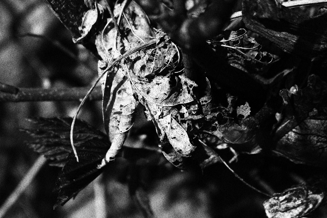
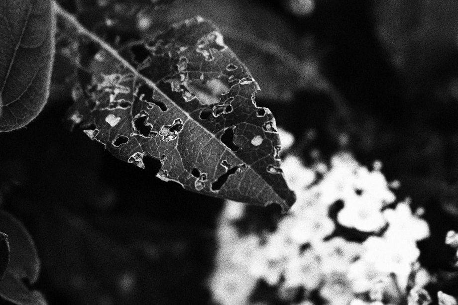
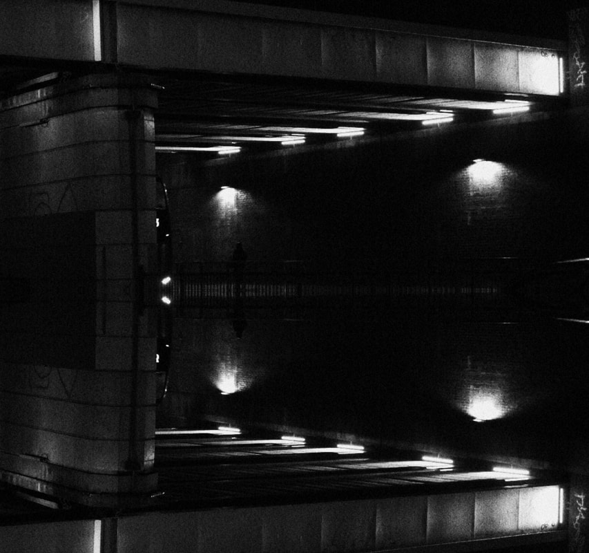
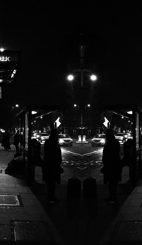
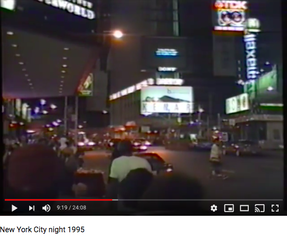
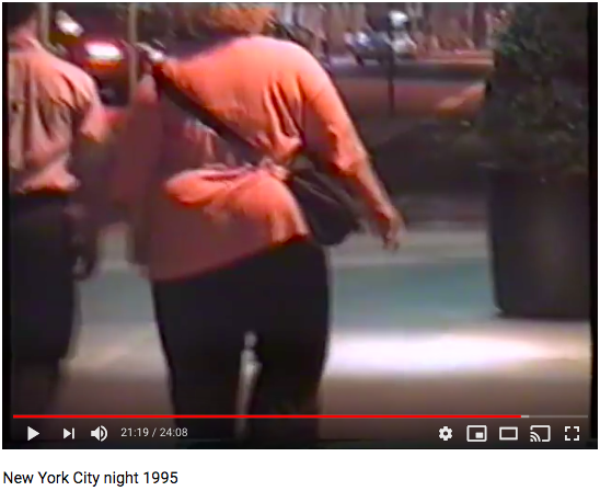
VARIATIONS AND SIMILARITIES

|
|
|


|
|
|
|
|
|
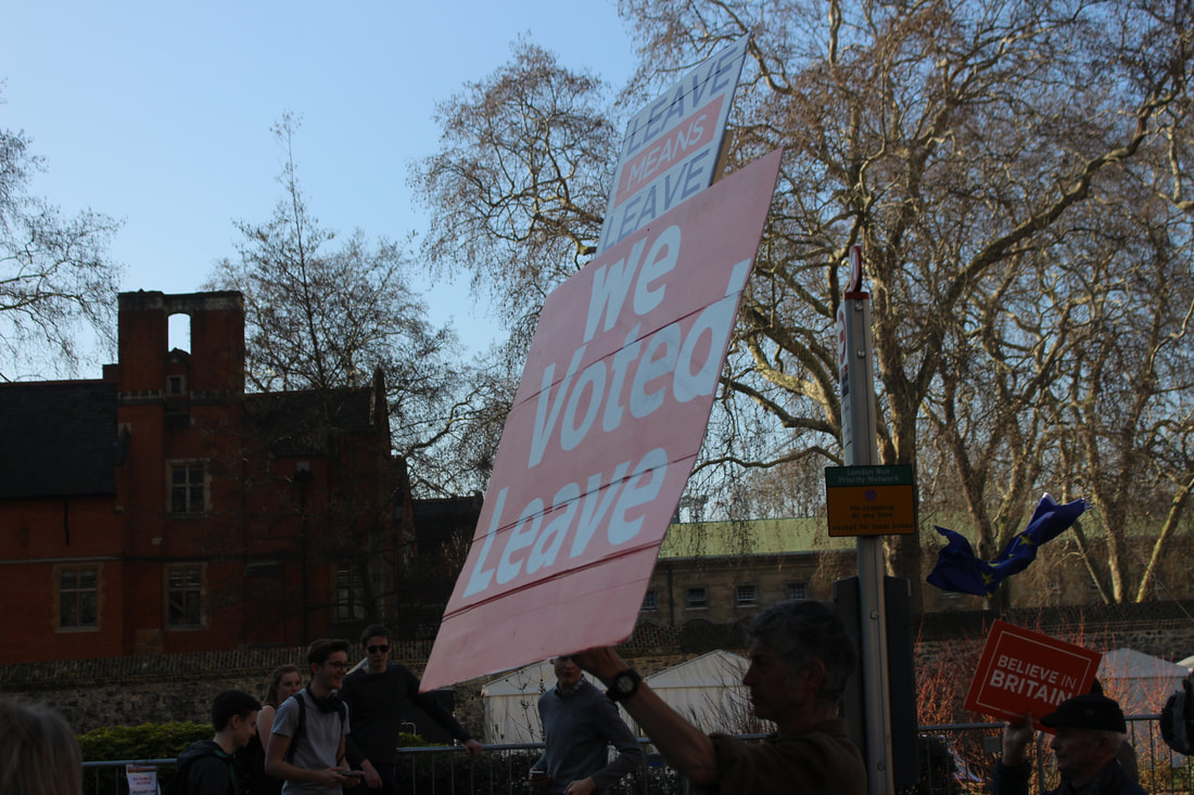
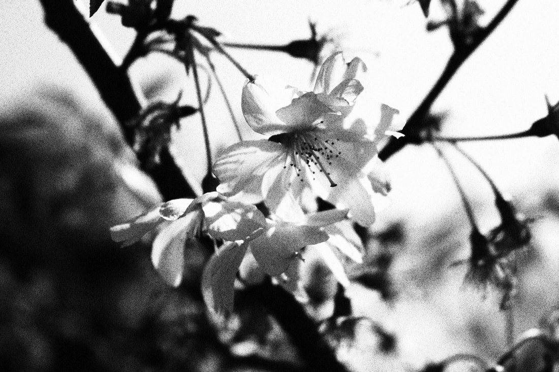
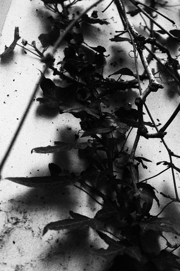
Remain


|
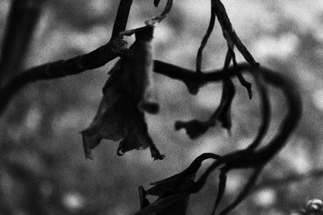
Leave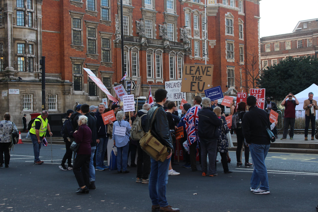


|
|

|

|
|
|


|


|

|
|

|

|

|
|

|

|
|

|
|

|

|

|


|

|

|
|
|

|

|

|

|
|


|


|
|
|
|
|
|

|

|

|

|

|
|
|


|


|

|
|

|

|
|
|
|

|
|
|
|

|

|

|
|
|

|
|
|
|
|
|
|
|
|

|
|
|
|
|
|
|