Exhibition Visit - Tate Modern
Tate Modern: Shape Of Light - 100 Years of photography and abstract art
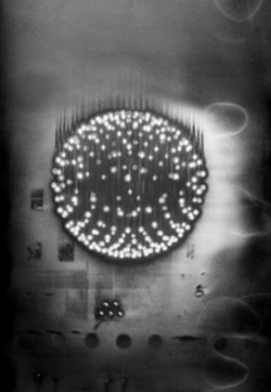
"Key photographs are brought together from pioneers including Man Ray and Alfred Stieglitz, major contemporary artists such as Barbara Kasten and Thomas Ruff, right up to exciting new work by Antony Cairns, Maya Rochat and Daisuke Yokota, made especially for the exhibition." - Tate.
The Tate modern for the first time, compares the differences and similarities between abstract art and photography - bringing the two forms of art together as one.
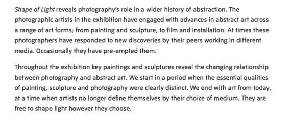
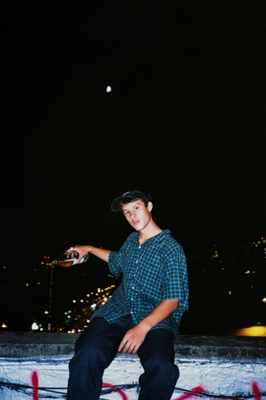
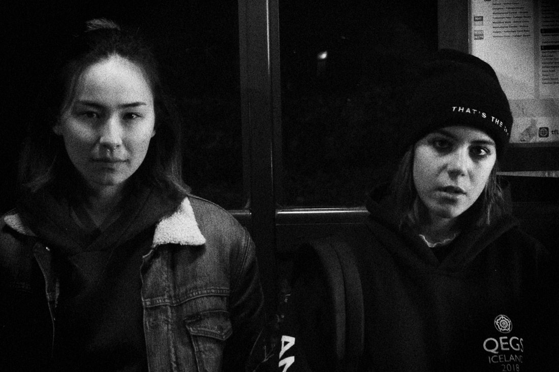
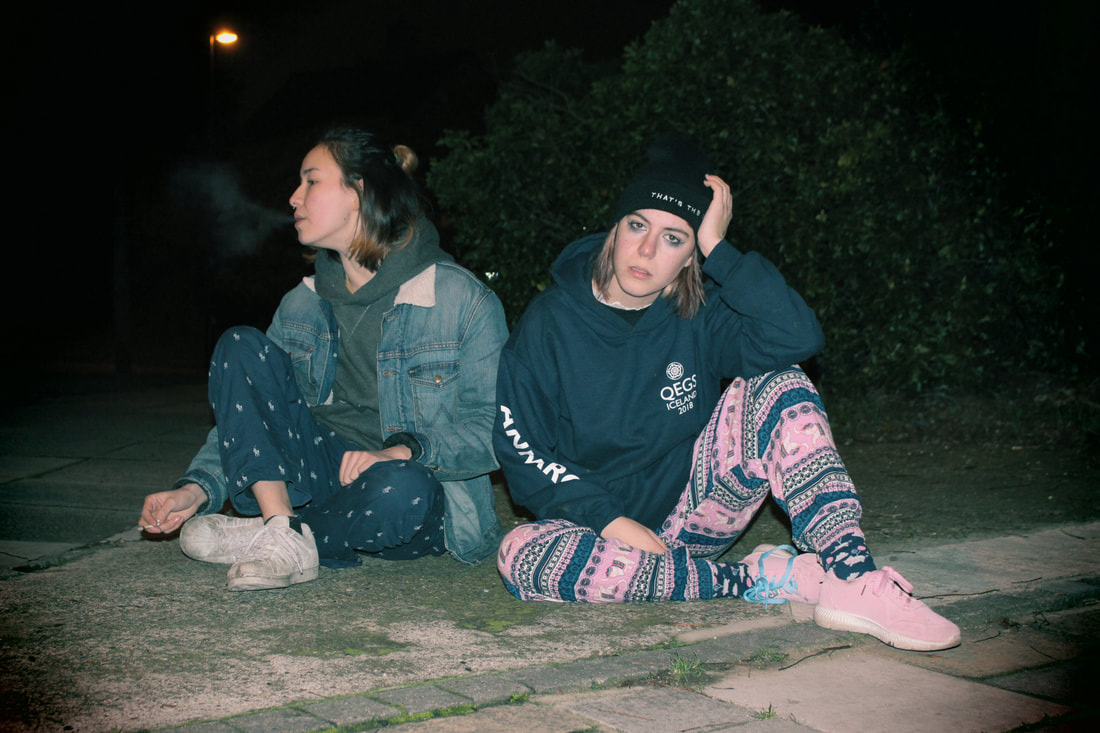
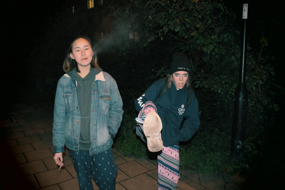
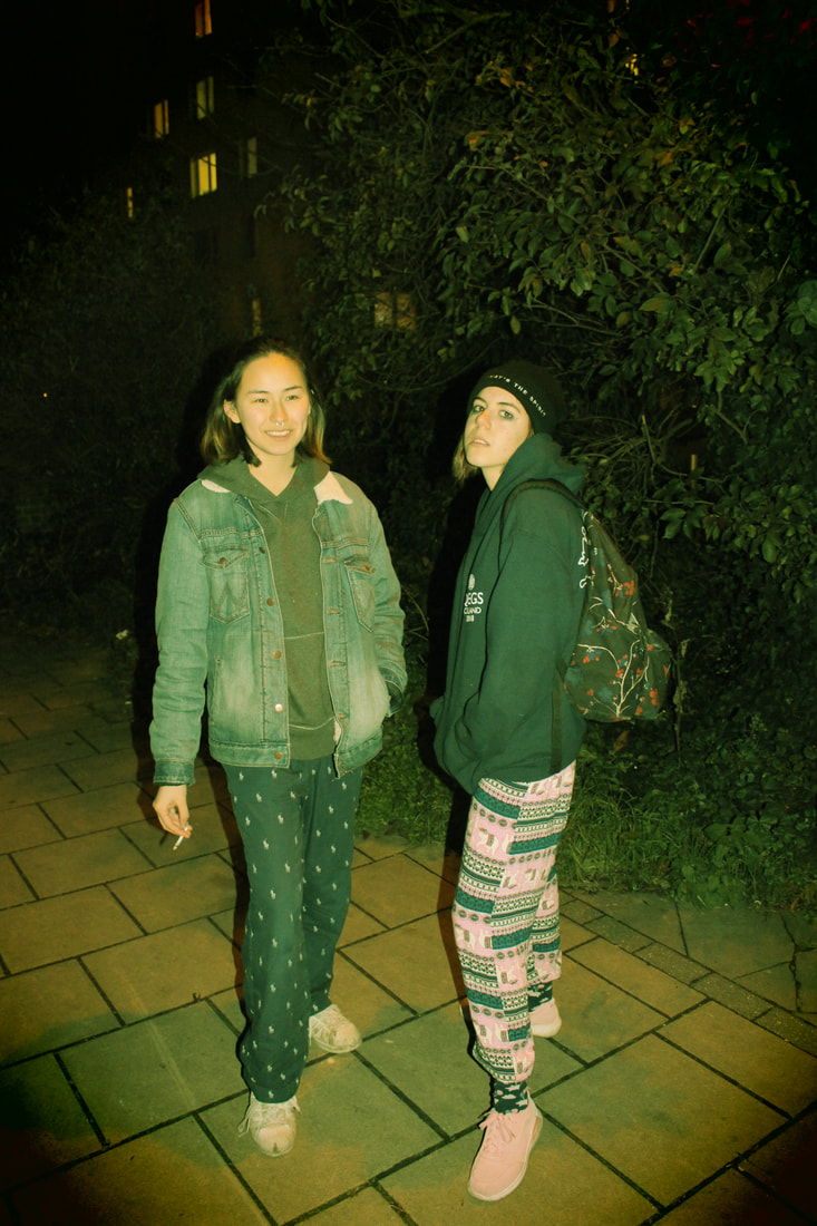
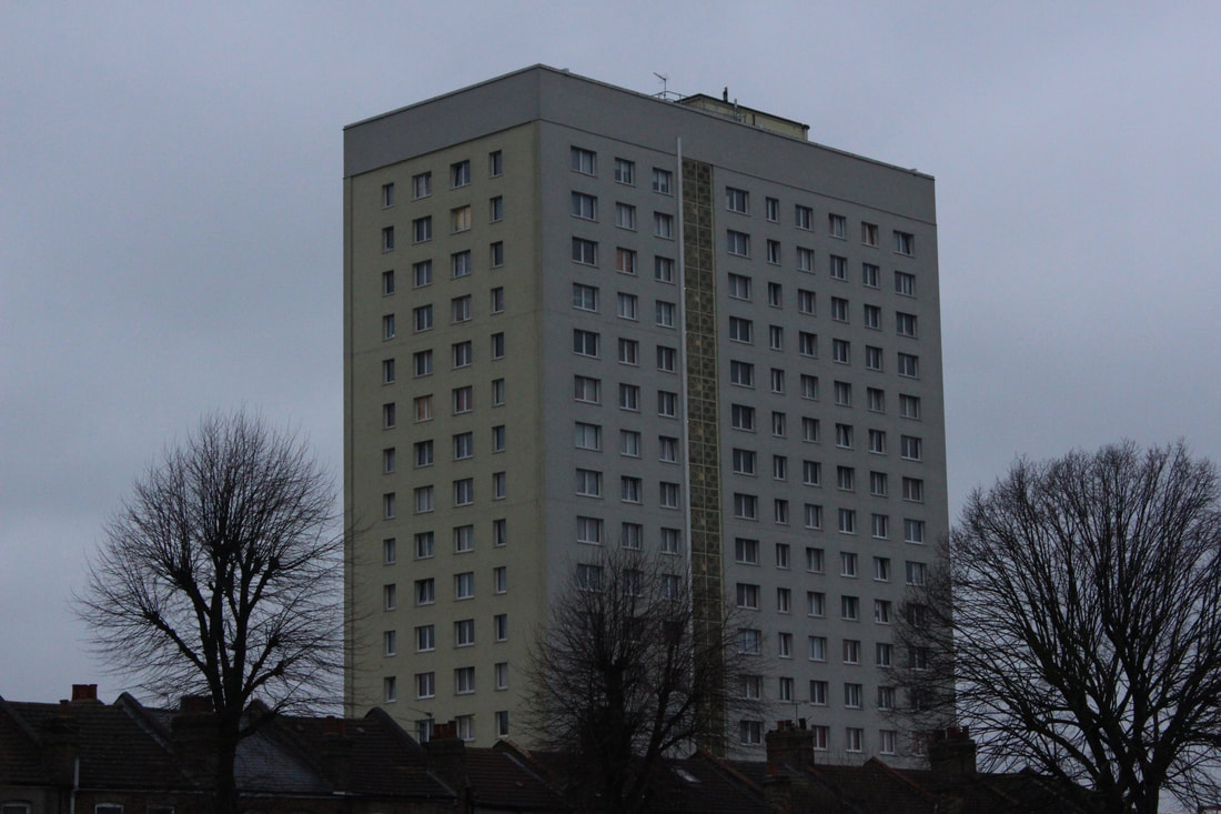
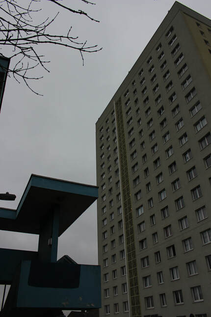
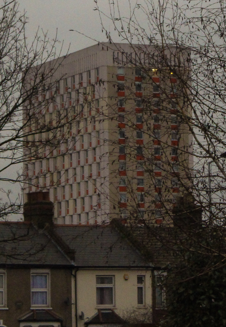
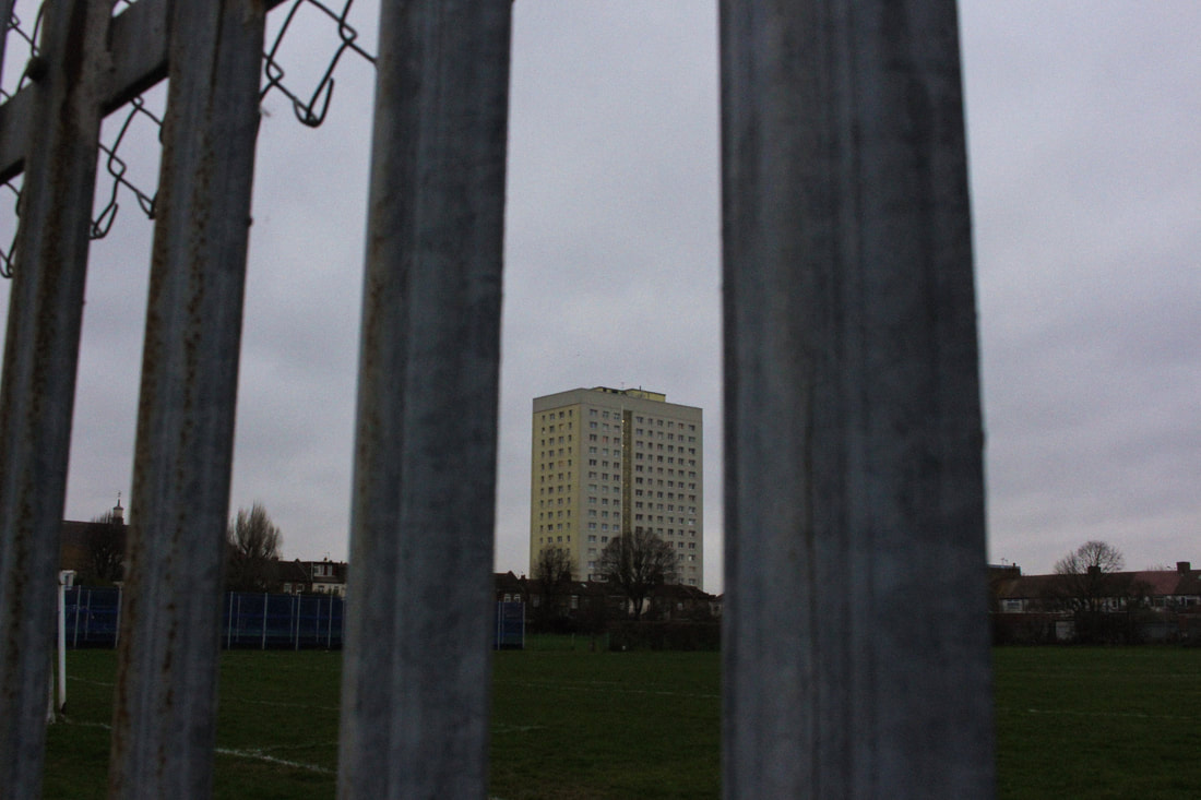
Museum of London: London Nights
London Nights shows the city at night through portraiture, documentary, conceptual photography and film. A display of over 200 works by 60 photographers, we see a variation of works from the late 19th century to today. Photographers featured include; Alvin Langdon Coburn, Bill Brandt, Rut Blees Luxembourg Tish Murtha and Nick Turpin.
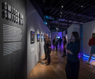
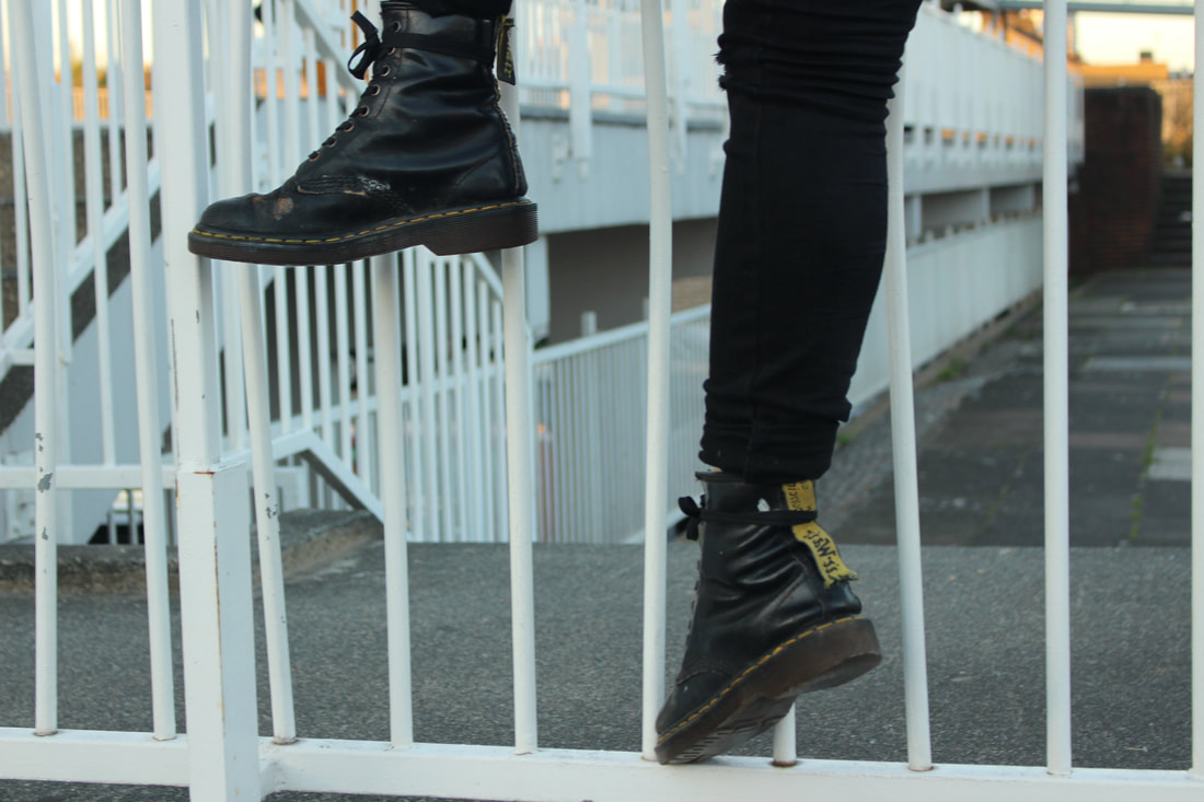
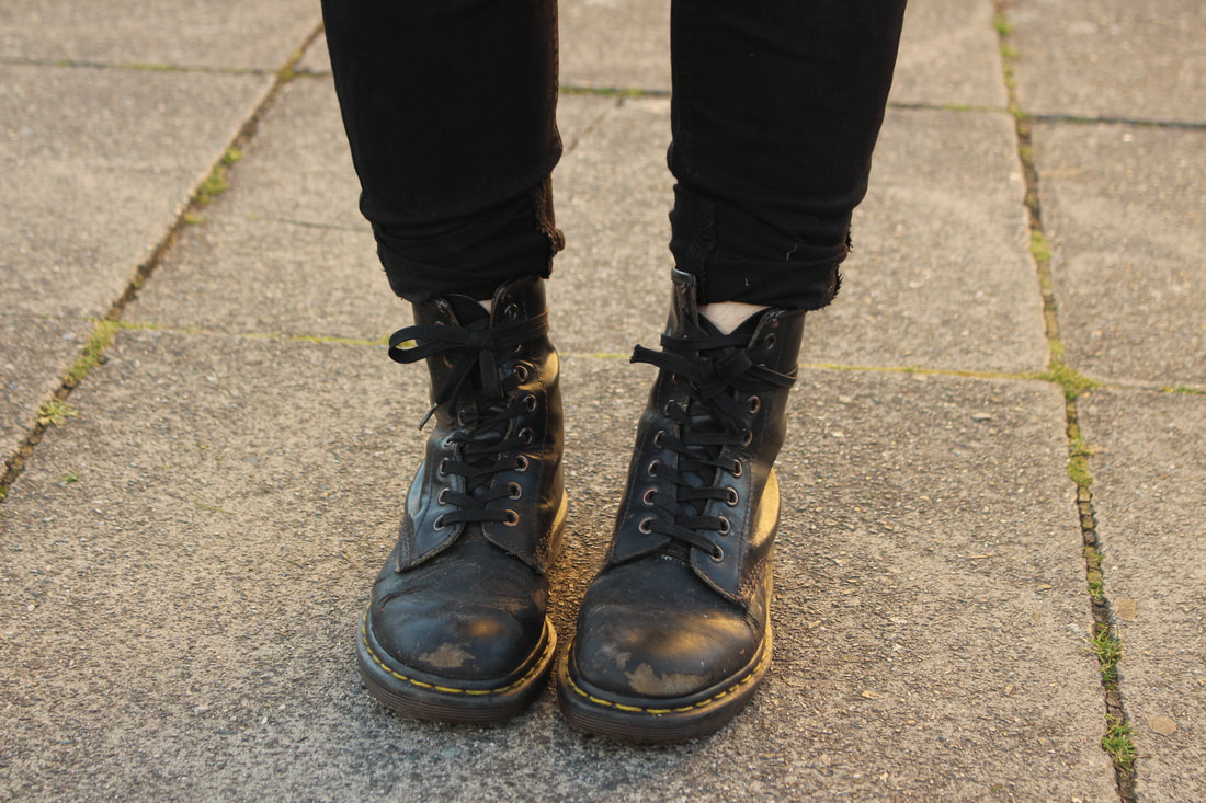
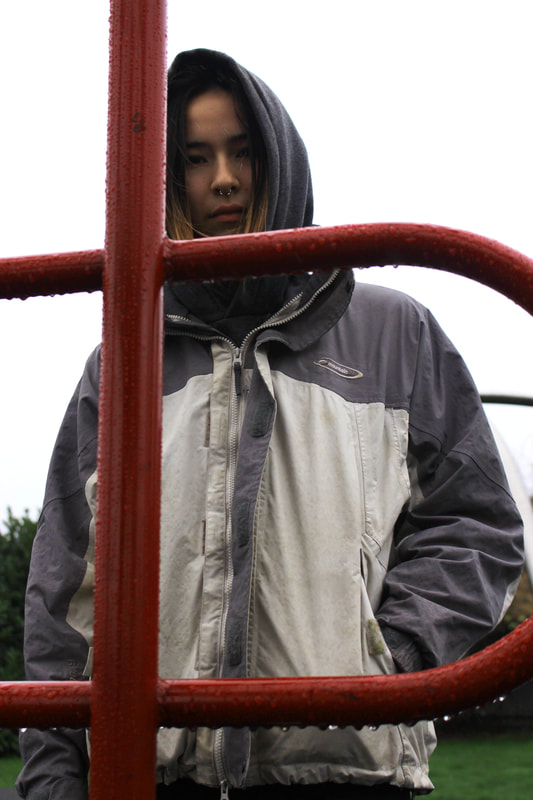
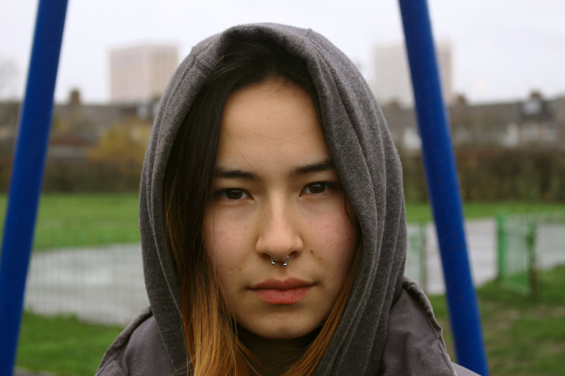
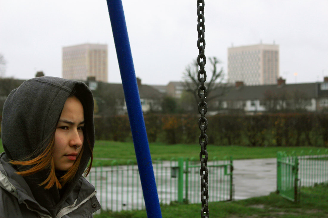
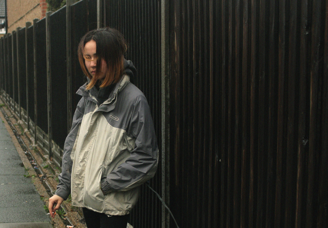
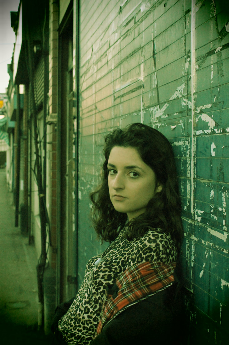
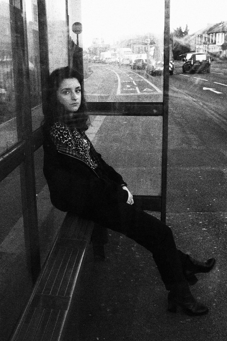
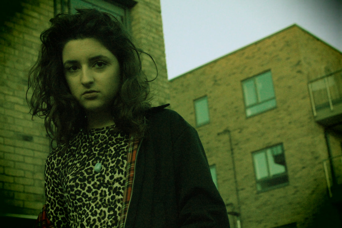
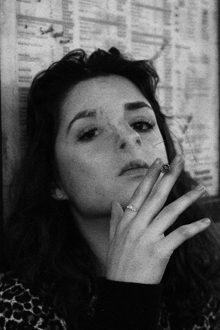
The exhibition really gave me an insight into the night life in London which could link vaguely to the theme of youth culture through photographers like; Vicky Grout's London grime scene, Sarah Ginn's fabric nightclub and Doughie Wallace's variety of photographs. Two of which are female photographers photographing mostly the youth at night.
The exhibition really gave me an insight into the night life in London which could link vaguely to the theme of youth culture through photographers like; Vicky Grout's London grime scene, Sarah Ginn's fabric nightclub and Doughie Wallace's variety of photographs. Two of which are female photographers photographing mostly the youth at night.
Vicky Grout
Vicky Grout is a 19 year old photographer who looks at the grime scene. It was almost by accident when she started photographing stars of the grime scene after taking up a particular interest to the lifestyle. Through her photographs she has gained many friendships as well as well known images useful for the artists themselves.
“I didn’t even think to document it, per say, I would just have my camera on me and just take pictures for myself, put them out there and then the artist would respond to them and be like ‘These are sick’, and ‘I’m like are they? Oh okay’” – Vicky Grout |
Sarah Ginn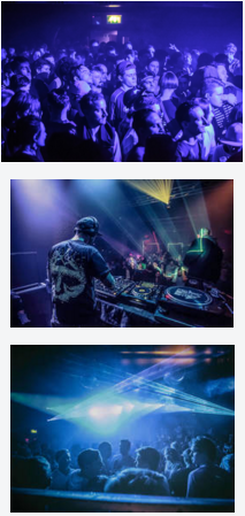
Sarah Ginn is a photographer who specialises in documenting electronic music. She started photography at 17 and found a passion for it almost immediately, she wanted people to know what the rave is like, she wanted them to go there after they see her pictures.
“I got into this as I loved music and wanted to make it look beautiful and I have the upmost [sic] respect for those that create it,” Ginn writes in a statement she posted to social media, citing her love of music and records going back to when she was 13 years old. |
Dougie Wallace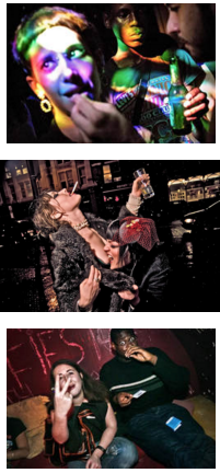
Dougie Wallace's series about the Shoreditch night life took place over 15 years, documenting thoroughly the life of different people at night. The simplicity of photographing everyday life is really captivating - clearly presenting East London's most colourful area.
"I’m not scared of breaking the fourth wall either. If they are looking at you in a photograph most photographers will think “Oh that’s not a good image”. People like to be involved and in the picture, you can see what they are thinking, see them talking. " |
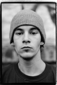
The Portrait
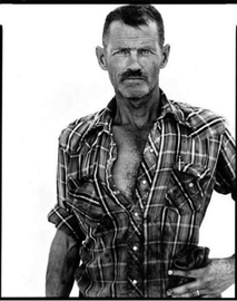
Richard Avedon - In The American Midwest
|
Richard Avedon's work on the American Midwest, was photographed against a white background which he carried around to photograph to create a somewhat studio effect.
By removing the background, he also removed all contextual evidence of where and what the person was or what they were doing at that period of time, all you can interpret from the person is from themselves for example what they're wearing and how they position themselves in general. It not only urges the audience to question what is going on, but have all the attention placed onto the one person allowing them to be the star of the image without anything disrupting their appearance. |
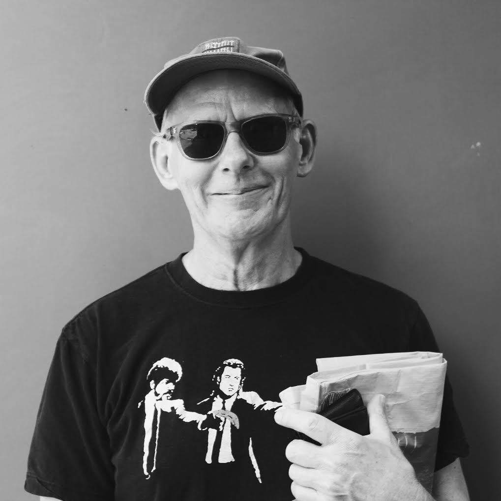
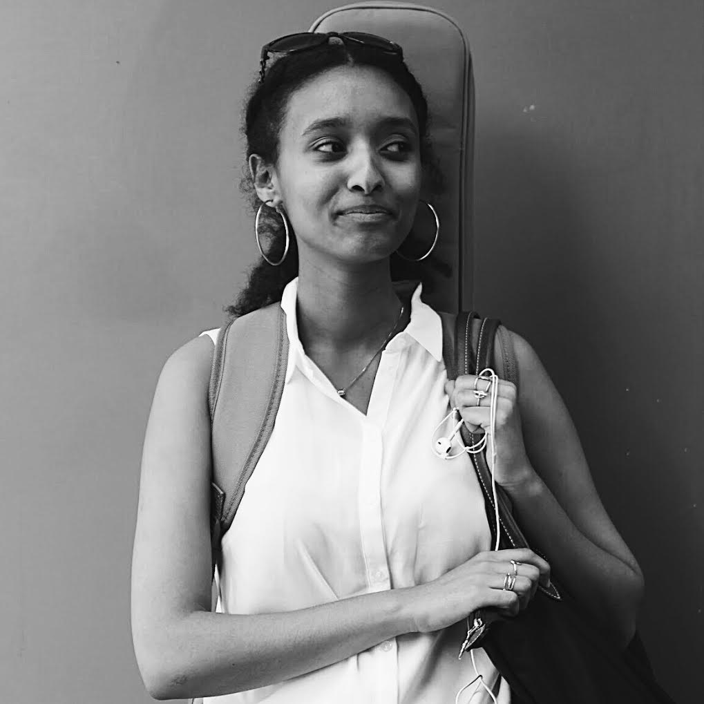
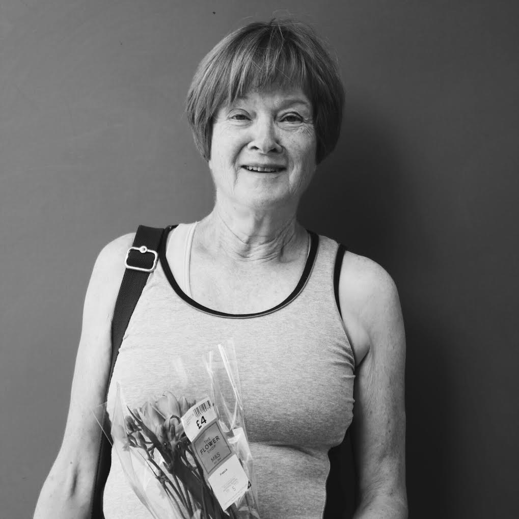
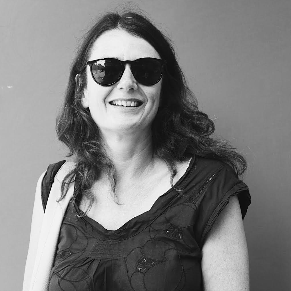
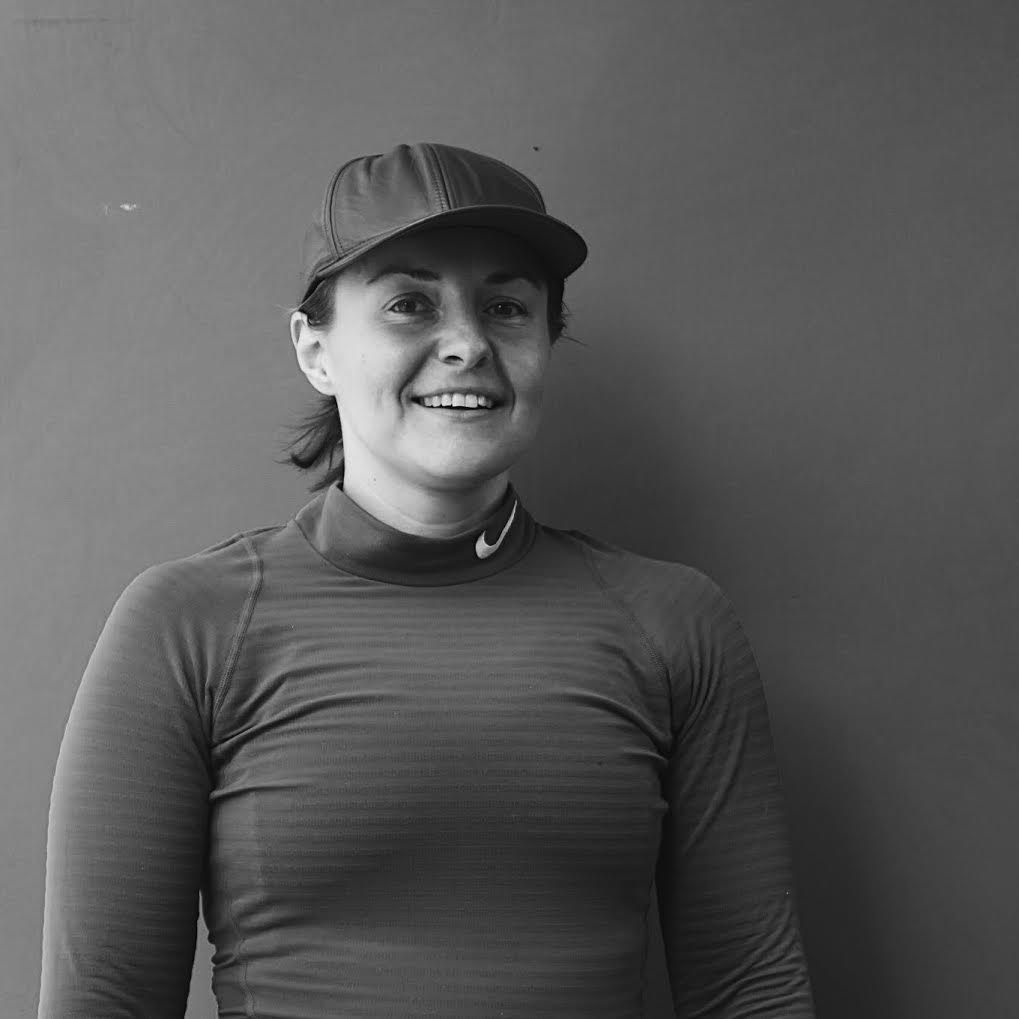
My Response
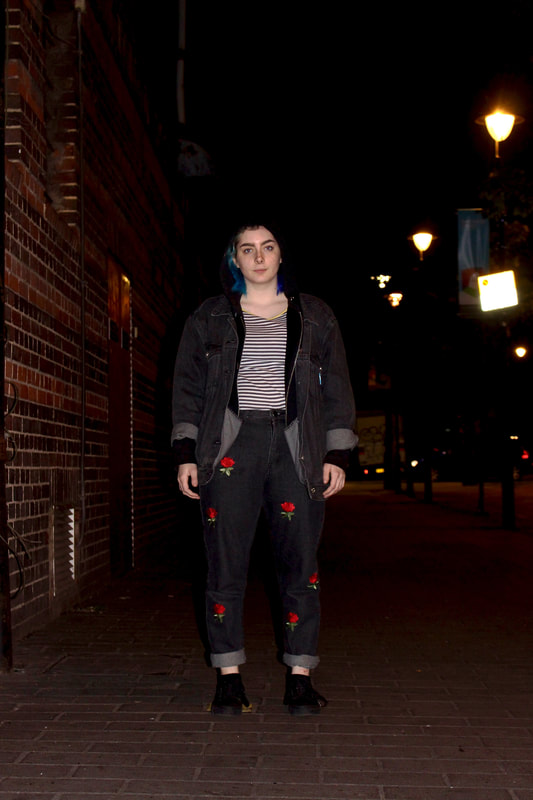
I responded to Richard Avedon's work by doing the same type of photography but in Muswell Hill Broadway, stopping random people on the street to capture their different attributes. I placed the subjects in front of a plain background to allow no contextual evidence to be shown, just simply the subject themselves and how they carry themselves. I think this was a very interesting thing to do, as you can really tell a lot about someones personality and image just by taking a photo of them.
|
|
|
|
|
|
|
|
|
|
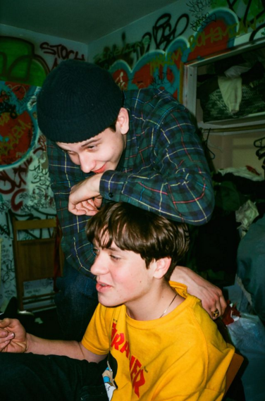
Youth Culture
Pinterest Board
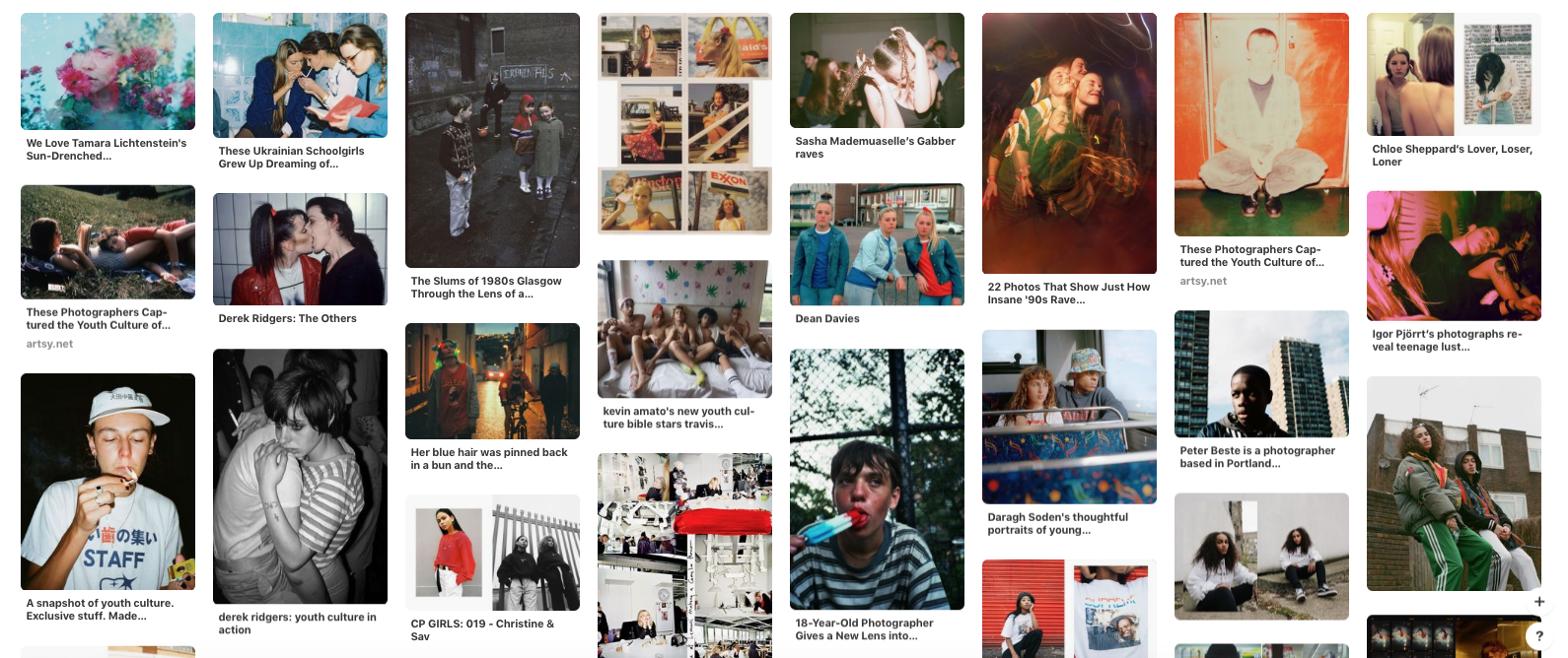
I want to explore the presentation of youth through my photography, this being through location and portrait shots in different areas. I want to look at fashion and lifestyles of different subjects, which ultimately form an identity for the person. I want to create several different shoots that explore different aspects of youth lifestyles that enable viewers to see what youth get up to. I want to take inspiration from different photographers that I have looked at for my curatorship task as they all explore different aspects of Youth Culture which I find very interesting to capture on camera. I want to firstly look at the fashion/ clothing of different subjects and how they present themselves and lead on from there.
Fashion
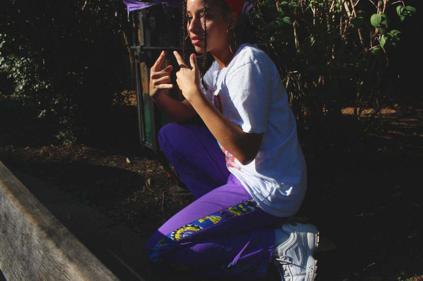
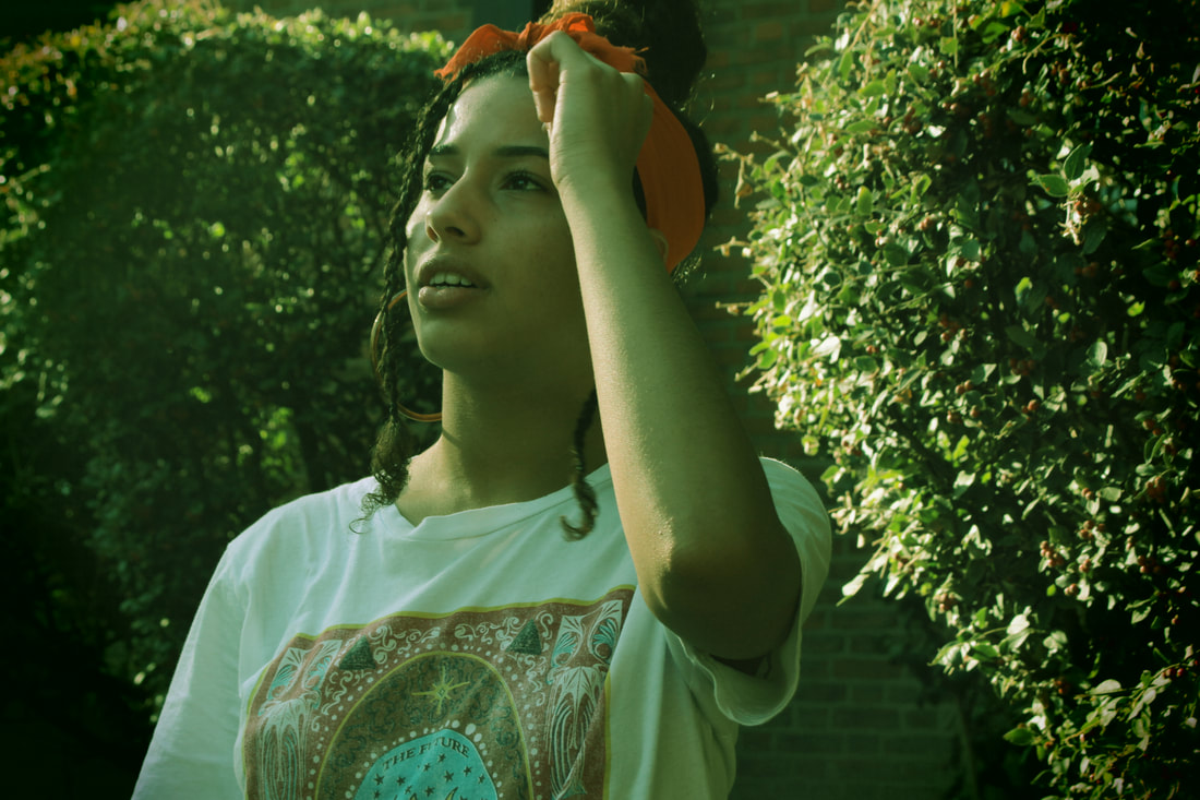
Photographer: Vicky Grout
|
|
|
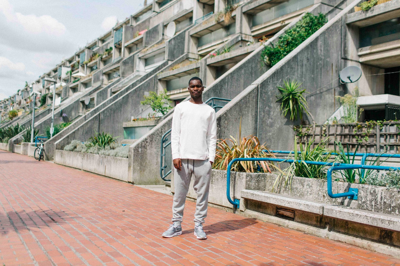
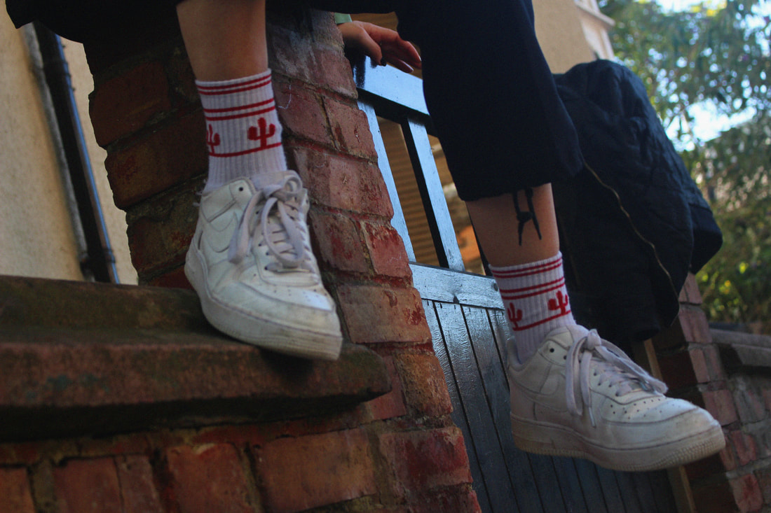
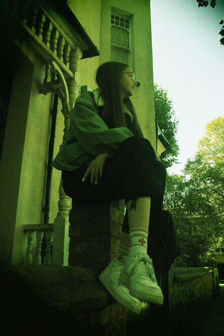
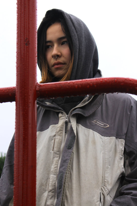
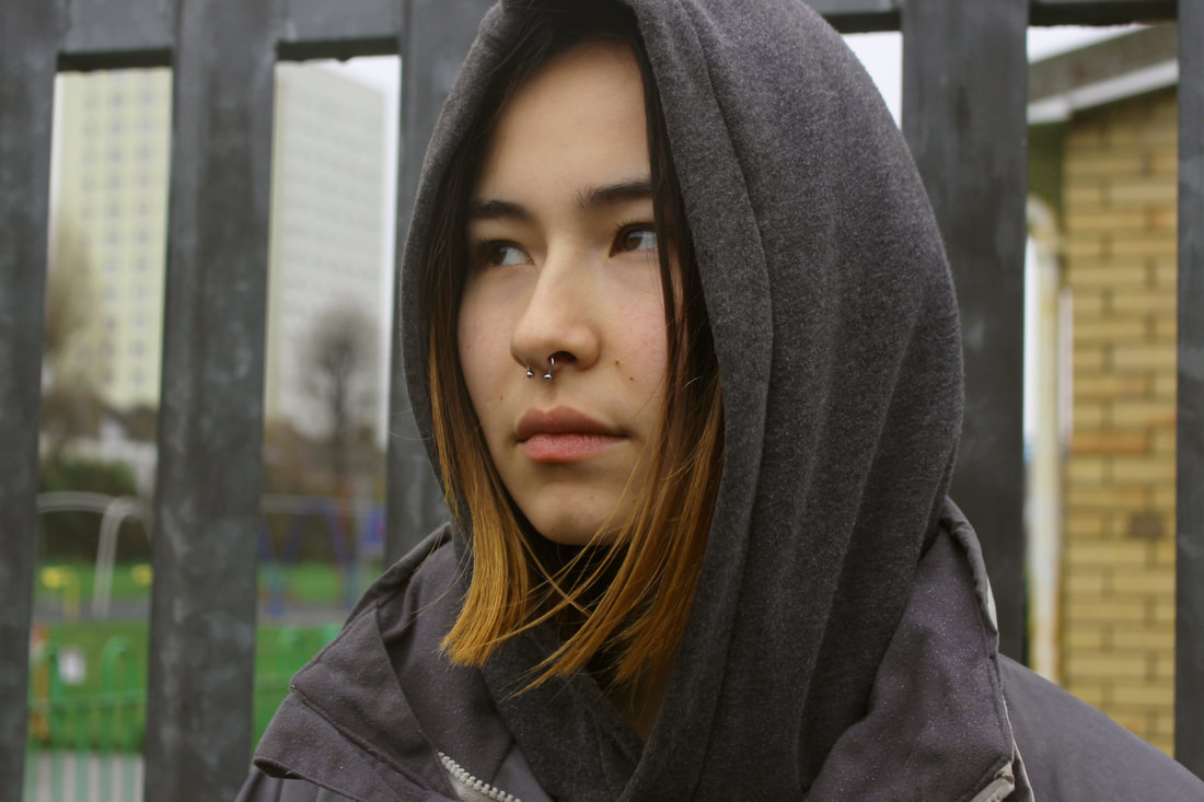
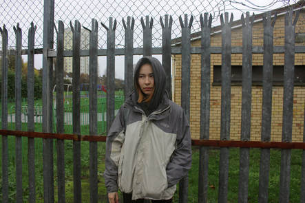
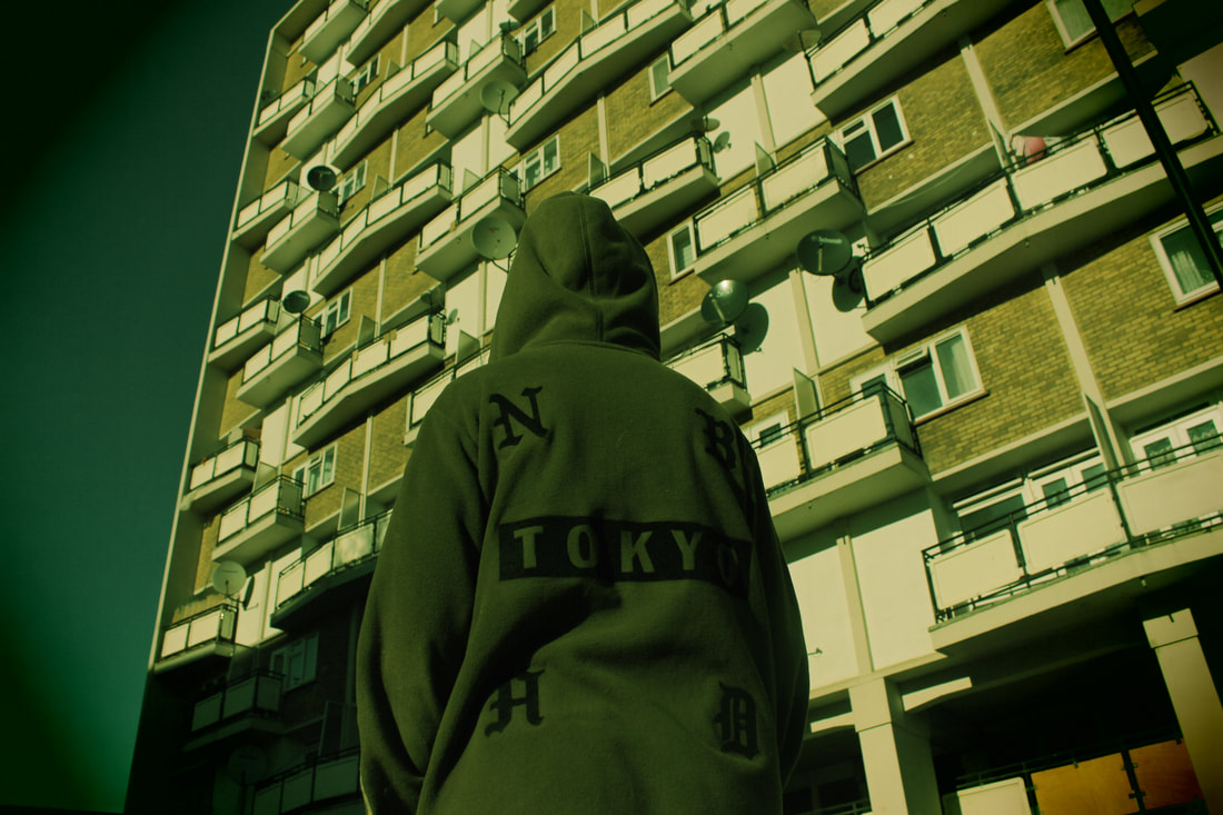
This specific shoot by Vicky Grout, is shot in Alexandra and Ainsworth estate. This estate is located in a quiet part of Hampstead, which I think aided the entire shoot. I like the colours that Vicky Grout has achieved to capture. The pastel tones contrast with the black jackets they are wearing, and the white coloured clothing almost makes them a part of the setting. The clothes match their surroundings as it is what you would typically wear in such a setting. Vicky Grout enjoys photographing young people in typical clothes that you would see most of the youth in which is exactly what I am trying to achieve in my own work.
I would like to re-shoot my 'youth fashion' shoot in this type of environment. My model will make sure to wear an outfit that contrasts to their surroundings so that the photograph is appealing to look at.
I would like to re-shoot my 'youth fashion' shoot in this type of environment. My model will make sure to wear an outfit that contrasts to their surroundings so that the photograph is appealing to look at.
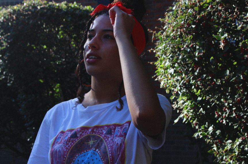
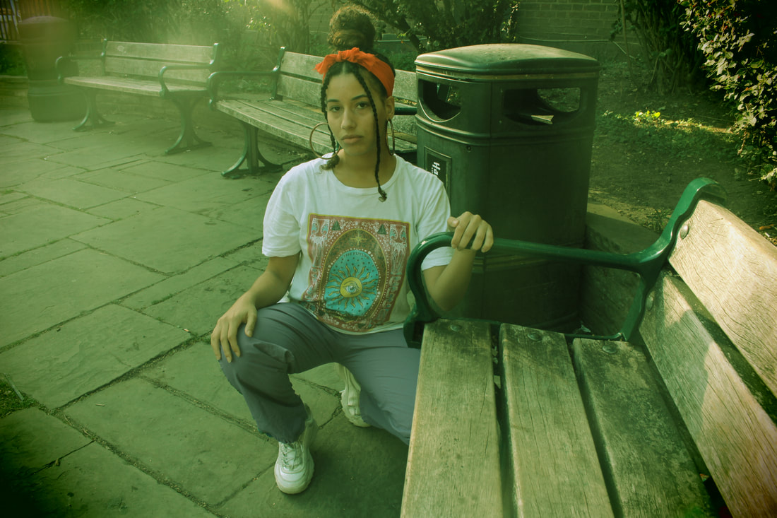
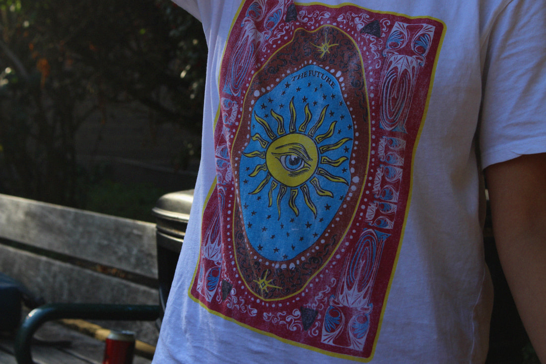
My shoot
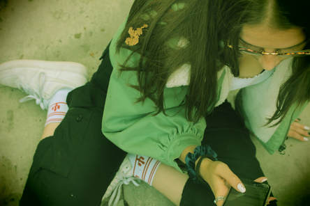
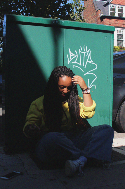
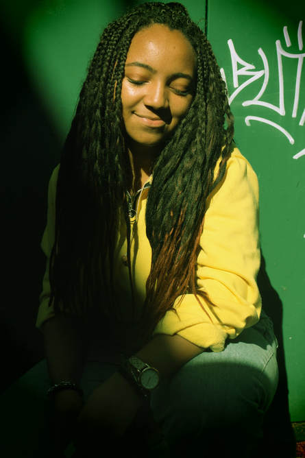
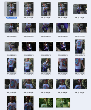
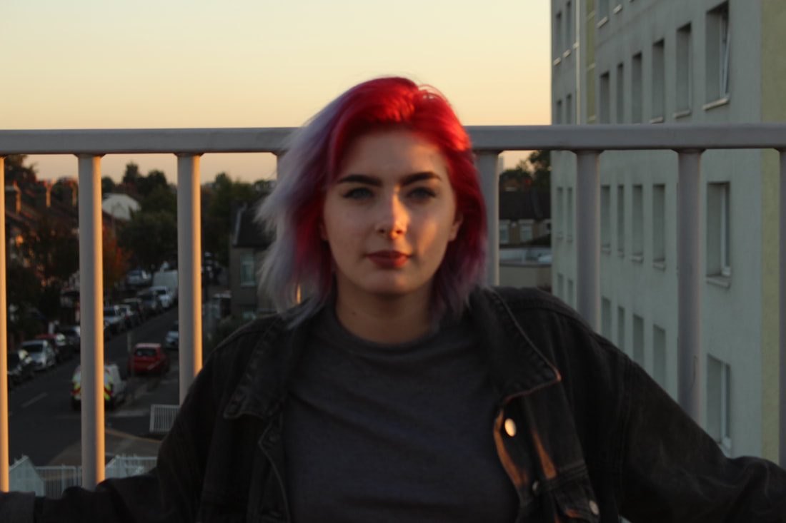
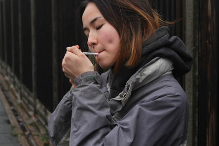
Fashion plays an important part in the youth of today, young people want a sense of individuality and they do this through their actions, hobbies, fashion etc... I took a series of images of each subject and experimented with different angles and viewpoints to create different effects. I wanted the images to seem natural and not composed as I think that reveals more about the person. I also used effects on my camera to add to a few of my favourite images to reveal more tones as well as it having a 'film effect', which I think made the image look aesthetically pleasing, I also created short clips of each person in motion, each clip being around 20 seconds. The videos almost bring the pictures to life and allow the viewer to see the natural movement of the subject and understand more about them.
Georgie
|
|
|
|
|
|
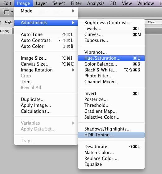
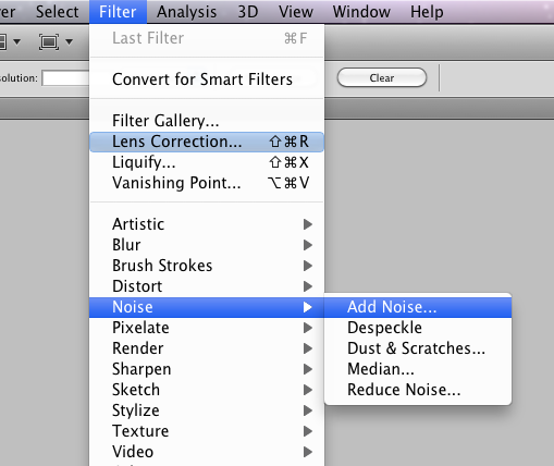
I have added a little bit of saturation to my images to make certain features stand out a bit more, as well as that I have added a bit of noise to make the image have a film effect to it as I feel like it adds a raw feel to the image which is what I want the outcome to look like.
|
|
I photographed the images in Muswell Hill in an area where there is many trees, making the image aesthetically pleasing however, I want to focus more on the location now to match the theme of Youth Culture more rather than the beauty of the location. The in-built filters on the camera turned out really well considering there was no photoshop involved in creating the final images.
Jaime
|
|
|
|
I have taken inspiration from Vicky Grout and other artists that focus on Youth Culture and aspects to do with it. The images of Jaime were taken in the same place where Georgie’s photos were taken which I think I should consider more in my next shoot on another day. I was focussing primarily on the outfits rather than the locations and the people in the photos.
Malak
|
|
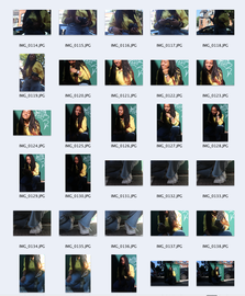
Overall, I think this shoot was successful however I could have taken more photos for my final two subjects. I looked at different viewpoints to shoot from to achieve different effects and the majority of my photos are in focus. Most of the lighting in my photos are great, and the majority of them have great contrast. I think however, that I should re-shoot the project and change up the locations, maybe something more urban to match the different people that I'm shooting rather than just random locations. As well as that I could look at more close up shots of details of outfits and give the viewer an oversight of the environment the subject is in. I do think the short clips were interesting to create as it felt like it brought the photographs to life which I thought was an interesting idea.
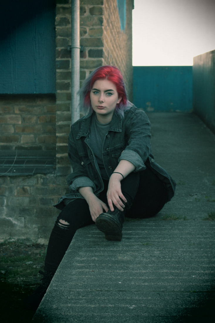
Re- Shoot : Night
I experimented with shooting in the night however, I did not like the turnout of any of the images because of the lighting. I took the images in an alleyway in Camden Town using a street light to take my images naturally but the natural grain of the images did not appeal to me so I experimented using the built in flash in my camera this however, took out many vital colours that I wanted to capture in the images and so the turnout wasn't what I was looking for. I want to re-shoot again in a different location in the daylight or evening when the sun is setting so I can get good natural lighting, and take more images overall so I have more to choose from.
|
|
|
|
|
I decided not to edit the images as the outcome wasn't what I had hoped for. I took inspiration from Vicky Grout and Sonya Kydeeva by capturing the raw feel to the image however, I feel like the image location isn't what I wanted and therefore the overall image was not as effective. I may experiment with night shoots again but I will continue with focussing on capturing the subject as the main focus as well as what they are doing and what they are wearing to capture their identity clearly.
Sonya Kydeeva
|
|
|
Sonya Kydeeva is a Russian Photographer who photographed post-soviet boys, who were in fact her friends - she captured not only their faces and bodies, but their lifestyles in the big unwelcoming city that they lived in. She captured small details like their tattoos, bruises, scars & their other friends who followed the same lifestyle. Kydeeva also looked at the idea of redefining masculinity as Russia was known for, and still is known for being, the country of "strong- heroic men", she liberates the boys in a way that gives them a sense of freedom, individuality and allowing them to be open to anything. Kydeeva never really captured models and the perfect identity, she wanted to capture the raw identity of different people through their flaws and imperfections - which really drew me to her photography. I want to capture this raw feel in my next shoot as I feel like it presents the area well.
"Confusion, alienation, void are the key traits of my character."
"Confusion, alienation, void are the key traits of my character."
Re - Shoot 2 : Day
Plan
Concept: My images are going to show how someone represents themselves through style and actions.
Location: Angel corner - flats and buildings surrounding the area.
Models: My friend Caroline.
Clothing / Accessories: She will be wearing something that she would typically wear, an everyday outfit for her; usually dark clothing and usually a dark denim jacket and doc martens/ vans.
Styling: Simple eyeliner that she would typically wear - usually either very minimal or very extravagant.
Props: I will not need any props in this case.
Lighting: The lighting will all be done naturally.
Timing: Around 6:00pm in the evening so that I can capture the 'golden hour' lighting.
Equipment / Materials: Just a camera
List of items needed for my shoot: Camera
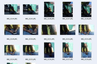
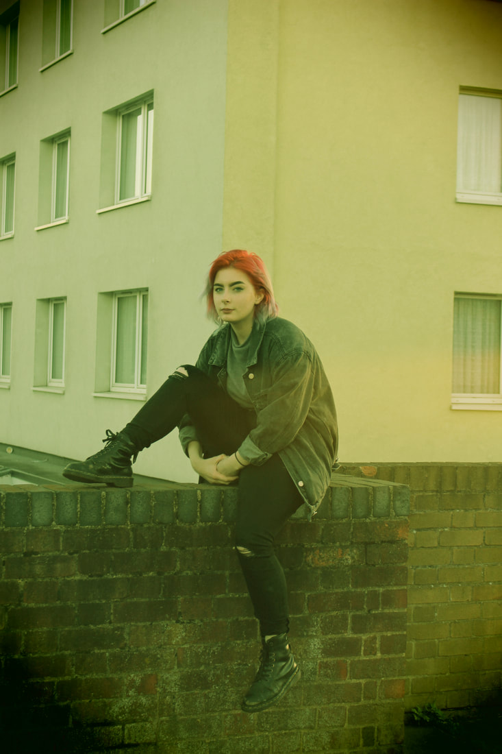
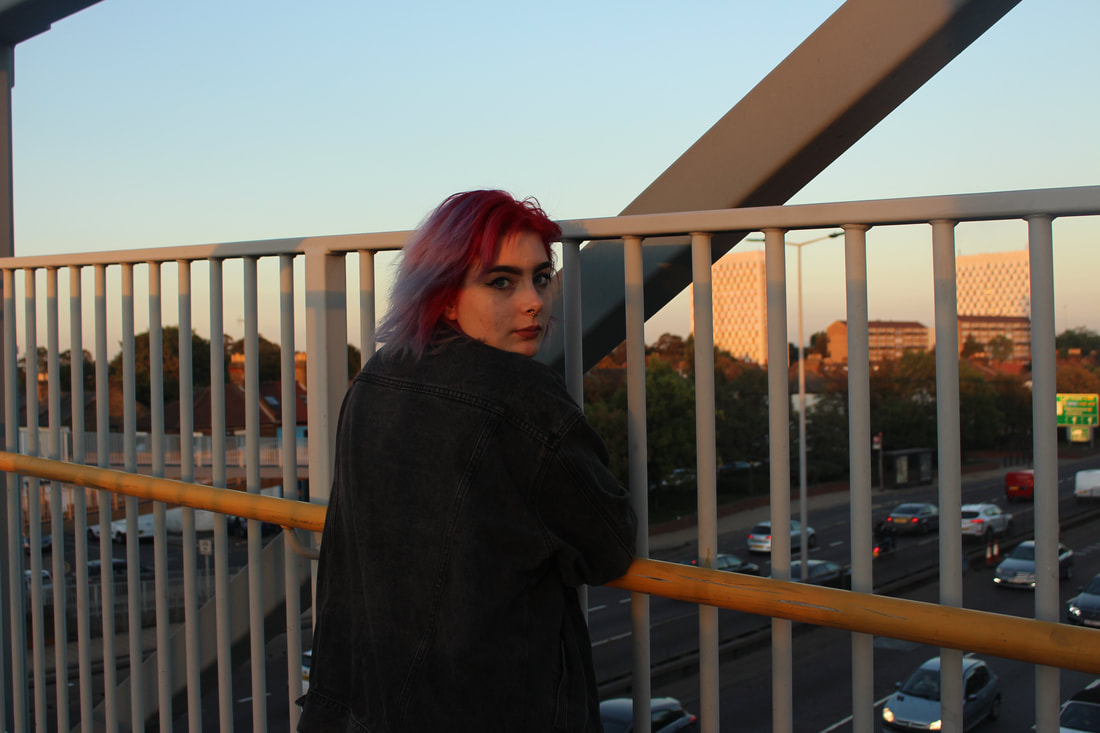
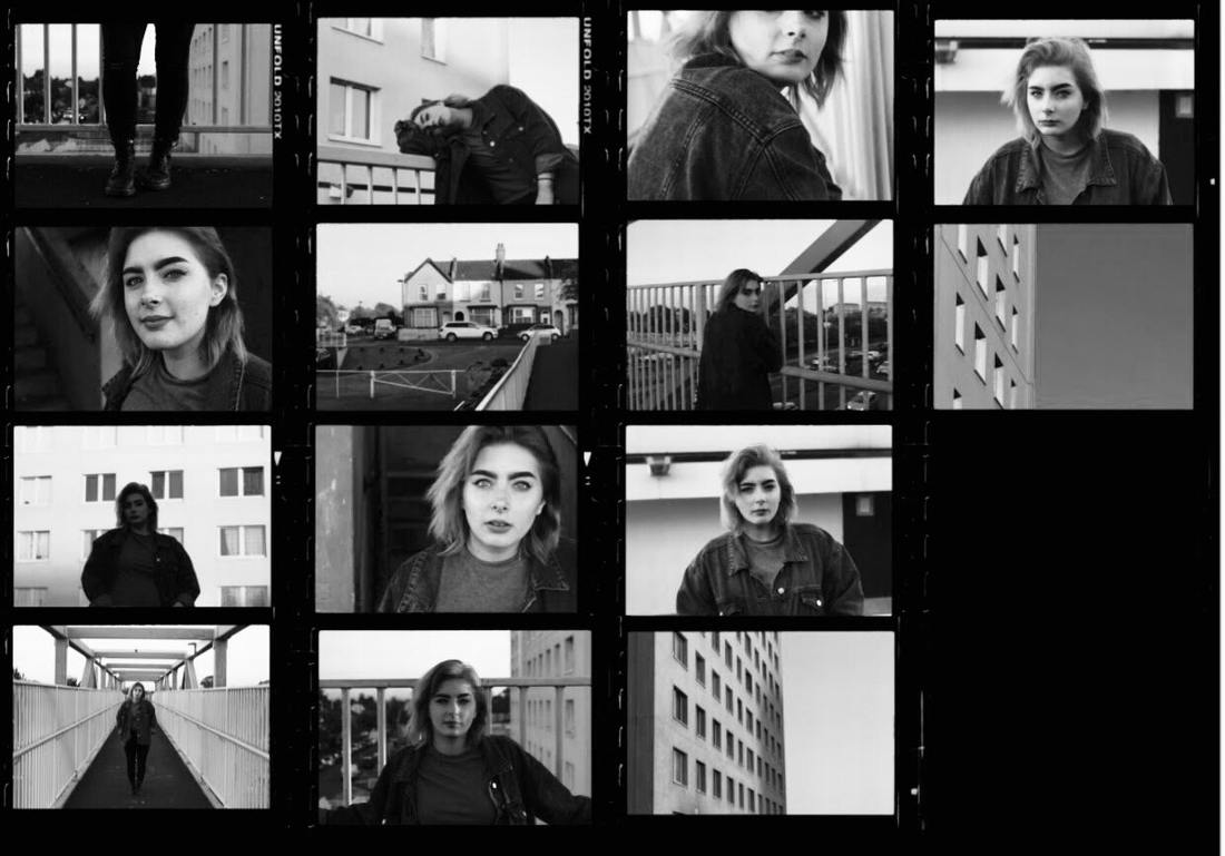
I think overall I have achieved what I wanted to achieve from the start of this shoot, I have taken a large variety of photographs from many different viewpoints of my model and the setting that I was in. The majority of my photos came out well focussed and the lighting was great compared to my previous shoot in the night which required my inbuilt flash on my camera. A large amount of my images have shown great contrast, with my models hair and clothing contrasting the light, pastel tones of the buildings and the sky with the sun setting. My contact sheet clearly shows a variation of different colours being presented, mainly pastel and dark tones contrasting with one another. I had to keep adjusting my aperture and shutter speed throughout the shoot however, so next time I will make sure I know what aperture and shutter speed I should have my camera set on before starting the shoot as it took up a lot of time and effort when we did not have much time before the sun had set. Next time I shoot, I will try to shoot slightly earlier during the day also to capture different types of lighting for my images and maybe even experiment with coloured film to achieve the desired effect that I want in my images - I also want to experiment more with different characters, so maybe shoot with more than just one subject in the next shoot that I do.
|
|
|
|
|
|
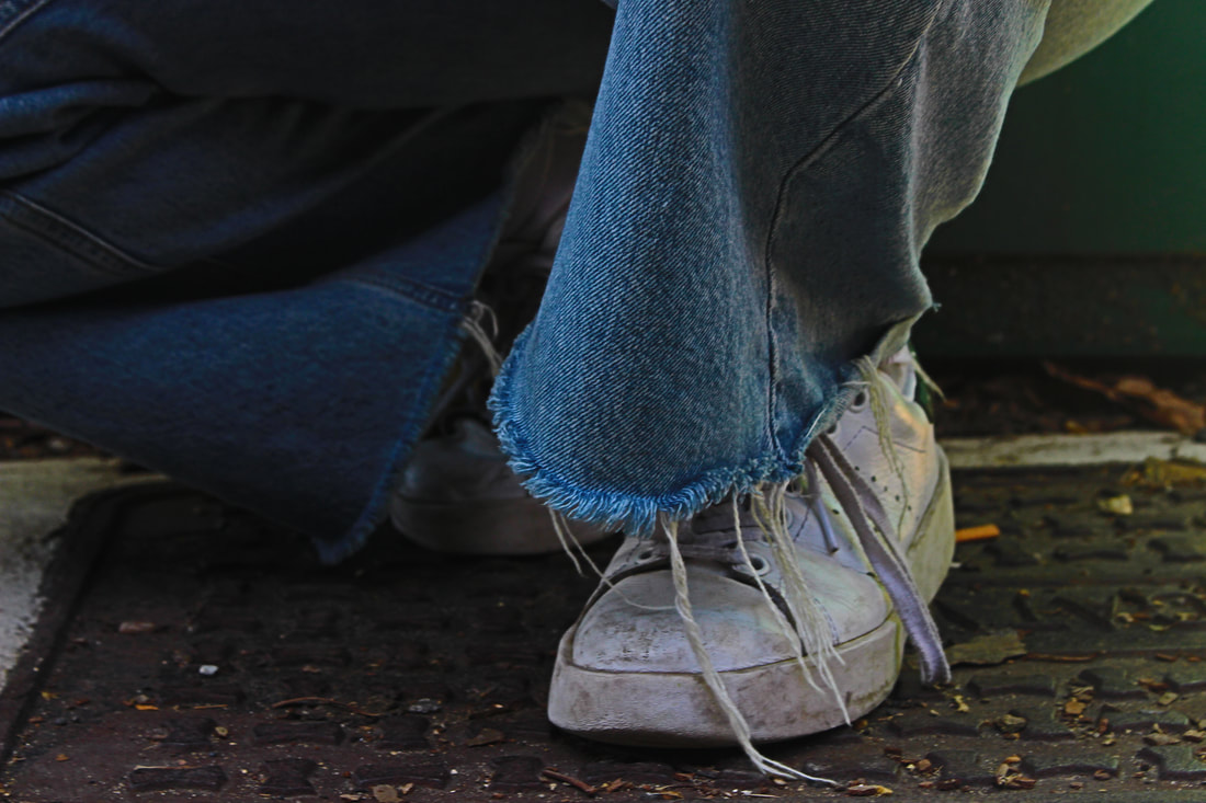
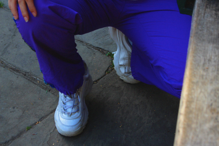
I like the close up shots of the shoes, I want to continue to do this throughout my shoots.
I took most of my inspiration from Vicky Grout and her Nike shoot which I have shown at the start of this page as well as some inspiration from Sonya Kydeeva. I really liked the way she had many close up shots as well as focussing on the environment. I felt like focussing on a certain type of area would add a bit of depth to the images and hold a bit of meaning. I decided to use Edmonton as my location as it is where I have lived for the entirety of my life and I have seen it change throughout the years. The subject in the image also has lived in the area her whole life and so is almost a part of the location. I want to link both the location shots and portrait shots together to show how the location is intertwined in her life, I may explore the area more thoroughly through my photography and present it in its true form.
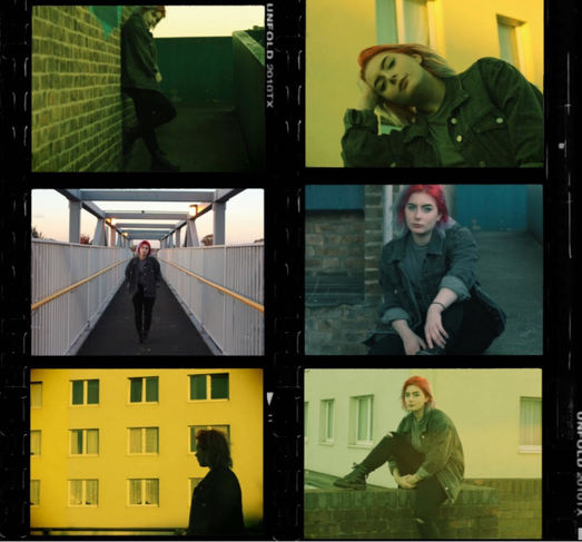
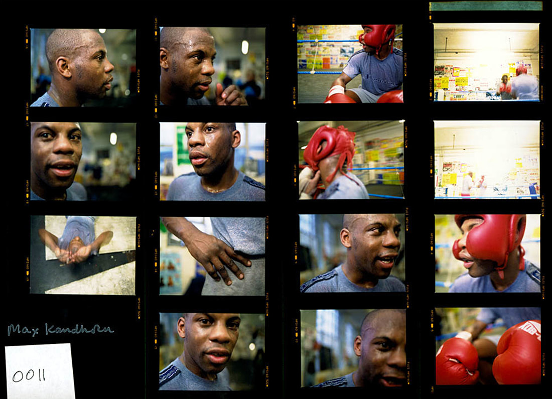
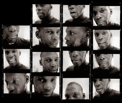
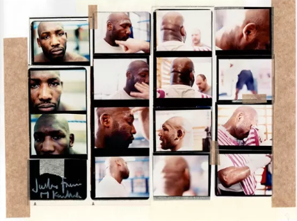
Max Kandhola - Contact Sheets
Max Kanhola photographed Nottingham born and world champion boxer, Carl Froch. Kandhola had been photographing boxers in their environment since 1996. Through the use of the camera he captures not the traditional fight but rather focusses on the conflict within the character. Kandhola captures the aura of the ring and the gym - the spaces of physical preparation - the spaces where the subject is almost vulnerable. As well as that, the work documents the distance from inner-city poverty that is common for many young boxers. His images are presented through large, blown - up contact sheets, that allow the viewer to see the movement of the subject and its actions. I decided to explore the use of this presentation, presenting many images at once as well as the movement of the character and the presentation of identity.
|
|
|
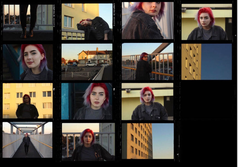
By displaying my images in this format it allows the location shots and profile shots to be presented together. I thought this was a very interesting idea to look at. I also experimented by turning the piece black and white just to look at how the colours look. Max Kandhola's use of movement in the images however is not really shown in my images but I feel like the piece really does represent the area and the identity of my subject. I could have placed more images that show my subjects personality more but I think the locations identity is shown a bit better in this piece.
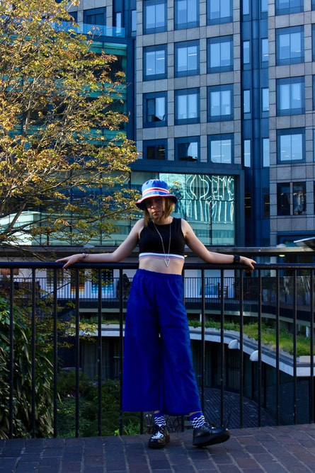
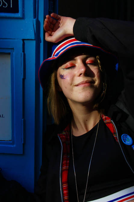
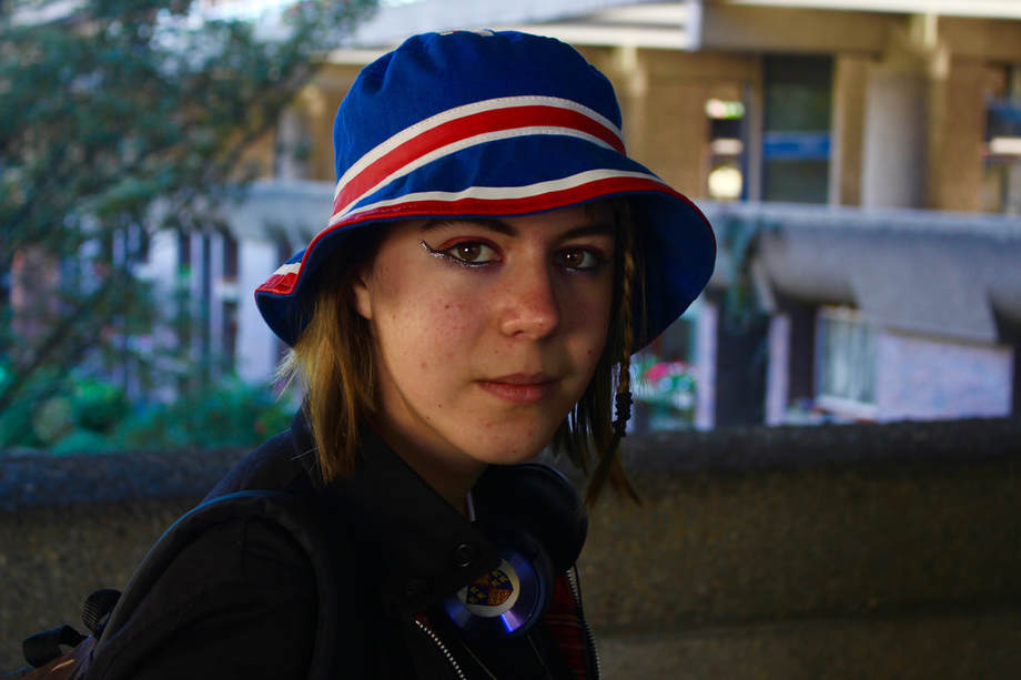
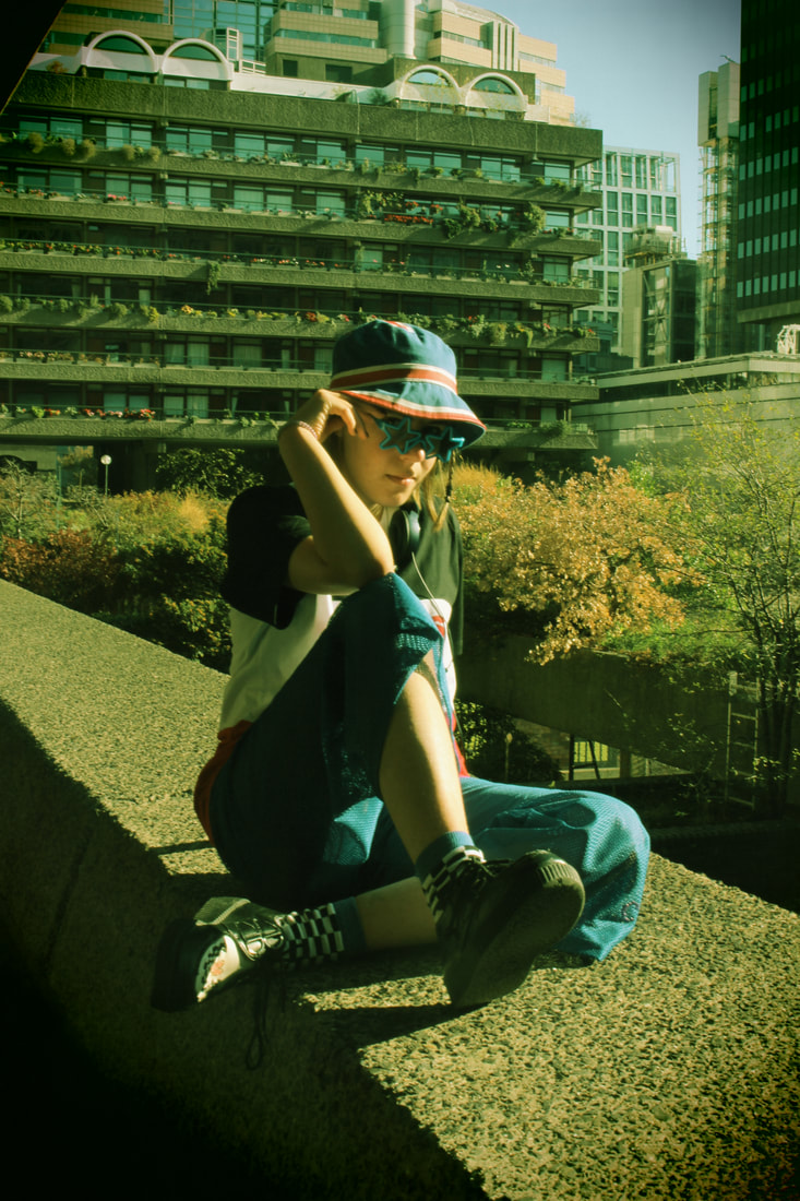
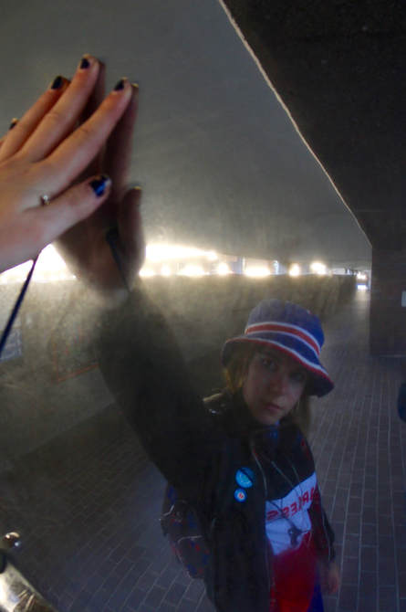
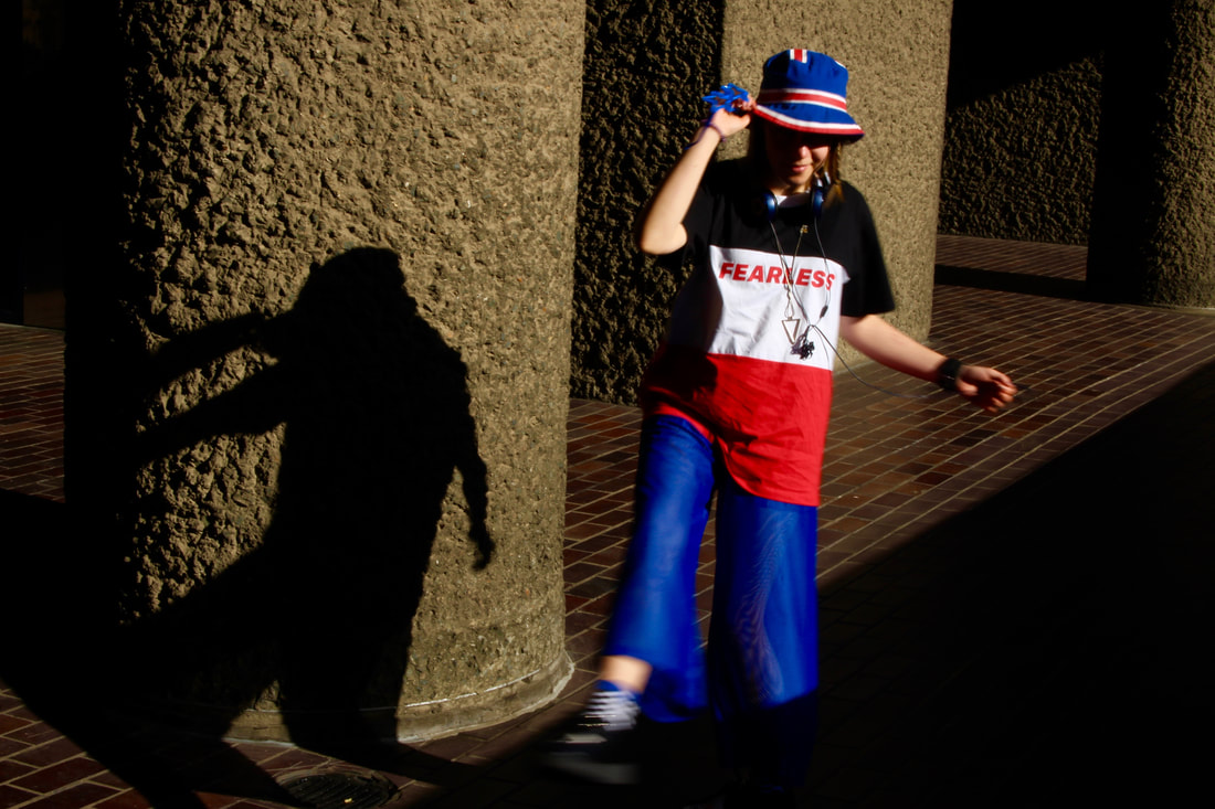
Plan For Shoot
Concept: My images are going to show how one person represent themselves through their style and actions.
Location: The Barbican
Models: My friend Anna
Clothing / Accessories: She will be wearing something that she would typically wear, an everyday outfit. Anna wears extravagant, colourful outfits - very colour co-ordinated
Styling: Anna will have her usual colourful makeup & significant eyeliner look
Props: I will not need any props in this case.
Lighting: The lighting will all be done naturally.
Timing: Around 4:00pm before it starts to get dark so I can capture daylight and get the best possible shots
Equipment / Materials: Just a camera
List of items needed for my shoot: Camera
Overall, I have taken a large variety of images but I haven't achieved what I had wanted. The images are much more digital and the colours are more vibrant than gritty - which is what I wanted to continue to achieve in my photographs. I don't think I had taken enough photos showing a variety of angles and viewpoints. The lighting wasn't easy to control as the area was mainly very dark.
The photos were taken near the barbican which was slightly less gritty than the photos I had taken in Edmonton and so I want to reshoot around Edmonton again. However, the lighting of these images were very good as well as the colours corresponding to her chosen outfit. Throughout the shoot I did not have to experiment much with aperture which made the series easier to capture, which is what I was struggling to do in my last shoot. The images were taken in the early hours of the afternoon, the lighting was great at this time as it was not too dark. The previous shoot had to be rushed in order to capture the lighting that I wanted. In the next shoot that I will do, I will go back to Edmonton to capture the more gritty images and structures. I will also add another subject in my images in order to add more movement and the idea of different identities in my image.
The photos were taken near the barbican which was slightly less gritty than the photos I had taken in Edmonton and so I want to reshoot around Edmonton again. However, the lighting of these images were very good as well as the colours corresponding to her chosen outfit. Throughout the shoot I did not have to experiment much with aperture which made the series easier to capture, which is what I was struggling to do in my last shoot. The images were taken in the early hours of the afternoon, the lighting was great at this time as it was not too dark. The previous shoot had to be rushed in order to capture the lighting that I wanted. In the next shoot that I will do, I will go back to Edmonton to capture the more gritty images and structures. I will also add another subject in my images in order to add more movement and the idea of different identities in my image.
|
|
|
|
I have decided to go back to Edmonton and take more shots around the area due to the grittiness created out of the location, this would give the viewer an insight into the urban environment as well as the identity of teenagers. The project could start to evolve into an overview of the area and my personal experience of growing up in Edmonton I could also take photographs of the area without people in it to show the structure and make up of the location. This could also then be presented in a contact sheet style showing portraits and fashion alongside the location images.
Sophie Day
|
|
|
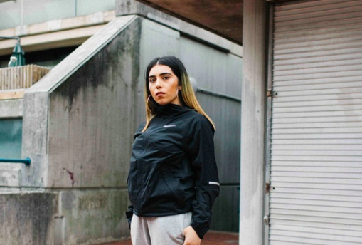
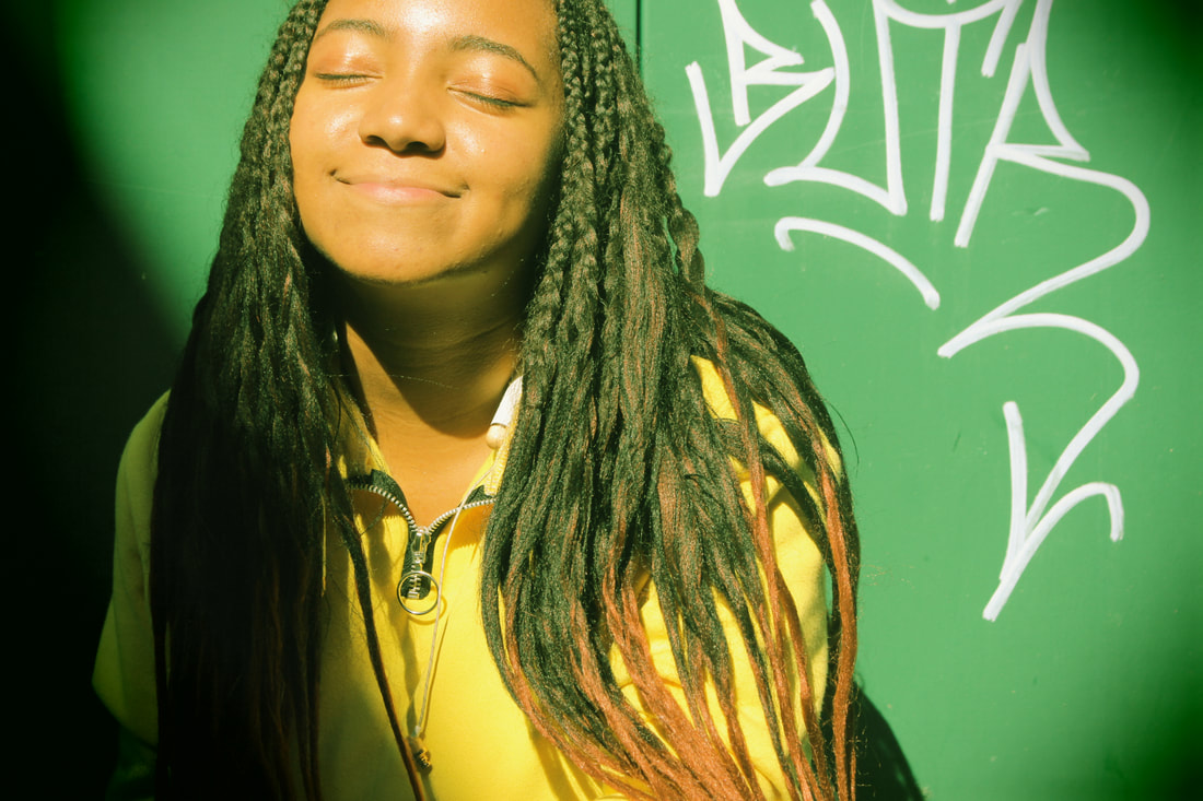
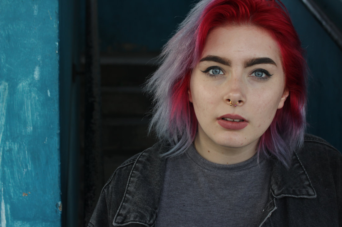
Sophie Day is a 19 year old photographer based in New York, as a young photographer she creates zines and series' that look at the lives of Youth today. "She describes her latest work as a “sex positive exploration," a print zine titled Wet Dreams Zine. She’s also working on a documentary titled Fuckboy, which evolved from a scripted short film into a documentary, based on downtown NYC skateboarders." I like her photography especially due to the colours and contrast in the images as well as the documentary style feel to them. I came across Sophie Day after looking at photographers for my curatorship task and found Day amongst many others. I found her documentary style very interesting and wanted to replicate some of her ideas. I liked the film look to her images (considering most of her photos are taken on film) and wanted to take that idea and take some of my own images. I also liked the idea behind the lives of young boys, and the night life idea in New York and so thought it would be interesting to switch up the roles and take some images of my female friends and what they get up to at night in the streets of London as they hang out in Edmonton.
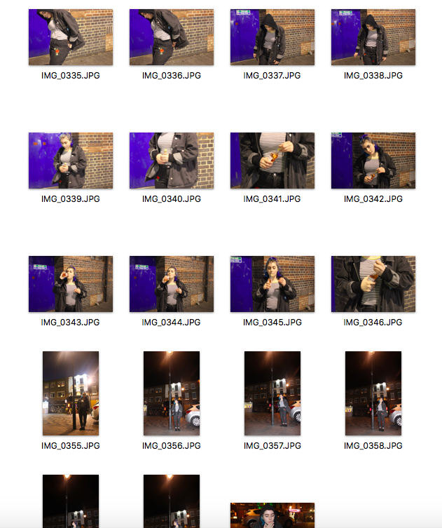
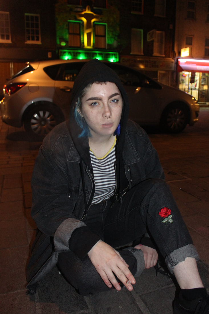
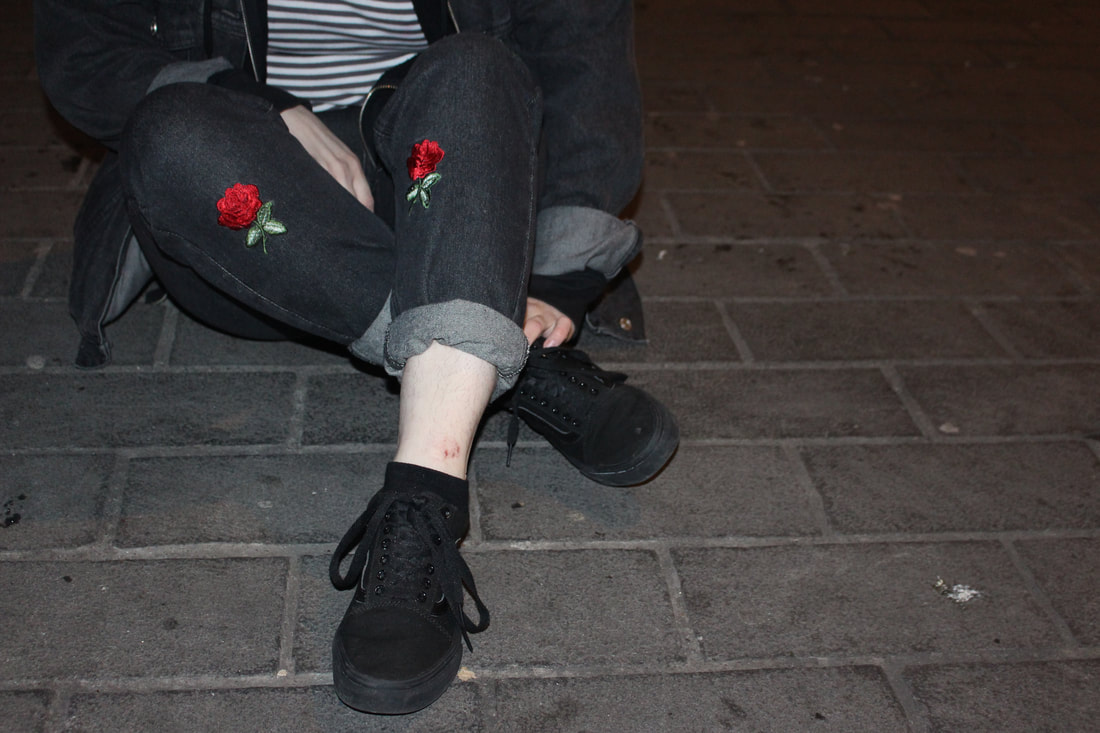
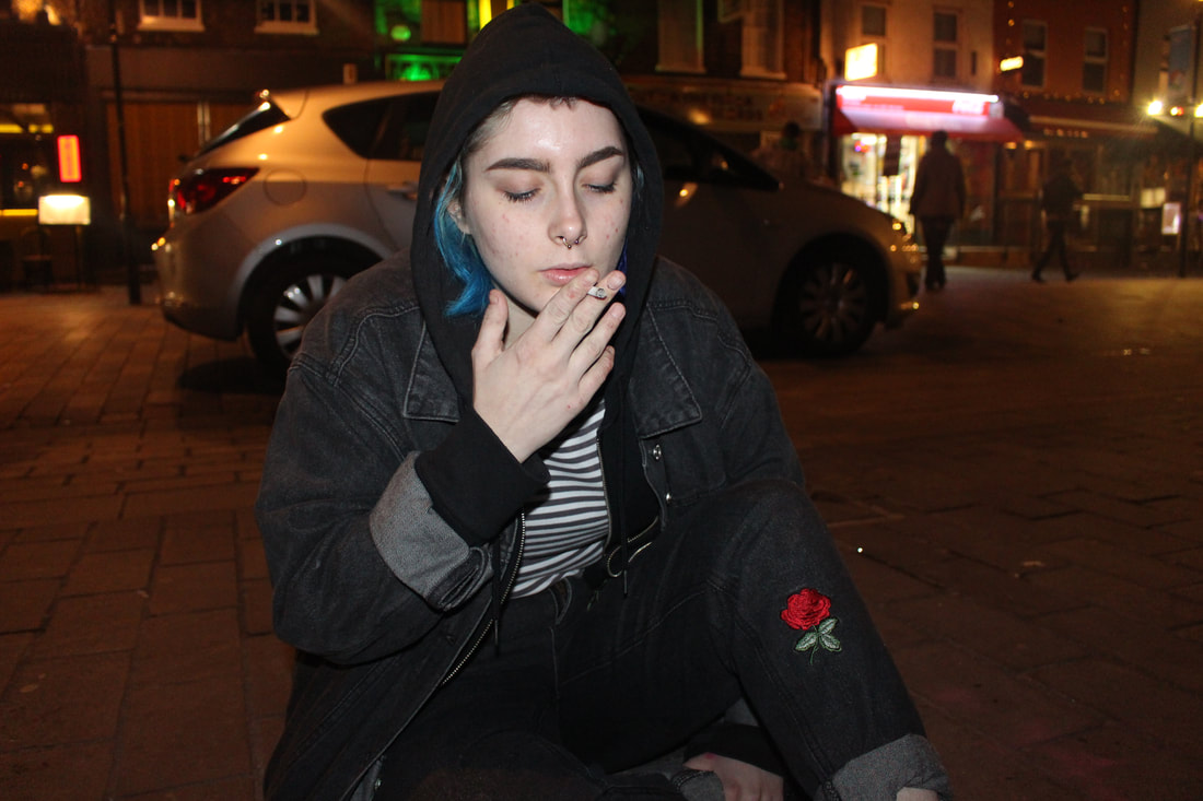
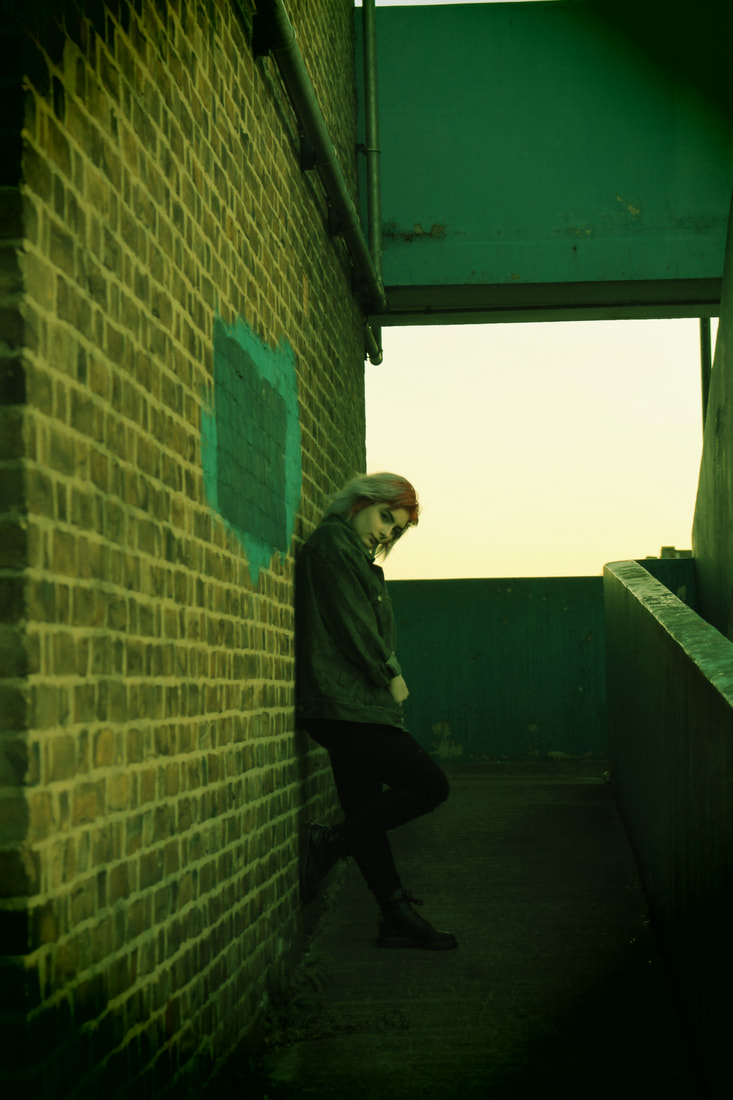
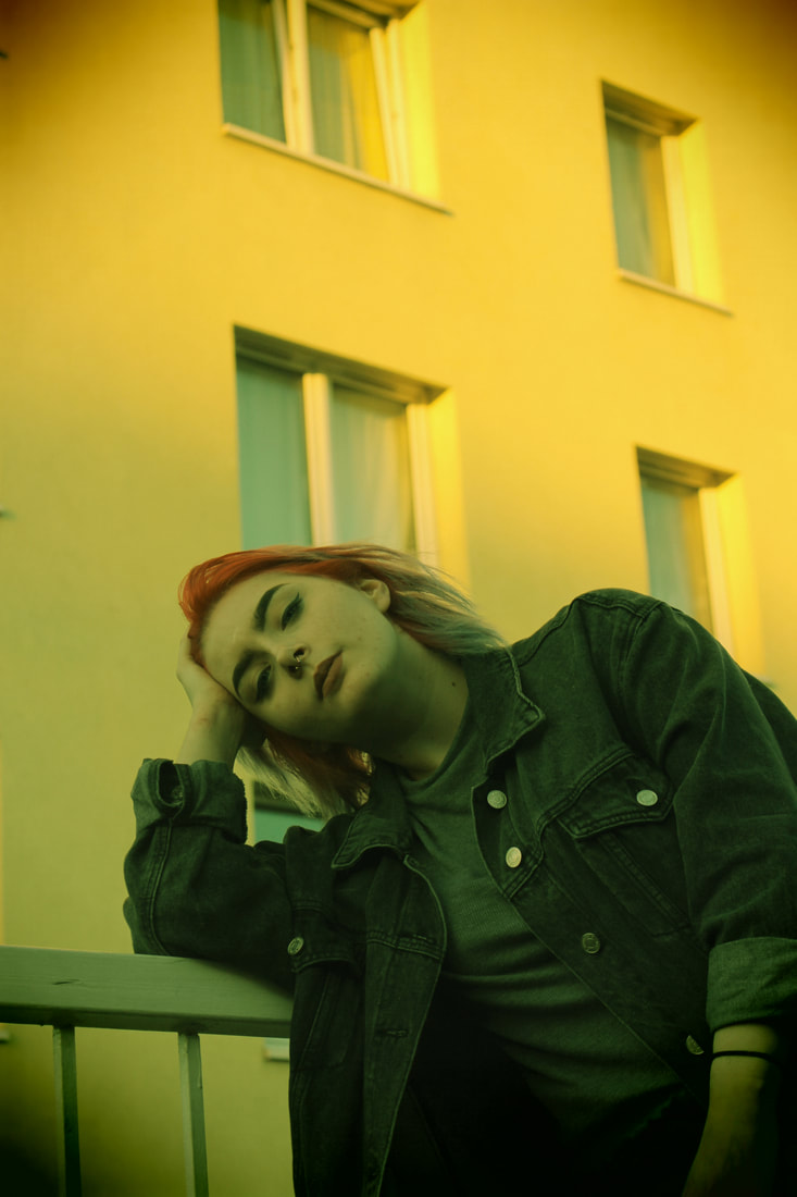
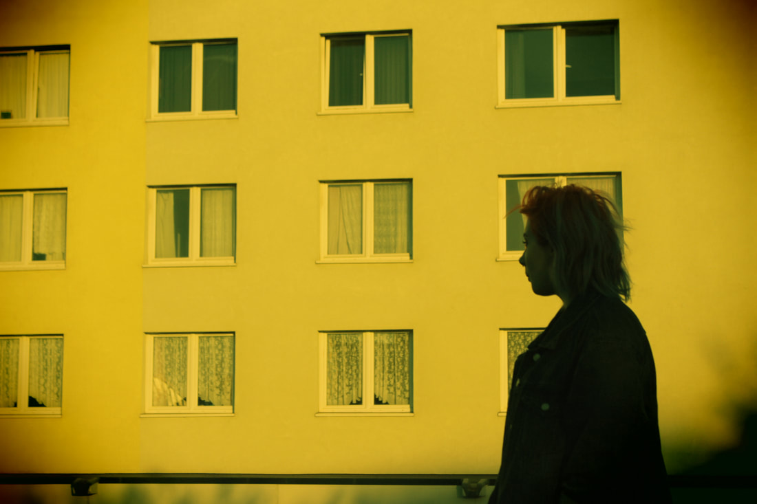
Night Shoot 2
I ended up reshooting another night shoot. I used the in built flash as well as lighting from street lamps. I took most of the inspiration from Vicky Grout and Sophie Day, I wanted to make some of my images black and white as well as adding the film, green toned filter that is in-built into my creative filters section on my camera. I like the way the images turned out considering I used a lot of in-built flash which usually ruins the feel of the image. I particularly liked the look of the close ups of Anna as I feel like it really captured the emotions of the image. However, I do not feel like I have taken enough photos and the lighting could have been better in the wider shots so I could have captured their surroundings.
|
|
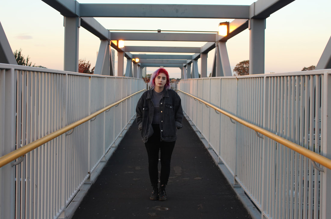
Vicky Grout
|
|
|
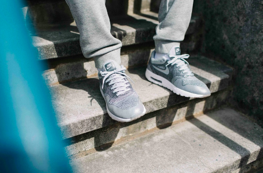
Vicky Grout is a 21 year old photographer who is known for her recognition in the music industry. Many of her images are influenced by Ewen Spencer and Simon Wheatley who's style is distinctly surrounded by the identity of the youth. I have decided to look back on the ideas of Vicky Grout and the idea of photographing fashion/ identity in an urban environment. The close up shots and the attention to small details like brands i.e. nike, appeal to my idea of presenting youth identity as well as giving an insight into the urban environment. In my next shoot I will focus on the details of the outfit on my subject as well as the surrounding environment. I will then edit the images to give it a more gritty look to match the theme of an urban environment.
Plan for my shoot
Concept: Capture details of a person as well as presenting the environment they are in
Location: Angel Corner area
Models: My friend Charlie
Clothing / Accessories: Hoodie, joggers, trainers
Styling: Simple, natural makeup
Props: I will not need any props in this case
Lighting: The lighting will all be done naturally
Timing: 11am
Equipment / Materials: Just a camera
List of items needed for my shoot: Camera
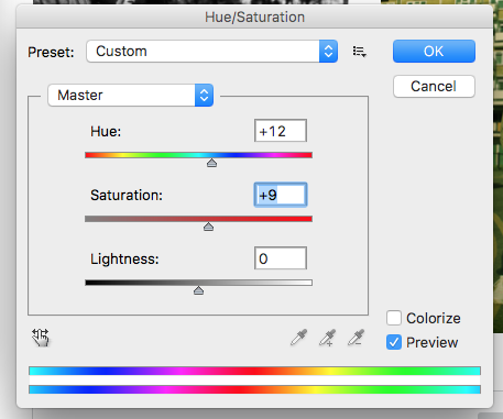
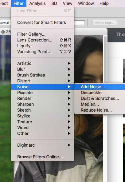
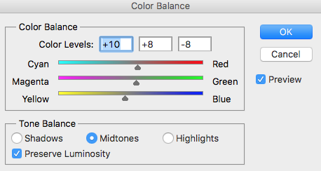
I did not edit the images much as I wanted to keep the image as natural as possible and the lighting was good. I played around with the saturation and colour balance to make the images more vibrant and also added a bit of grain/noise for a film effect.
|
|
|
|
|
Overall, I think I have taken a good amount of images but did not capture the area as much and so did not really present both subject and area. I think the colour of the images is good, as well as the lighting and the contrast of the images. I feel like I could have taken more close up, detail shots of the clothing items as well as experimenting with different angles to get different effects. I want to use these images and add more to them. I also want to try and capture the location she was in and maybe bring them together in some way to show a link between the location and the subject either being through layering the images or even through text.
Location Shots
I decided to photograph estates and different areas around where I live to join together with the portrait shots that I had taken previously. I have taken a broad range of images and the lighting, tone and contrast has turned out really well in the images. I have edited a couple of the images, adding a bit of saturation and grain on the camera but otherwise have left the images unedited as I felt like it looked the best. I now want to join the images of Charlie together with the images of the area to bring the two together as one to show a link between Youth and the area.
|
|
|
|
|
|
|
|
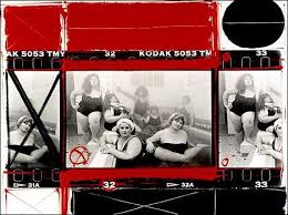
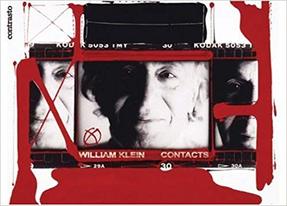
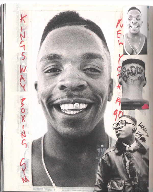
William Klein - Contacts
|
|
|
The picture is taken at 1/125 of a second. What do you know of a photographer’s work? A hundred pictures? Let’s say 125. That comes out to one second. Let’s say, more like 250 photographs? That would be a rather large body of work. And that would come out to two seconds. The life of a photographer — even of a great photographer, as they say — two seconds.
I found the works of William Klein quite interesting with the way he has laid together the images of people and used paint to make them stand out a bit more. I also like the rough edge to the images as I feel like it adds a personal touch to the images as well as making the images almost journal/ scrapbook like. However, I do not feel like this is how I want to link my images together but I do like the idea of a rough feel to the images and that is what I want to end up doing to my own images.
I found the works of William Klein quite interesting with the way he has laid together the images of people and used paint to make them stand out a bit more. I also like the rough edge to the images as I feel like it adds a personal touch to the images as well as making the images almost journal/ scrapbook like. However, I do not feel like this is how I want to link my images together but I do like the idea of a rough feel to the images and that is what I want to end up doing to my own images.
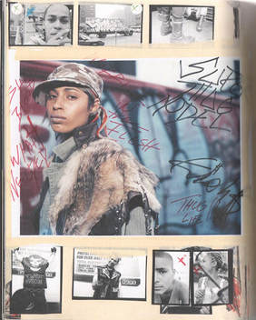
Ben Watts "Big Up"
|
|
|
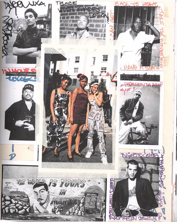
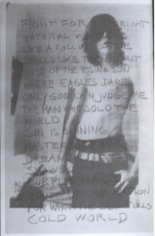
Ben watts is a photographer who looks at a variety of different subjects from; fashion, street, hip-hop culture, wrestling etc... Watts wanted to capture what it is like to live as a person who is young & urban. The images that he takes also show text and other parts of images layered on top of the main images. The text coming from his own thoughts of the image, of simply stating what the image is of. Some of his pieces also show elements of existing items like train tickets, following the idea of his images almost presenting his own visual diary. These images from Big-Up, showcase fantastic collages almost in a scrapbook form making the pieces that much more nostalgic and aesthetically pleasing to look at.
I like the idea of layering text on top of an image. What has been done by Ben Watts has really caught my attention, heading towards my overall final piece I would like to do this to my own images. The text could come from quotations from the area of Edmonton from newspapers and articles online that describe the area itself. Ben Watts prints out his images and writes directly on top of them which I think adds a personal feel to the images and adds the raw, authentic look to the images which I particularly think looks good. Watts images are of normal people that he comes across which again I feel like adds more depth to the images making them more unique. The text is written in different colours making them stand out to the viewer, I want to attempt to write on my own images also.
I like the idea of layering text on top of an image. What has been done by Ben Watts has really caught my attention, heading towards my overall final piece I would like to do this to my own images. The text could come from quotations from the area of Edmonton from newspapers and articles online that describe the area itself. Ben Watts prints out his images and writes directly on top of them which I think adds a personal feel to the images and adds the raw, authentic look to the images which I particularly think looks good. Watts images are of normal people that he comes across which again I feel like adds more depth to the images making them more unique. The text is written in different colours making them stand out to the viewer, I want to attempt to write on my own images also.
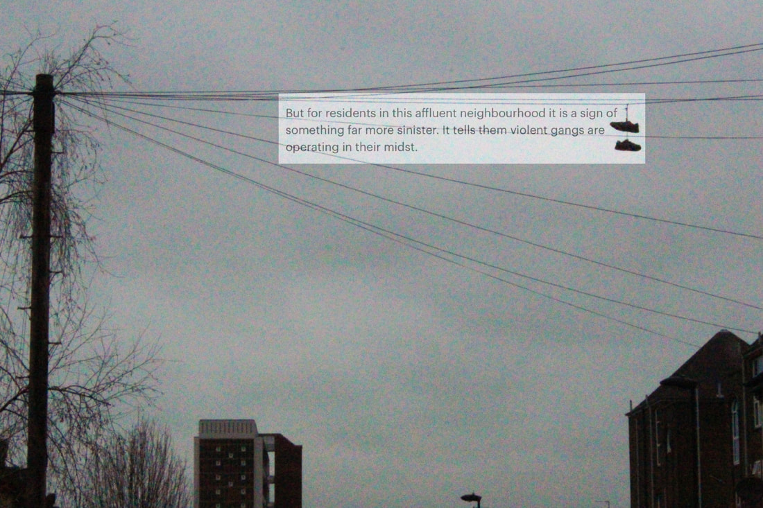
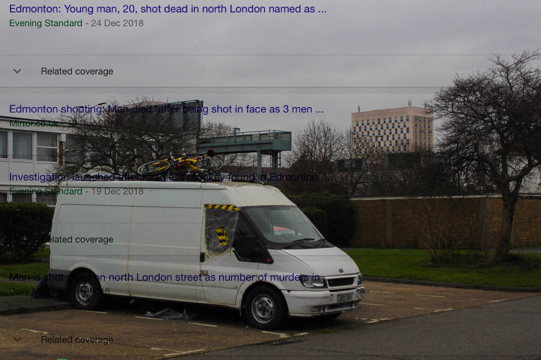
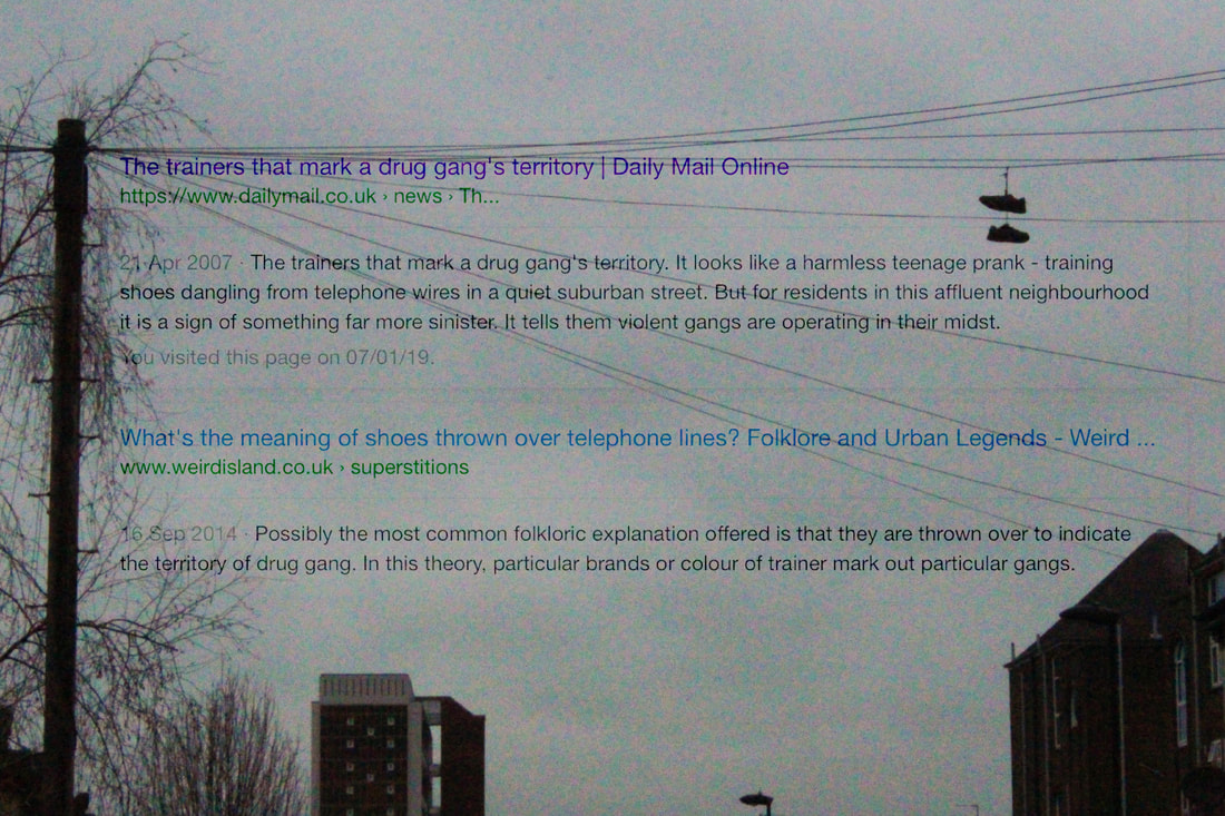
Newspaper articles in Enfield
I have been looking at various news articles to do with the area that I live in, with most of the articles being about knife crime and gang violence. I want to use quotes from the articles and write on some of my images quoting the articles to show what youth has around them. I want to write on the images by hand to give it almost a "Journal" feel to the image making the images look raw and real. This could also link to the idea that the Youth are controlling what is going on, using hand written, rough font it will make the audience understand that it has an effect on people in the area.
Text and Image
I experimented by digitally placing key parts of articles onto the photographs and blending them in different ways. However, I think it would be interesting to write the articles by hand to give a raw, authentic feel to the image, but trying out this technique has allowed me to look at various different articles about the area giving me ideas on what I could hand write onto my next images.
Written text on image
|
|
|
|
|
|
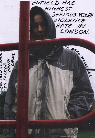
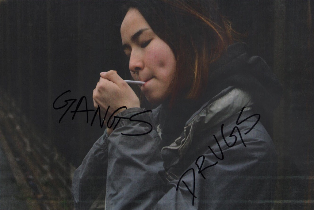
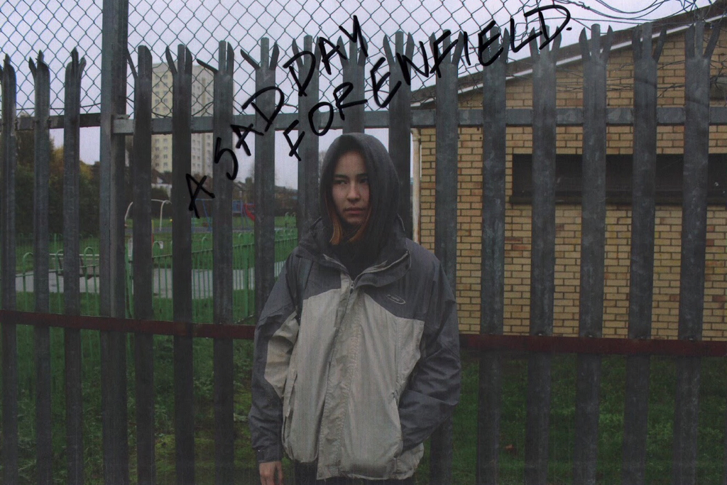
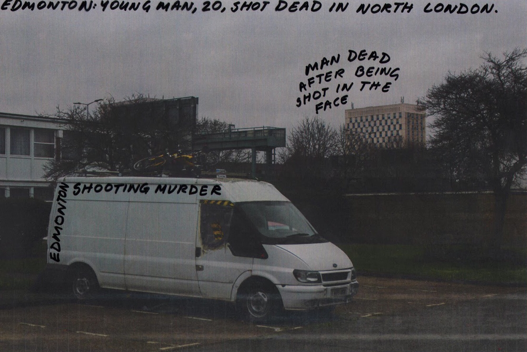
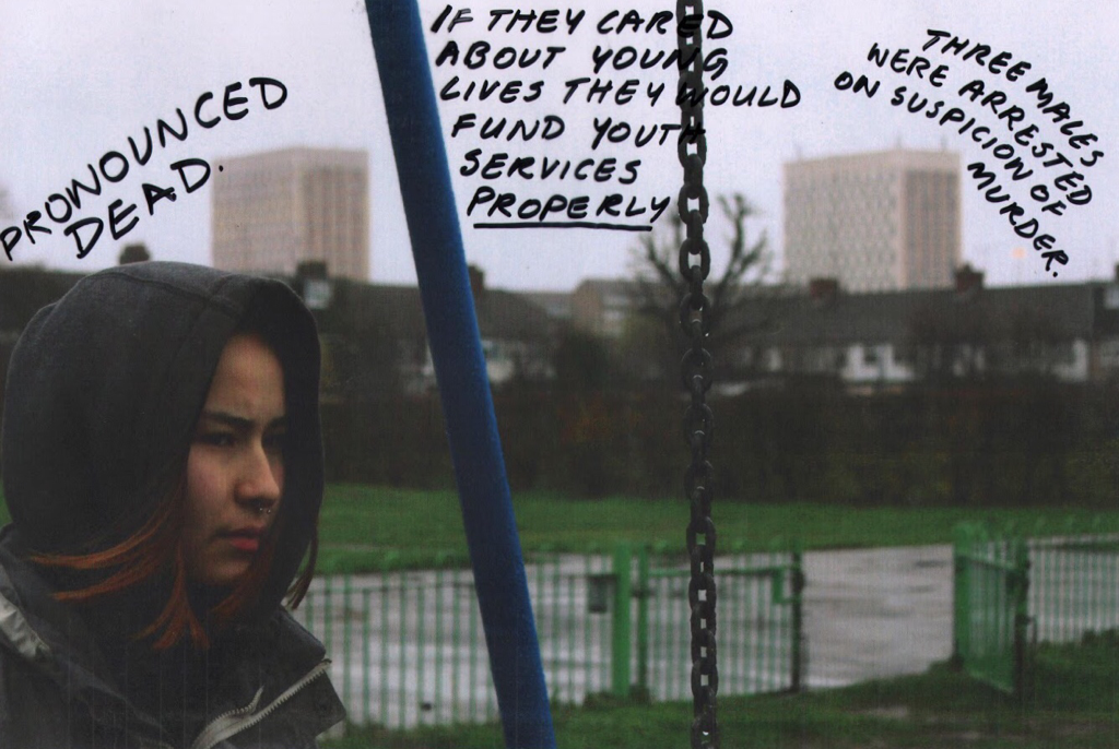
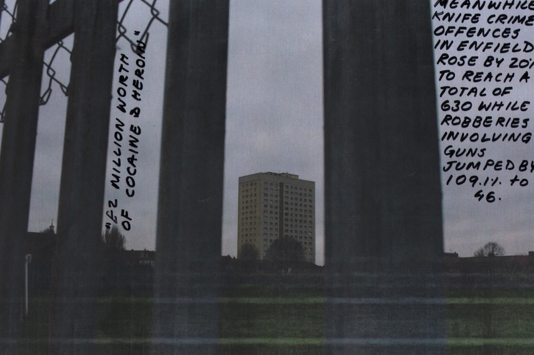
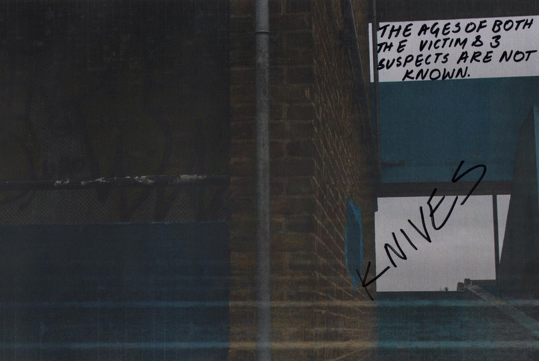
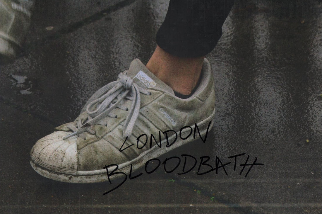
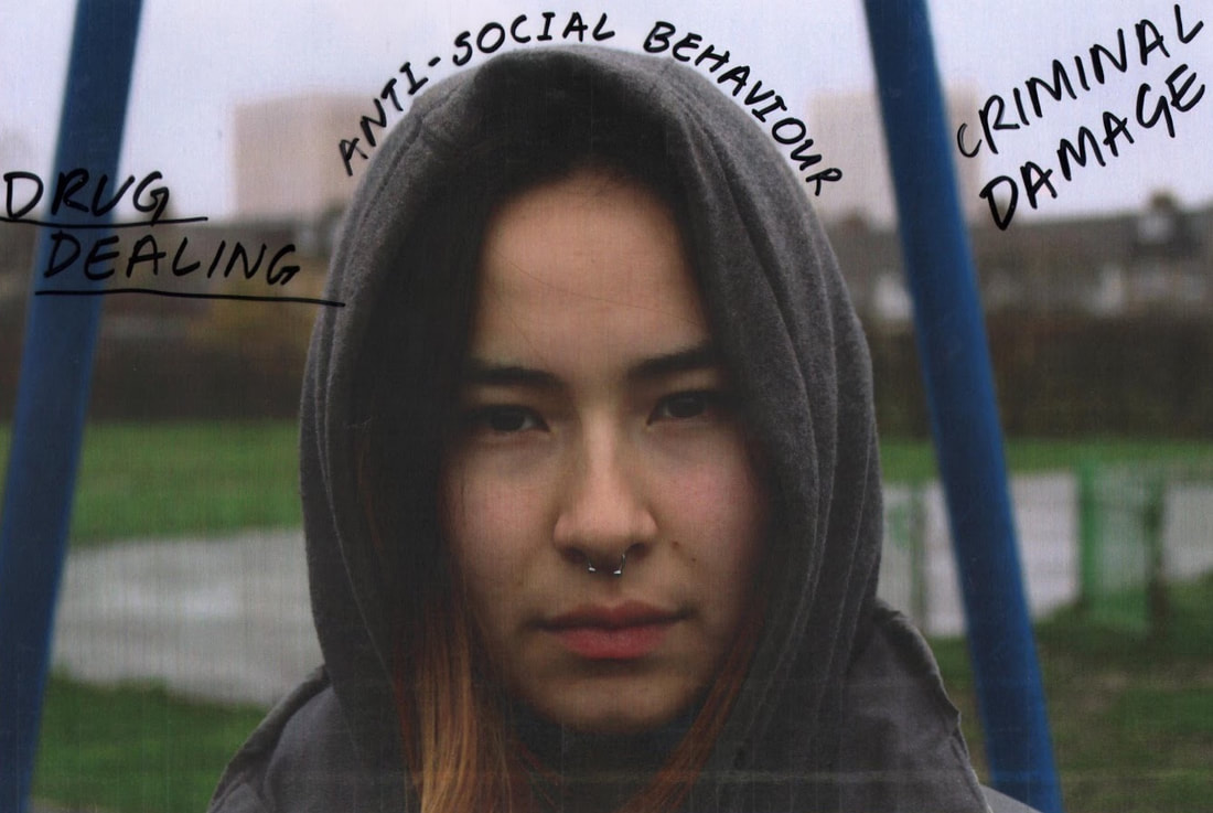
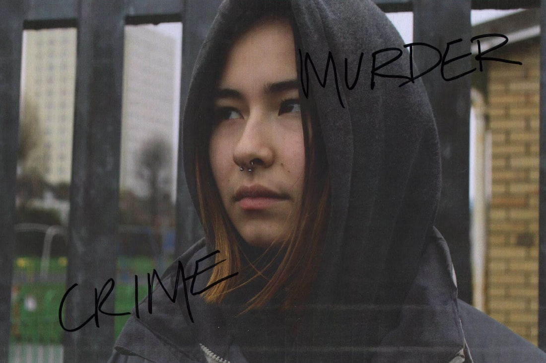
I have created a series of images by editing some photos from the previous shoot that I took. The images represent the Enfield area and the text is taken from articles that are about the area itself. The text mainly talks about the concerns for knife crime and other anti social crimes that occur often in the area and how common it is for Youth to be involved in it.
After living in the area for the entirety of my life I have grown up knowing that the area that I live in is somewhat dangerous and surrounded by gang crimes. I have seen many scenarios of young people being arrested and getting themselves involved in anti-social behaviours, including some of my friends in the past. I decided to reflect what I know of the small community and what is ruining what could be a normal county for youth to live in. The news only seems to present the worst bits of the area and not positive things.
I have taken all the negative connotations of the county and placed them hand written onto the images that I took 5 minutes away from my home. I thought that writing on the images by hand would add a raw effect to the images reflecting the nature of the environment and the people living in the area. I thought it would be a good response to artists like Ben Watts, and the image would have a "journal feel" to it as if to show that youth is what makes up the area.
The images turned out grittier than I had expected but I think I like the overall results. I think the darkness of the images reflects the area perfectly and the text being in black, simple font makes the image more interesting to look at as well as giving it that "journal" style look to it, which I wanted to create in the end.
Collaging the images
Ari Marcopoulos
|
|
|
Ari Marcopoulos is an Amsterdam-born American photographer and filmmaker. He lives and works in New York and California. He looks into the intimate lives of people living on the edge which include; artists, snowboarders, musicians and skateboarders have been muses throughout his photography career. Many of his photographs show a lot of contrast and are mainly black and white. The images are raw and taken in the moment to capture the authenticity of the subjects lifestyles. His photographs vary from landscapes and portraits. I chose to look at Marcopoulos' work because I like the natural feel to the images, many of his images are of young people which goes along perfectly with what I am looking at and as well as that he has a few pieces that have written text placed on the images which is what I want to do for my final piece.
Like Ben Watts, Marcopoulos uses hand written text to place words on his images which is what I think adds a personal feel to the images. I like the black and white images he has taken as I feel like it gives the image more emotion and in some cases emphasises some emotions that may be going on in the images. I feel like this could reflect back on my photography and the emotions in certain places I photograph. I want to have some of my images in black and white to emphasise the emotions in my images as well as it emphasising the contrast and tone of the images.
Like Ben Watts, Marcopoulos uses hand written text to place words on his images which is what I think adds a personal feel to the images. I like the black and white images he has taken as I feel like it gives the image more emotion and in some cases emphasises some emotions that may be going on in the images. I feel like this could reflect back on my photography and the emotions in certain places I photograph. I want to have some of my images in black and white to emphasise the emotions in my images as well as it emphasising the contrast and tone of the images.
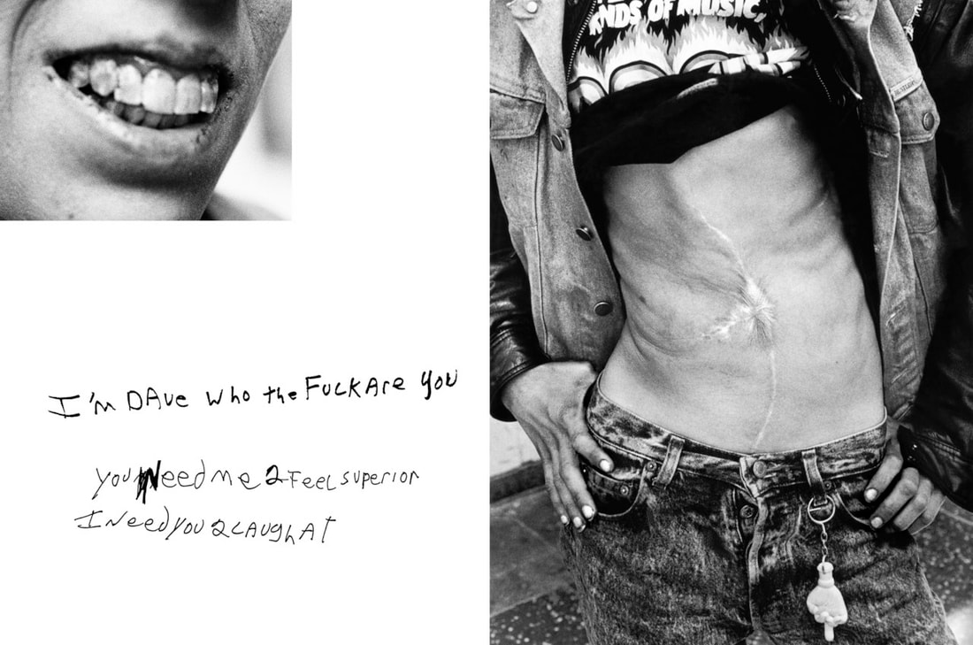
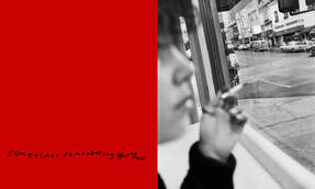
Jim Goldberg - raised with wolves
|
|
|
"Jim Goldberg’s Raised by Wolves is purely narrative. It is a story, as true as any story can hope to be; it is a story told through many mediums; it is the story of the streets. Jim Goldberg, a photographer by trade, spent ten years on the streets of San Francisco and LA “documenting” the citys’ homeless teens."
Goldberg photographed his experience with the teens he saw in San Francisco and LA. "Raised by Wolves is part photojournalism, part novel, part movie, part comic, and part museum display. Shifts in mediums occur within the individual pieces themselves."
His images consist of image and text being placed together, usually the text being speech from the subjects or explaining what is going on in the image. The text is written roughly to the side of the photographs in a journal like manner adding a rough edge to the pieces. I like the way the text has been placed on the images, it makes the text and the image stand out to show the importance of both the text and image in the piece, I also like the use of the black and white in the images as it adds more tone to the images as well as emphasising the mood of the images. I decided to look at Goldberg amongst the other photographers as I like the composition of the text and image. I also like the rough handwriting used ultimately adding more emotion to the pieces.
David Carson
|
|
This photographer found on pinterest takes images of mainly models and uses white and black pen on mainly black and white images. I like the tone of the images as well as the mood set by the text. The text usually consists of who is in the images and what they are do and say, I think this adds a personal touch to the pieces allowing the viewer to understand who is in the image and what kind of person they are. I like the use of the white pen on the black and white, the contrast of the two tones makes the text stand out, therefore more effective. Just like the other photographers that have used text, the text adds a personal touch to the pieces making them more unique and interesting. I want to now respond to these artists, using the black and white style of the images as well as focussing on tone and contrast of the images. I still want to make sure to focus on the locations as well as the subject and how they present themselves so in my next shoot I will photograph a subject in Edmonton and continue with the text on image idea whilst using different pens to make it stand out a bit more.
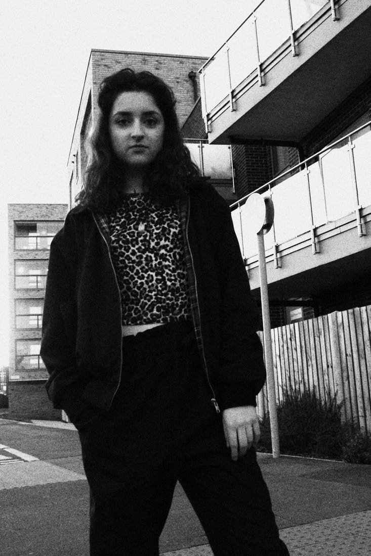
Response 1
The images that I have taken are a response to the photographers I have been looking at particularly Ari Marcopoulos, because I really like the colour and contrast of his images as well as the close up shots and the attention to detail he has put in his photographs.
Overall, I could have shot more photos from a larger variety of viewpoints to capture certain aspects of the image. The majority of photos are in focus and show immense detail in the few close ups that I had taken. I made sure to play around with the ISO as the lighting was very poor when I was taking the photographs as the sun was about to set, this made some of my images very grainy and quite bright. I also made sure to pay close attention to the aperture to allow for a clearer close up image that had more depth. The majority of my images have good contrast, with many dark tones from the clothes and shades from the buildings. I edited the images with my in-built creative filters on my camera, I felt like the green film filter and the black and white emphasised the emotion of the area which is what I wanted to do.
The location that I used for the shoot was not what I had wanted, I had to experiment with another area that I had but the gritty, raw feel to the image was not exactly there. I will now have to reshoot in an area with more estates to explore the raw feel to the area rather than the modern and new parts. I will also experiment with more angles and viewpoints to allow for a larger variety of quality images.
|
|
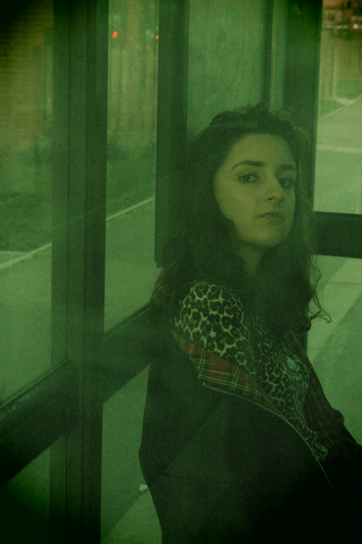
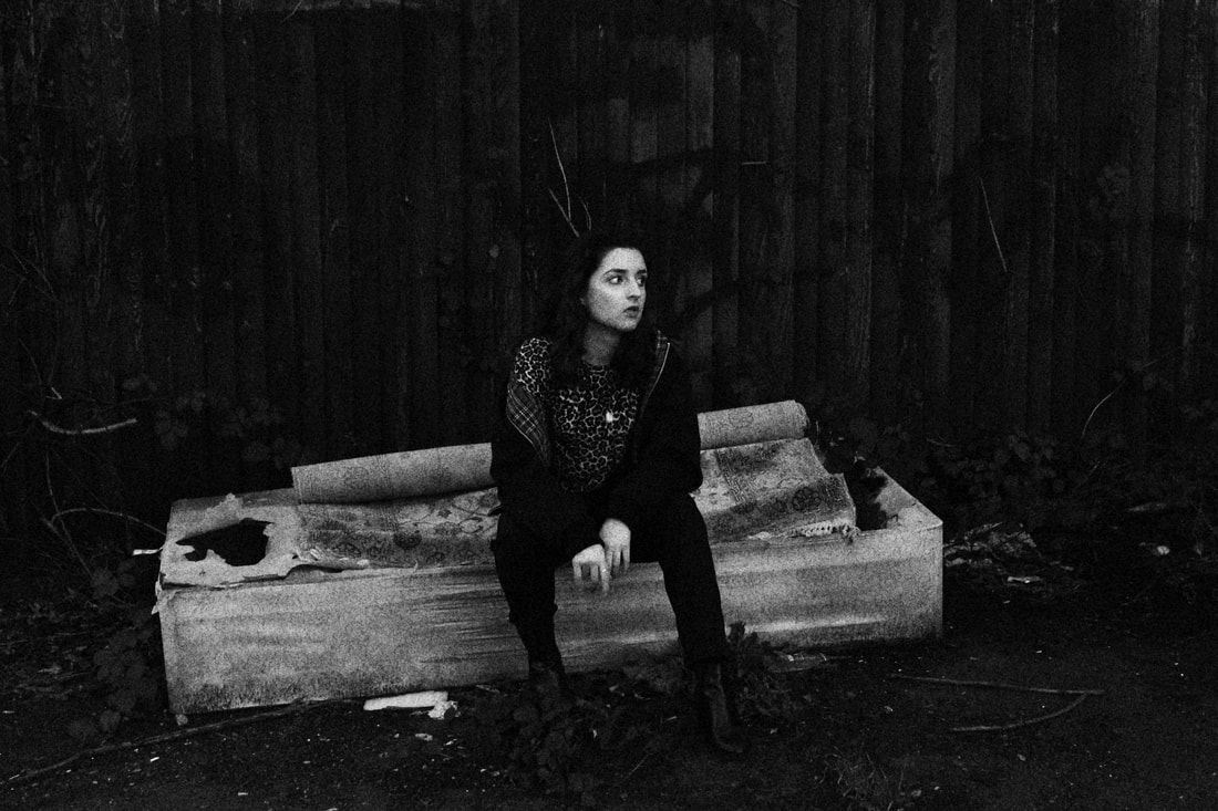
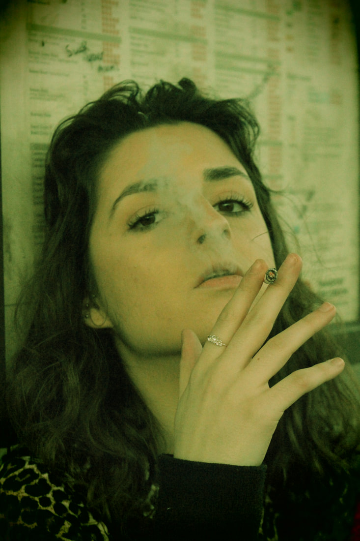
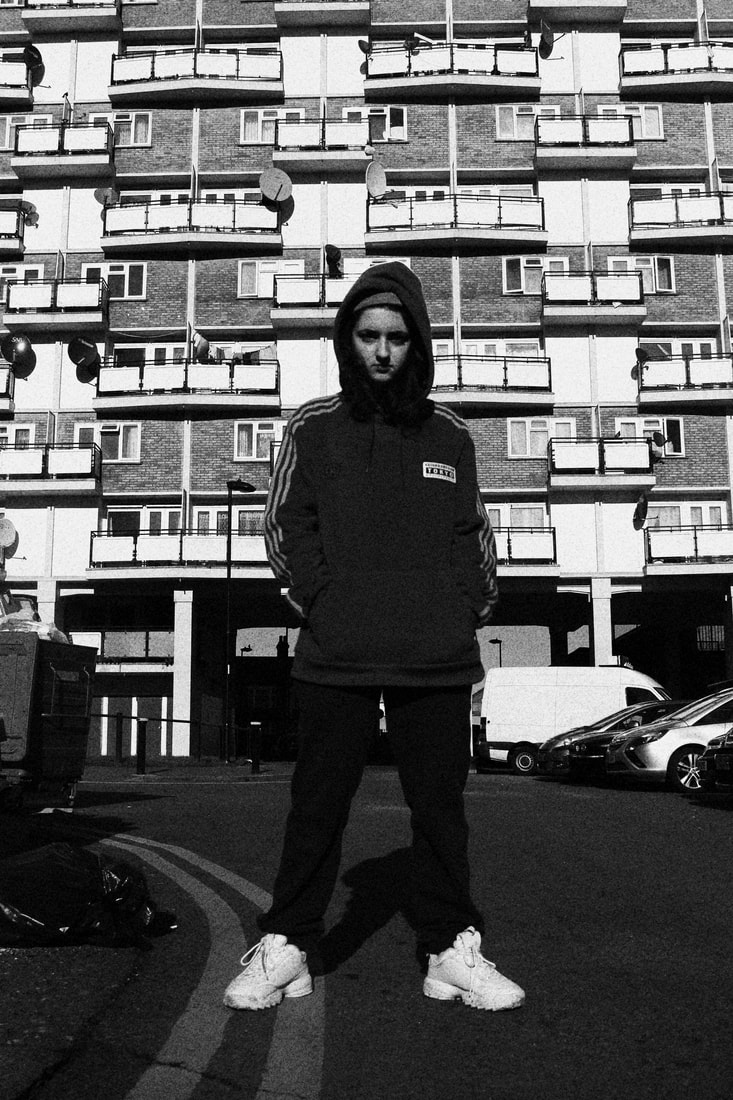
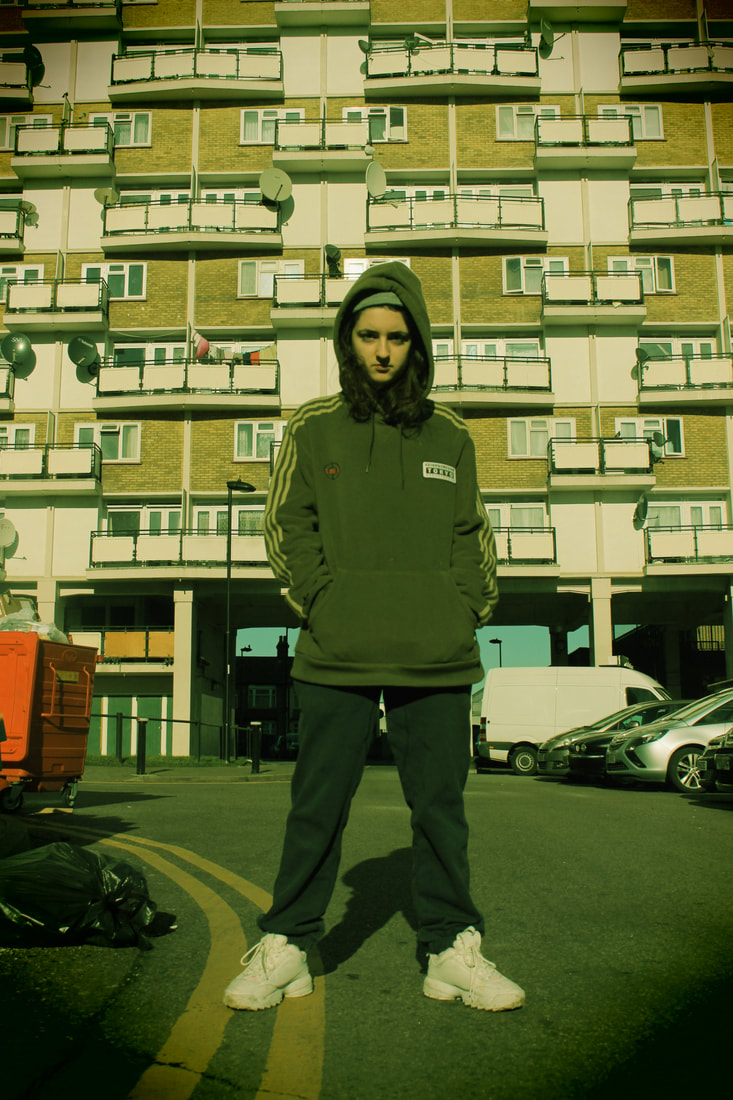
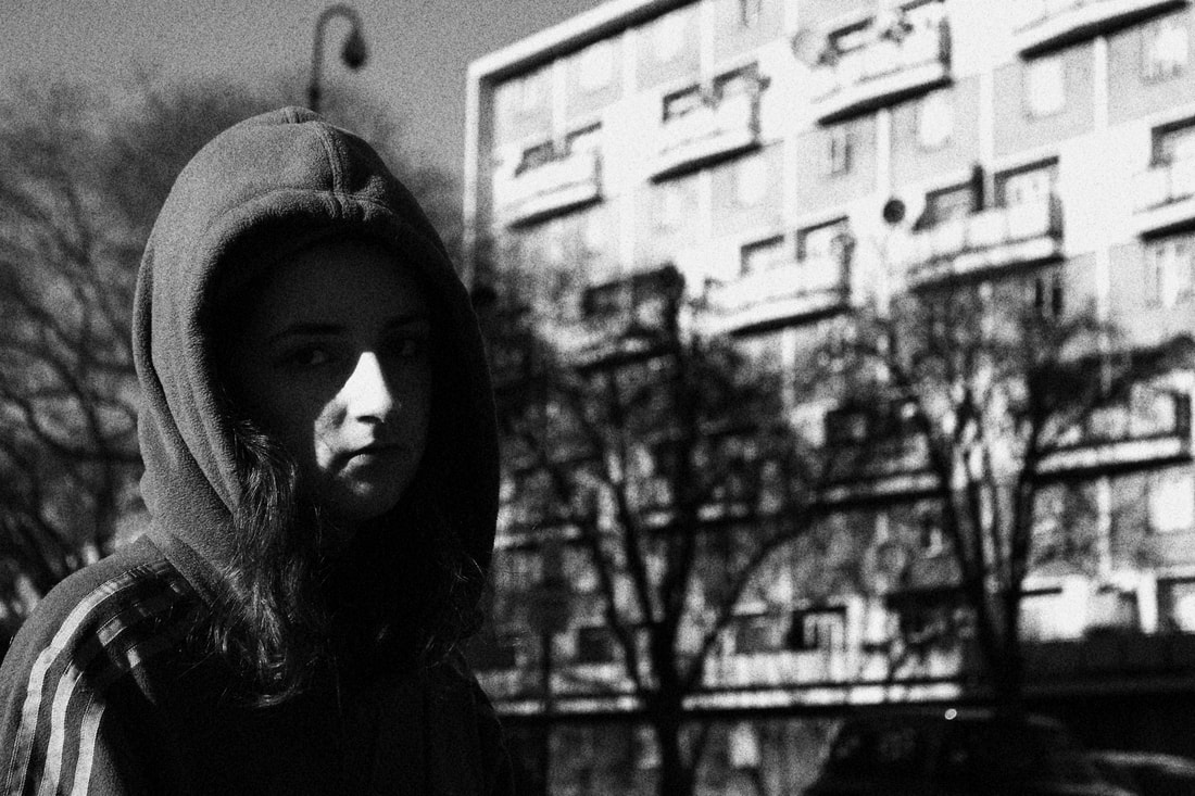
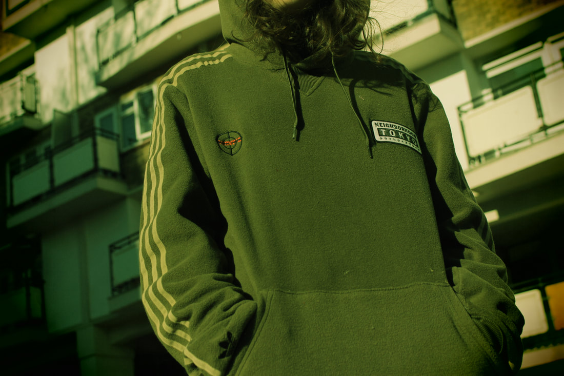
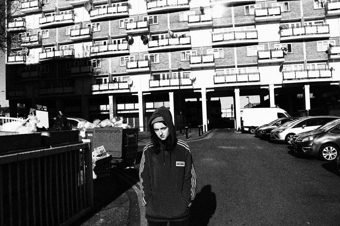
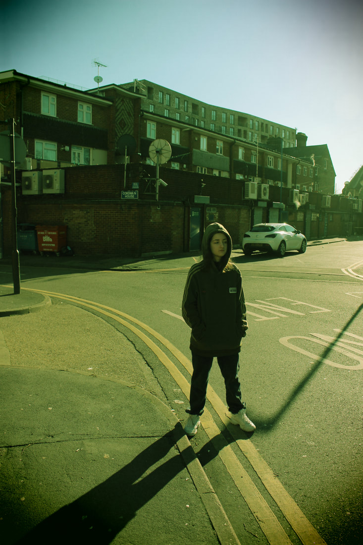
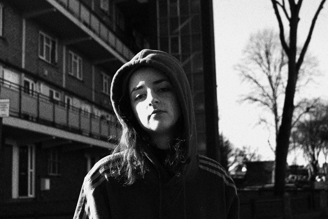
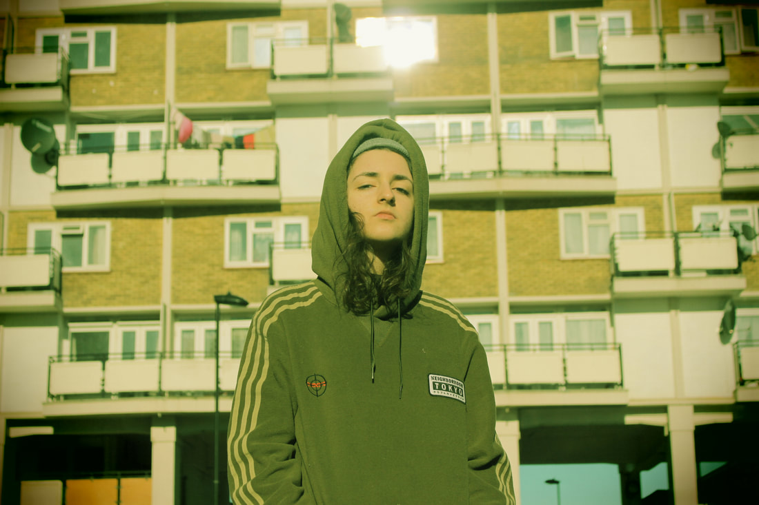
Response 2
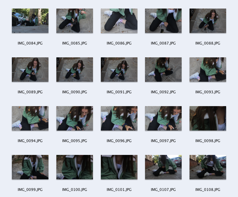
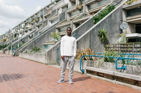
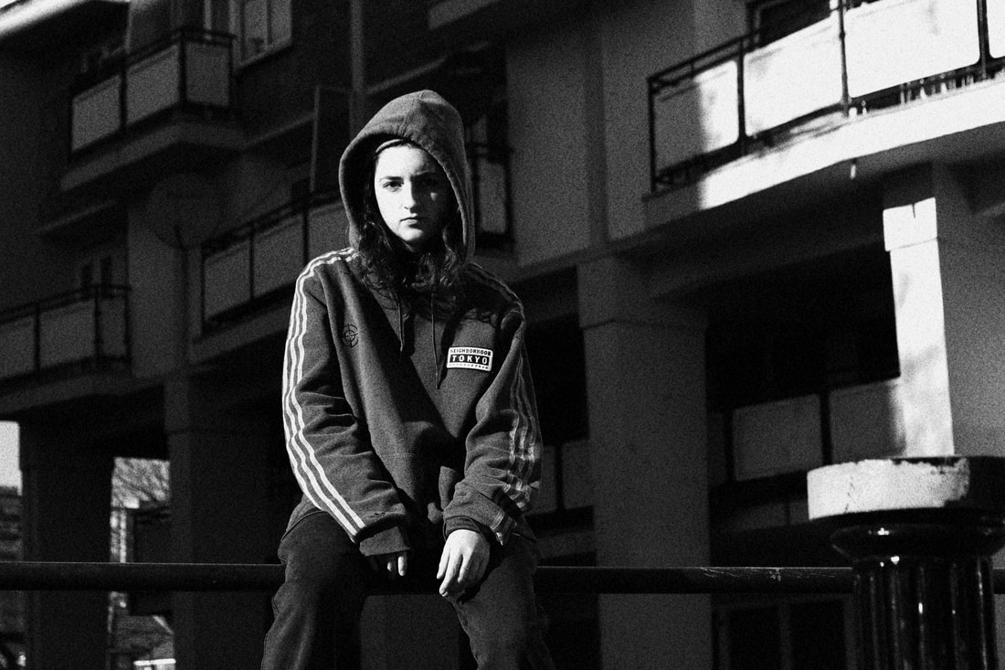
I decided to reshoot in a different location as I felt like the previous location did not capture what I want (the grittiness of the area), these photos were taken in an area where many gangs gather and the area is usually surrounded by crime. The atmosphere is eery and you do not see many people around the area, I took the images with the intention of capturing the feeling of the area and made it clearer through the use of the in-built filters on my camera - this being in response to a few of the previous photographers I have looked at. I do not think I have taken a lot of photos, especially close ups but this is because I was trying to capture the surroundings as much as the subject so overall I think I have taken enough.
The subject is dressed in a comfy tracksuit which is usually seen worn amongst youth in the area, which reinforces why I am taking the photographs in the first place - to represent Youth in the area as well as the problems surrounding the area. I think the lighting in the photos was quite hard to work with as it was very bright but I changed up the WB several times as well as changing the aperture in order to capture a well lit photograph.
With these images now I would like to print them out bigger and write directly on top of the images; things that will present the area and the crime as well as what is personal to the subject to make the pieces more personal; I want to use different coloured pens including white this time to make the text stand out as much as the images which is what I originally intended on doing during my first text on image pieces.
|
|
|
